The accordion is a graphical control element comprising a vertically stacked list of items, such as labels. Each item can be expanded or collapsed to reveal the content associated with that item. There can be zero expanded items, one or more than one item expanded at a time, depending on the configuration.
To add an accordion component to a page of your site, click on the blue button in the upper right corner of the Customizer menu. Expand the list of components, find Accordion and use drag-and-drop to add it in the exact section of the page where you want to include it.
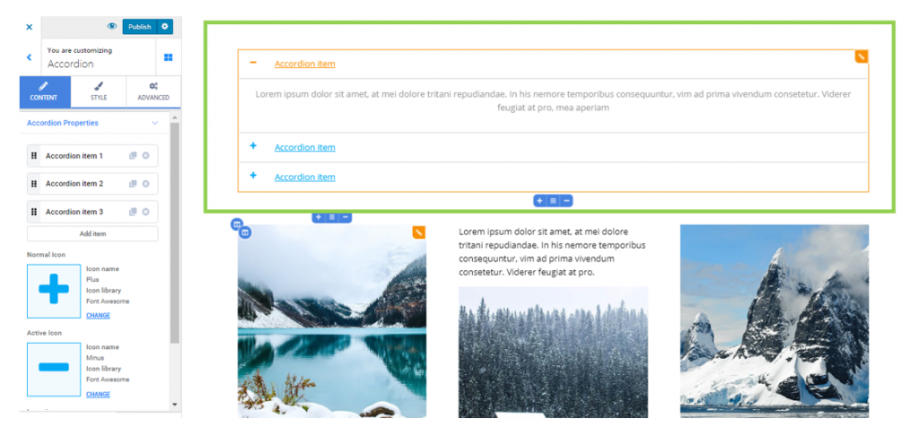
Example of Accordion component added to a page section:
To customize an Accordion component, click on it and make sure you have the corresponding settings category open in Customizer.
Content
From here, you can adjust the Accordion properties:
The list of Accordion items
The first set of customizations refers to the list of items that form the Accordion:
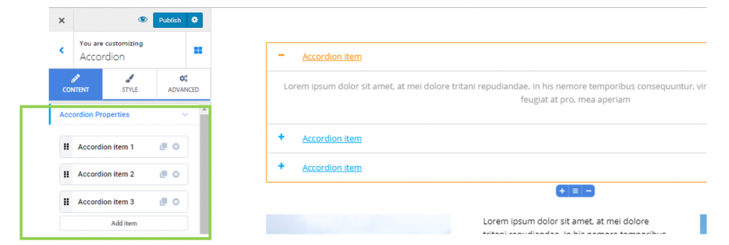
- Use the dots-like symbol on the left of the items to drag-and-drop the items and place them in the order you want
- Use the x symbol next to the items to completely remove those items from the list
- Use the duplicate button next to the items to make copies of them and include them in the list
- If you want to add new items to the list, use the Add Item button at the end of the list
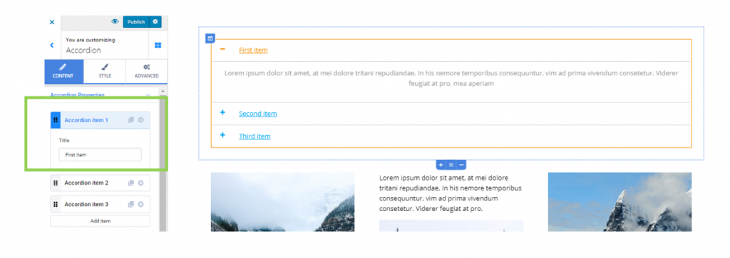
- To change the title of an Accordion item, click on that item and fill in the blank space under Title with your own words
Icons associated with the Accordion items
For a better orientation into the content comprised by the Accordion element, the titles of the items can be associated with suggestive icons. These icons signal to users what content they are currently seeing in the Accordion element.
E.g.
A + sign means that the respective item has to be expanded for its content to be seen. A – sign means that the respective item is already expanded, and its content is currently visualized by users.
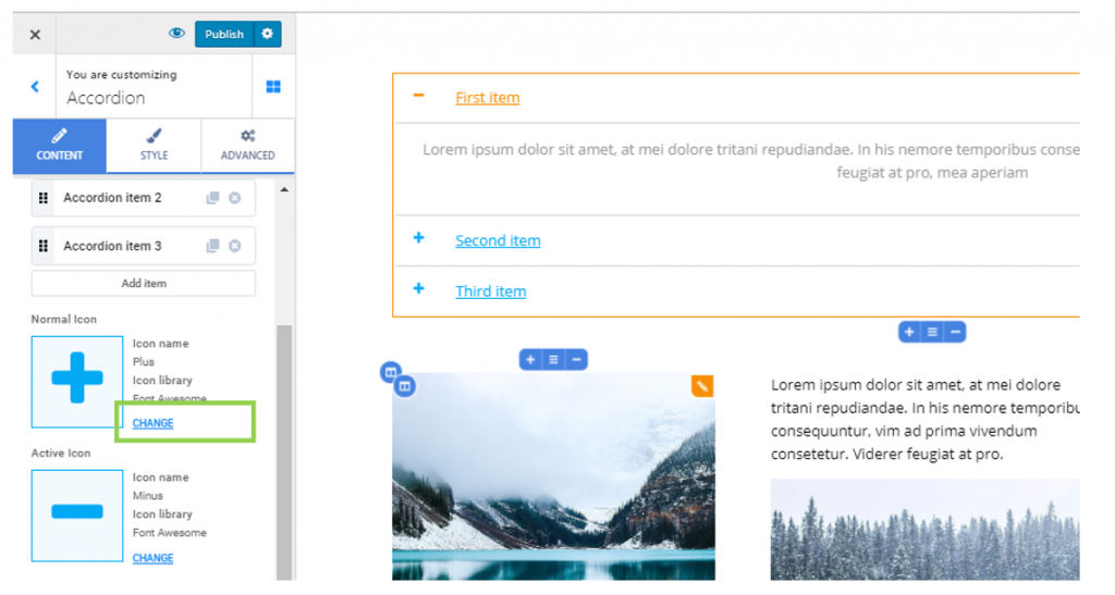
If you want to change the default icons for the normal items (items that have to be expanded so the content can be visualized) and the active item (item that is expanded and its content is being visualized), click on Change next to the default icons:
You will thus open the icons libraries that are available in Colibri, search for different icons and attach them to the titles of the Accordion items:
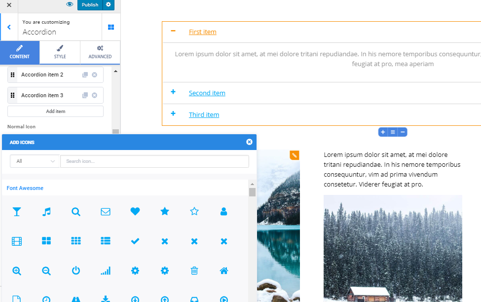
However, it’s best practice that you keep using suggestive icons that visitors are used to see for Accordion items.
Size of the icons
Set your values on the slider under Icon size, if you want to modify the dimensions of the icons accompanying the titles of Accordion items (to make them more visible or minify them).
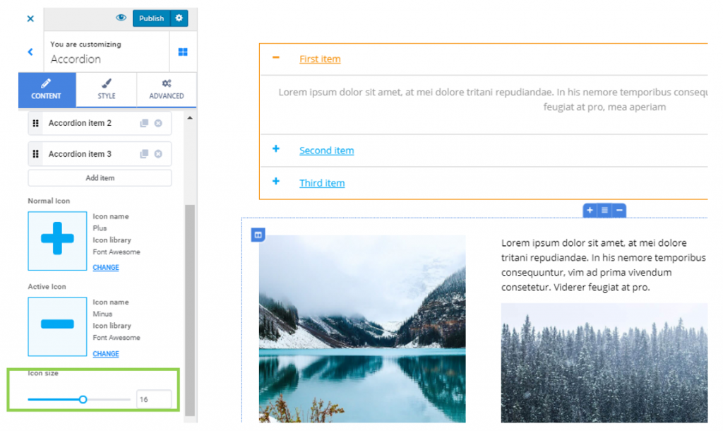
Allow multiple items open
If you enable this option, more than one item can be expanded at the same time, and their corresponding content can be visualized simultaneously.
Style
These settings refer to styling the following elements:
Accordion
Border type – you can create a visible border for the Accordion component, by selecting other options than None from the drop-down menu next to Border Type. These options might be: solid line, dotted line, dashed line, etc.
Border radius – this option applies only when you have previously chosen to show a visible border for the Accordion element. Set values greater than 0 for each of the border corners, to make the corners rounder.
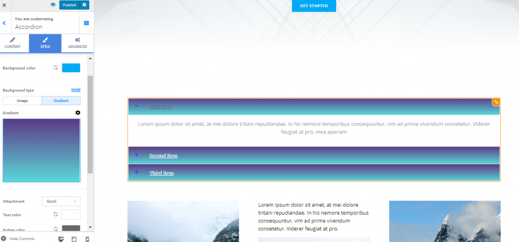
Titles of the Accordion Items
Background color – this is the color of the background onto which the titles of the Accordion items are placed. Select a specific color from the color picker.
Background type – in case you want a more sophisticated look for the Accordion component, you can switch from showing a simple background color to showing a background image or gradient. For the image background, you have to upload an image from your device, position it for adequate display, define the size of that image and enable a parallax effect. For the gradient background, you have to select a specific gradient, adjust the colors forming that gradient, choose the angle of inclination and the location where a color fades into the other.
Text color – this is the color of the text for the titles of the Accordion items.
Active color – this is the color of the text for the title of the Accordion item that is expanded and currently visualized.
Typography – click on the button next to Typography to open the panel with further settings for the typography style of the titles corresponding to the Accordion items (choose the font, the size of the font, line height, letter spacing, etc.)
Padding – these values determine the surface over which the titles of the Accordion items are displayed, both vertically and horizontally. Set your values for padding and you can create more space over which the text is spread, or reduce that space for optimal visualization.
Icons associated to the Accordion Items
From here, you can adjust the properties for the icons that accompany the titles of the Accordion items.
Icon position – you can place the icons before the title of the Accordion items, or after them (choose icons to be displayed to the left or to the right)
Icon size – you can customize the dimensions of the icons accompanying the titles corresponding to the Accordion Items
Icon color – choose a particular color for the icons, from the color picker. The selection should take into account the icons visibility, depending on the background you have set for the fields dedicated to the Accordion titles.
Icon active color – this is the color of the icon associated with the element that’s expanded and currently being visualized by users.
Icon spacing – greater values on the slider under Icon spacing mean that the icons are placed at a greater distance from the titles of the Accordion items.
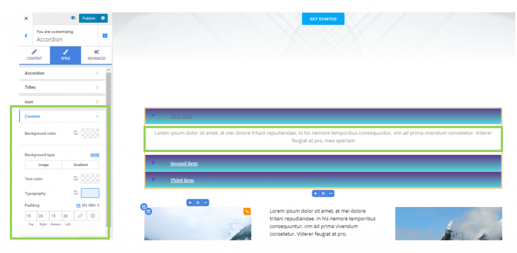
Content of the Accordion Items
These settings apply to the content associated to the Accordion items, when the items are expanded and the content can be read.
Background color – this is the color of the background onto which the Accordion content is displayed, when its items are expanded.
Background type – for a more stylish look, you might want to apply an image or a gradient to the content background. For an image background type, you have to upload the image from your device, position it for the most adequate view, and adjust its size. For the gradient background type, you have to choose a gradient from the list of available gradients and customize it to your wishes.
Text color – this is the color of the text for the content of the Accordion items, when the items are expanded, and that content is displayed onto the screen.
Typography – click on the icon next to Typography to open the panel with further settings for the typography style of the items content (choose a font, adjust the size of the font, etc.)
Padding – this option refers to the surface over which the content of the Accordion items is spread over. Choose individual values for all sides and customize the padding for the content of the Accordion items.
Advanced
From here, you can make additional customizations to:
- the Accordion component itself
- the title of the Accordion component
- the title of the active element that is open in the Accordion component
- the content of the Accordion component.
The customizations can be differentiated in changes you make both the elements in normal state and the elements on hover.