Beside HERO and Navigation, there are additional sections you can add to the Header of the website.
In the left-hand menu of the Customizer, go to Header sections.
Click on the + sign next to Header sections, to add new sections to the Header.
The list of Header sections can be managed as follows:
- Rearrange the sections in the Header, with drag-and-drop
- Remove sections by hovering with the mouse over the respective sections and pressing the red Remove button next to them
- Add sections to menu, by hovering with the mouse over the respective sections and pressing the orange “Add to menu” button
- Click on the grey cog icon next to the section you want to customize, to open the corresponding panel with settings for that section.
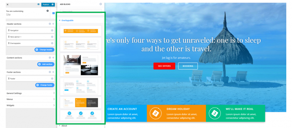
Overlappable sections
Overlappable sections are sections you add after the HERO and are indented into the HERO. For ease of use, overlappable sections come first in the list of available sections you can add to a page.
Layout
Define the structure of the layout for the overlappable section.
- Container width – set the horizontal distance onto which the overlappable section is deployed; choose between the default width of the container and the display of the container on full screen
- Container height – set the vertical distance onto which the overlappable section is deployed; choose among auto adjustment of the height, display on full screen and minimal height of the Container
Overlap height – select values that define onto what vertical distance the overlappable section unfolds, into the Header. The values can be adjusted on the slider.
Spacing
These values define the distance from the top and to the bottom of the section. They can be set differently for desktop, mobile and tablet, so the website be mobile-friendly from its very launch.
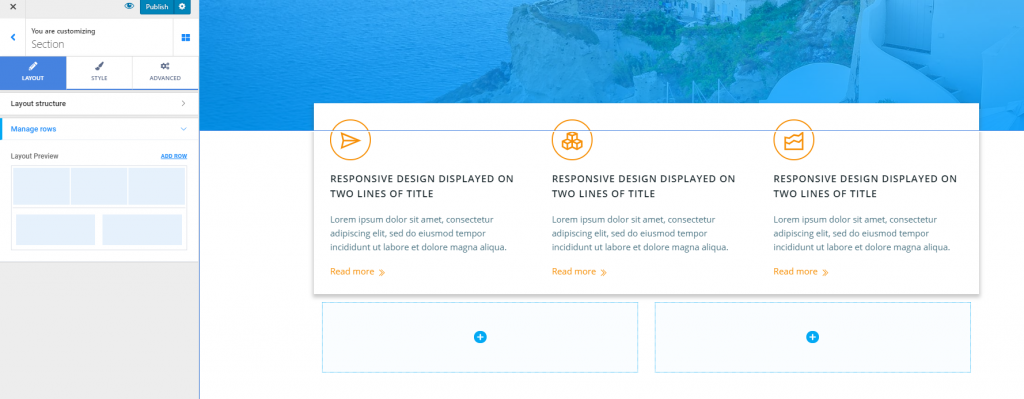
Manage rows
From here, you can get a preview of the current layout, and add extra rows to the section.
Style
The Styling options refer to customizations for:
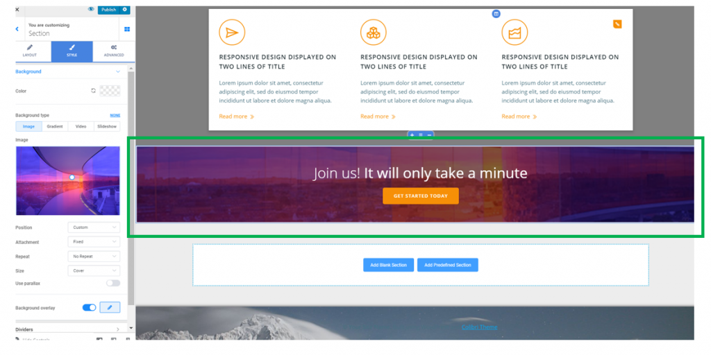
- The background of the overlappable section you’ve added (apply a color, set the background type to image/gradient/video/slideshow); you also have the possibility to add a background overlay (color/gradient/shape only)
- Dividers – they are graphic elements that separate the overlappable section from the upper section and the section following it. You can choose to have dividers for both top and bottom sides, or just one of them. If enabled, this option allows you to choose a certain Divider style (geometrical shapes), attach a color to the Divider and set how high the Divider will be for the upper/lower part of the section. You can also choose the negative version of the Divider.
Advanced
The Advanced options allow for extra customizations of the overlappable section. These options include, among others:
- Spacing (set values for padding and margins of the section)
- Border and Shadow (set a visible border for the section and apply a shadow effect to it)
- Typography (define typography settings for the text included in this overlappable section).
CTA sections
Next to Header sections, click on the + sign and expand the list of available sections you can add to the Header. Scroll down to CTA and choose to include a CTA section into the page.
Layout
Define the structure of the layout for the CTA section you’ve added to the page.
- Container width – set the horizontal distance onto which the CTA section unfolds
- Container height – set the vertical distance onto which the CTA section unfolds
Spacing
From here, you can set the spacing of the CTA section as related to the top and to the bottom. You can set different values for desktop, mobile and tablet, and preview the results.
Manage rows
From here, you can get a preview of the section layout. Also, you can add rows to the section and enrich its content with new elements.
Style
The styling options for the CTA sections include the following:
- Customizations of the background (you can set a certain color for the section background, you can set the background type to image, gradient, video or slideshow; you can also apply an overlay to the section background)
- Dividers – by enabling Dividers, you will add a top/bottom separator to the section and better differentiate it from the rest of the page. Choose a specific shape of the Divider, set a color for it, and define the height onto which the respective Divider unfolds. You can also enable the negative version of the Divider.
Advanced
You can apply additional customizations to the CTA section you’ve added to the Header.
For instance:
- Spacing (set values for the padding and the margins of the section)
- Border and Shadow (for a more stylish effect, choose to show a border and apply a shadow effect to the section)
- Typography (adjust settings for the typography that best suits the text in the CTA section)
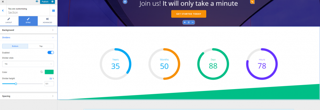
Counters sections
To add a Counter section to the Header, click on the + sign next to Header sections, and expand the list of available sections. Scroll down to Counters and choose a sections that fits your page.
Layout
- Container width – set the horizontal distance that the Counters section spans over
- Container height – set the vertical distance that the Counters section spans over
Spacing
From here, you can set the spacing of the Counters section as related to the top and to the bottom. You can set different values for desktop, mobile and tablet, and preview the results.
Manage rows
From here, you’ll get a preview of the section, and you can add supplemental rows for more content you’ll want to include in the section.
Style
The styling options for a Counters section refer to:
- Customizations for the section background (set a specific color for the background, set the background type to image/gradient/video/slideshow; you can also choose to apply an overlay to the section background).
- Adding Dividers that separate the Counters section from the section above (in this case, the CTA section) and the section below it. Choose which graphic element best suits the design of the page, select a color for the Divider and set the optimal height of the Divider – the vertical distance this separator occupies in the section. You can also choose to display the Negative version of the Divider.
Advanced
From here, you can make additional customizations to the Counters section:
- Spacing (set values for the padding and margins of the Counters section)
- Border and Shadow (give a visible border to the Counters section and add a shadow effect to the Counters box)
- Typography (select colors for the text contained in the Counters section)
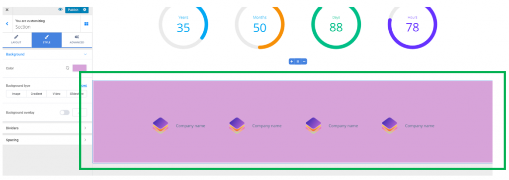
Clients sections
To add a Clients section to the Header, click on the + sign next to Header sections and expand the list of available sections. Scroll down to Clients and choose a section that best suits your design and content.
Layout
Concerning the structure of the layout for the Clients section:
- Set the width of the Container – this refers to the horizontal distance that the section spans over
- Set the height of the Container – this refers to the vertical distance that the section spans over
Spacing
From here, you can set the spacing of the Counters section as related to the top and to the bottom. You can set different values for desktop, mobile and tablet, and preview the results.
Manage rows
From here, you can get a preview of the current layout. Also, you can add extra rows, and include more content in the Clients section.
Style
The styling options include:
- Customizations of the section background (choose a color for the Clients section background, set the background type to image, gradient, video or slideshow; you can also choose to apply an overlay to the background)
- Customizations of Dividers (the Dividers separate the section from the section above and the section below it; they can have different shapes, you can choose a specific color for the Dividers, and decide on the height you want the Dividers to occupy in the section)
- Adjustments of the Spacing (choose the values you want for the Top spacing and Bottom spacing, that is the distance of the section content from the top and to the bottom). You can set different values for display on desktop, mobile and tablet; click on the small icons next to Top spacing/Bottom spacing to get a preview of how the section is displayed on different devices.
Advanced
From here, you can make advanced customizations to the Clients section:
- Spacing (set values for the padding and margins of the Clients section; you can set individual values for each side: top, bottom, left, right)
- Border and shadow (you can choose to include a visible border and apply a certain style to it; also, you can add a shadow effect to the Clients box)
- Typography (set the colors for the text contained in the Clients section).