Open the list of Components and find the Blog Posts Component. Use drag-and-drop to place a Blog Posts Component in the page you are customizing.
Example of Blog Posts Component added to a page:
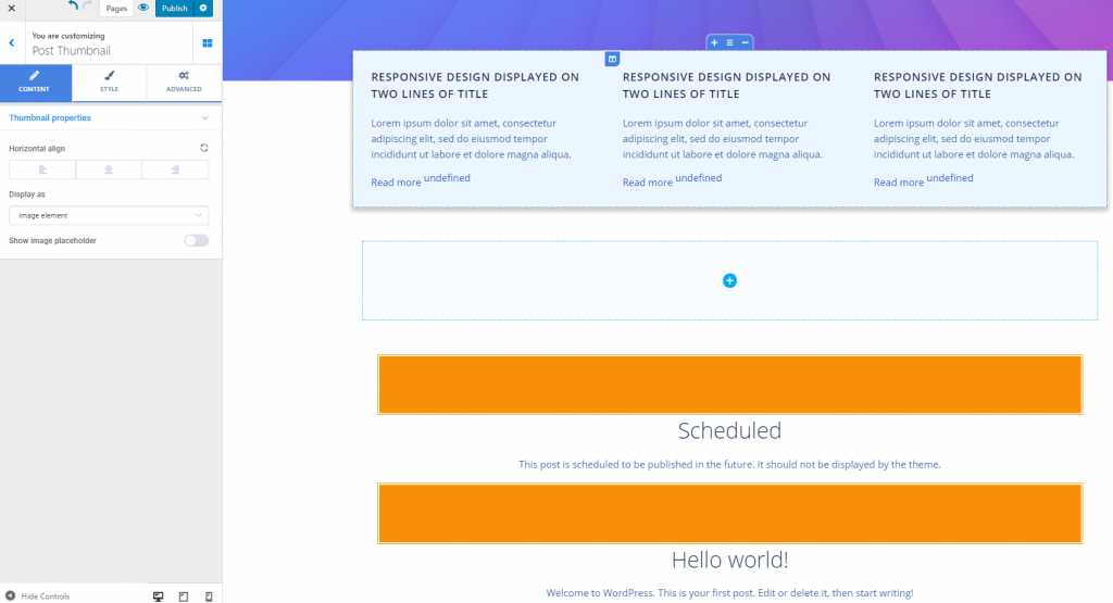
Click inside the component and make sure you have the corresponding settings category open in Customizer.
Content
From here, you adjust the blog posts appearance, as they are displayed in the page where they’re inserted.
Posts per row – set the number of posts that’ll be displayed in a row.
Use masonry layout – set a masonry layout for the blog posts that appear in your page.
Spacing and alignment – from here, you set the spacing between columns representing the blog posts, as well as the column inner padding.
Positioning of the column – columns specific to blog posts can be aligned to the left, at the center or to the right.
You also have options for post filtering. Posts can be ordered by date, or by title, and they can be shown in ascending or descending order. Posts can be filtered by category, by tags or by authors.
Style
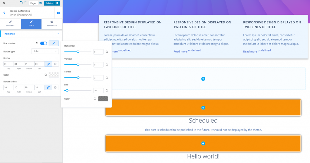
From here, you set the styling options for the thumbnails corresponding to the blog posts.
Box Shadow – you can choose to apply a shadow effect to the thumbnails for the blog posts. Click on the pencil icon next to Box shadow to open the panel with further customization options:
- Choose the horizontal distance over which the shadow is unfolded
- Choose the vertical distance over which the shadow is unfolded
- Set the spread of the shadow around the thumbnails
- Give a blur effect to the shadow
- Select the color of the shadow surrounding the thumbnails
Border type – select values other than None to create a visible border for the thumbnails (solid line, dashed line, dotted line, etc.)
Border thickness – select values for the thickness of the border (set individual values for each side of the border). The higher the values, the thicker the border of the thumbnails will be.
Border color – select a color for the border of the thumbnails.
Border radius – this option refers to how round the corners of the thumbnail border will be.