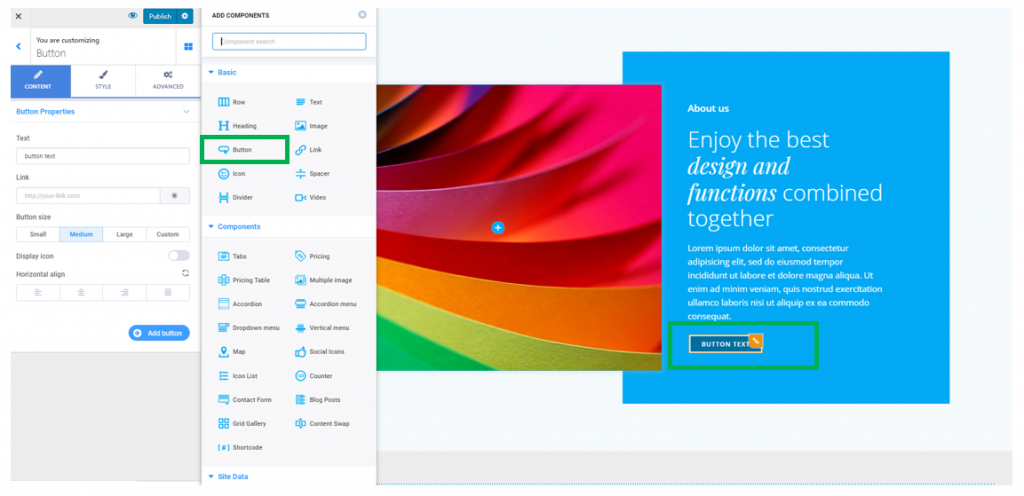
You can add a button component in a predefined section you included in the page.
Click on the blue sign next to Section, in the upper part of the Customizer menu. You will open the list of components.
In the category of Basic Components, find the Button component.
Use drag-and-drop to put a new button to the section you are modifying.
New button added to a page section:
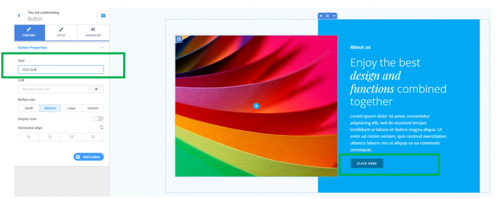
To customize the button element, you need to have the settings category for Buttons open in Customizer.
Content
From the Content category, you’ll adjust the properties of the button.
Text
Fill in the blank space with the text you want to place onto the button.
Link
The role of a button is to lead users to another page/page section/website/checkout page/newsletter subscription page, etc.
Fill in the blank space under Link with the complete URL to the destination page.
Button Size
Determine the dimensions of the button (it can be small, medium, large or of a custom-size).
Display icon
If you want to display an icon next to the button text, enable the option to Display icon. You can change the default icon by choosing another one from the Font Awesome icon library.
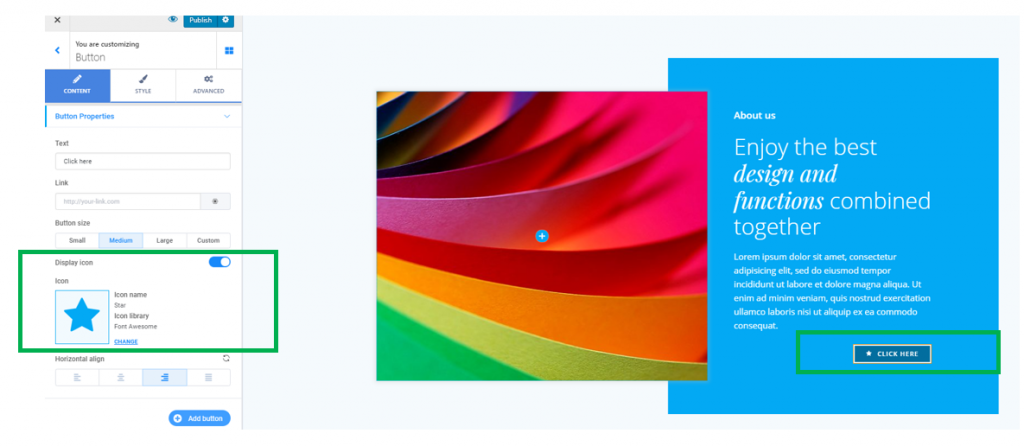
Horizontal align
Choose the most effective placement of the button, by aligning it to the left, at the center or to the right.
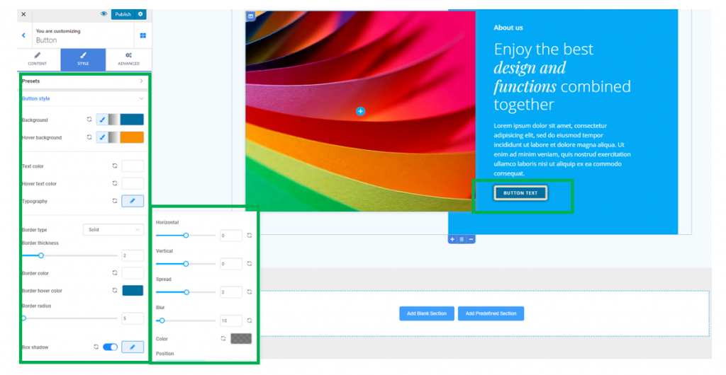
Style
Define the styling options for the button you’ve added to your section.
Background of the button
Under Button Style, next to Background, you’ll find a brush icon followed by gradient options and color options.
Click on the color picker to choose an effective color for the button, that is a color which drives users’ attention.
Click on the symbol for gradient option and select a specific gradient for the button you’ve added to the section.
Background of the button on hover
Under Button Style, next to Hover Background, you’ll find a brush icon followed by gradient options and color options.
Click on the color picker to choose an effective color for the button when users hover over it with the mouse, that is a color which drives users’ attention.
Click on the symbol for gradient option and select a specific gradient for the button as it appears when users hover over it with the mouse.
Text of the button
Choose the color of the text that appears on the button, from the color picker.
Text of the button on hover
Choose the color of the text that appears on the button, when users hover their mouse over it.
Typography of the button text
Choose the style of the text that appears on the button, by adjusting the typography for that text.
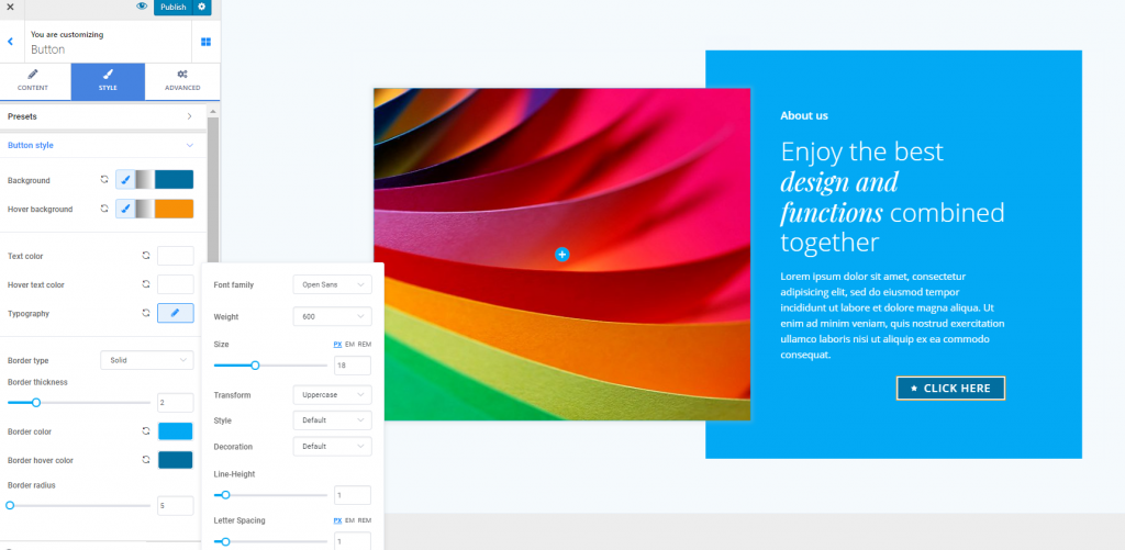
Border Type for the button
If you want to make the button more salient, you can select among 6+ different types of visible borders.
Thickness of the border for the button
Then, you’ll need to select, on the slider, a value for how thick you want the border to be. The higher the values, the thicker the button border will be.
Color of the button border
To differentiate the button element from the other elements in the page, you can apply a particular color to the button, by selecting it from the color picker.
Color of the button border on hover
This is the color the button border will have, when users hover their mouse over the respective button.
Border Radius
This option refers to how round the corners will be. The higher the values for the border radius, the rounder the corners of the border will be.
Box Shadow
For a more stylish effect, you can enable the option to attach a shadow to the button box. Click on the pencil icon next to Box Shadow, to open the panel with customization options for the shadow of the box. You can set the shadow color, deviation on a horizontal/vertical axis, the surface it is spread over around the button box, and you can apply a blur effect to it.
Advanced
From here, you can set additional options for the button component.
You can make modifications for the Border and Shadow, Spacing and Typography.