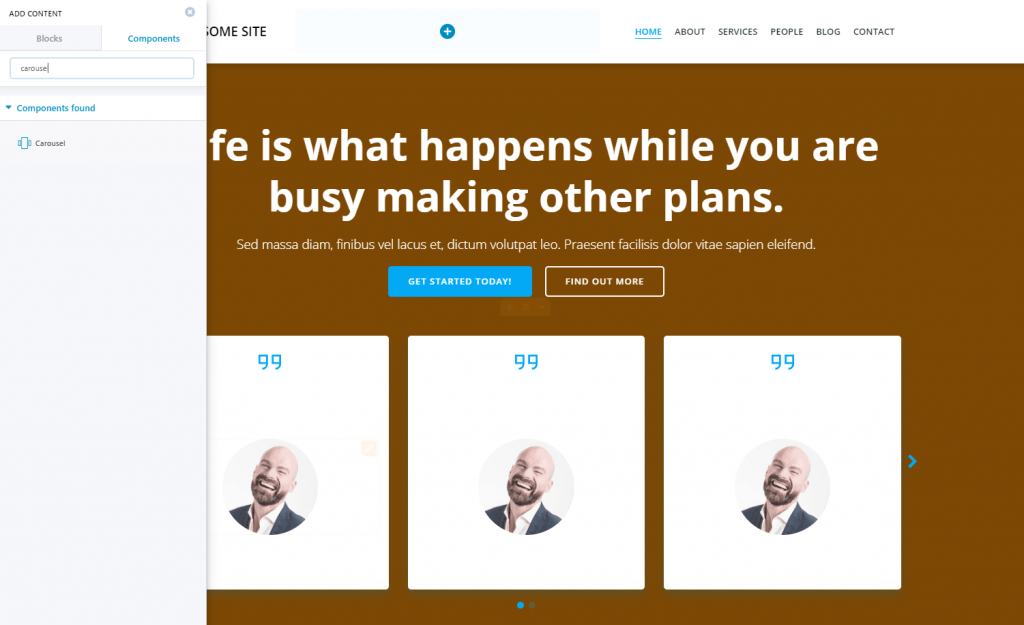
The carousel component is useful for including concise information in a limited space of the website page.
To add a carousel to your page, open the list of components, and search for “Carousel”.
Then, use drag-and-drop to place the carousel component into the page.
Click inside the component to open the panel with customization options for the carousel.
Content
Carousel Items
If you click on any of the items, you open the set of features for the respective element.
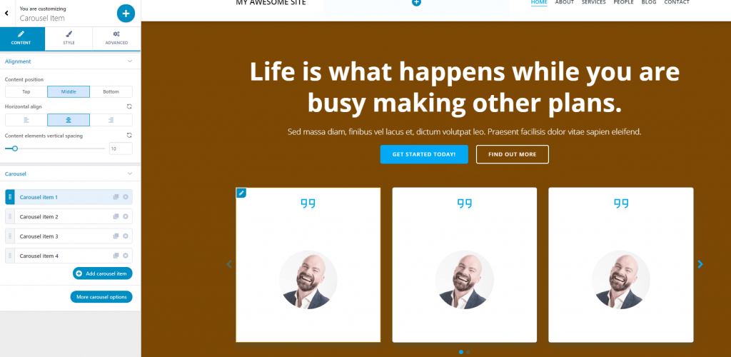
Carousel Item Content
Content vertical alignment – you can position the content of an item to the top, in the middle or at the bottom.
Horizontal alignment – content can be placed to the left, at the center or to the right.
Content elements vertical spacing – this is the distance of the content from the box margins, on a vertical axis. The higher the values, the more distance between content and the box margins.
Carousel Item Style
Color – choose a specific color from the color picker, for the carousel item background. Note: you can link the style of one item to the style of other items in the carousel, for a coherent design.
Background Type – apart from color, the background can be set to image/gradient/video.
- For an image, you can replace the default one with an image of your choice
- For a gradient, you can choose the gradient you like from the list. You open the list of gradients by clicking on the cog icon
- For a video, you can choose to upload a self-hosted video or provide a YouTube link; also, you can upload a video poster, that will be displayed when the video is not loading or cannot display
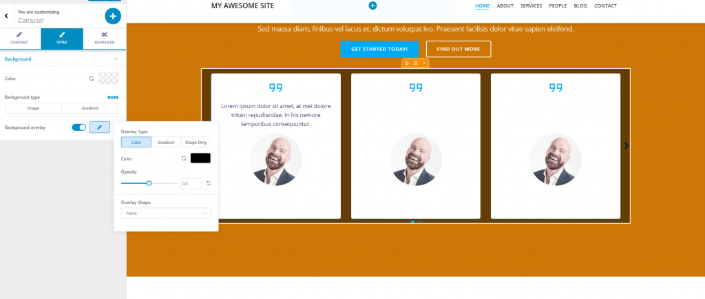
For any type of background, you have the option to apply a background overlay. Click on the pencil icon to open the panel with customization options: choose an overlay – color/gradient/shape only and adjust additional settings for any type you’ve chosen.
Carousel Item Advanced
You can adjust these settings for the carousel item in normal state and on hover.
You can customize border and shadow, spacing and typography.
Carousel Options
Minimal height – this is the minimal height from the top of the item box. Choose a value on the slider and test the results.
Horizontal alignment – this is the alignment of each item content, on a horizontal axis (to the left, at the center or to the right)
Number of visible elements – from here, you can set the number of items that are displayed at once on the screen, before another element comes in.
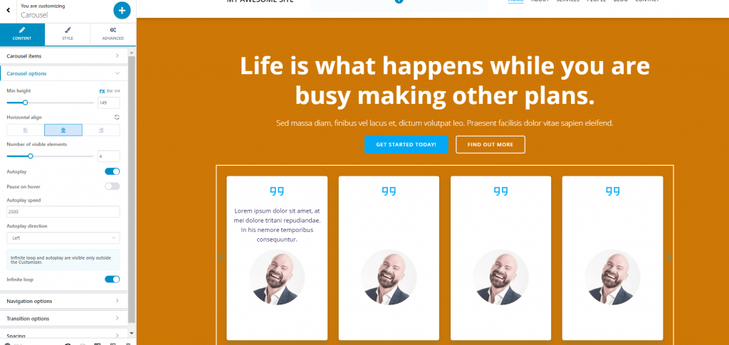
Autoplay – this feature allows for automatic succession of the carousel items. Users don’t have to use arrows to bring new items into view, the carousel items automatically succeed to one another.
Pause on hover – this option is available only if you’ve previously enabled autoplay. If you enable pause on hover, it means the automatic succession of items is paused, while users hover over the displayed items with their mouse.
Autoplay Speed – from here, you can set the succession of items to be fast or slower, depending on the values you select for Autoplay Speed.
Autoplay Direction – the items can succeed to one another to the left or right, depending on your selection from Autoplay direction.
Infinite Loop – due to this option, the carousel items are succeeding to one another until they have been all displayed onto the screen, then the succession starts over again, in an infinite loop.
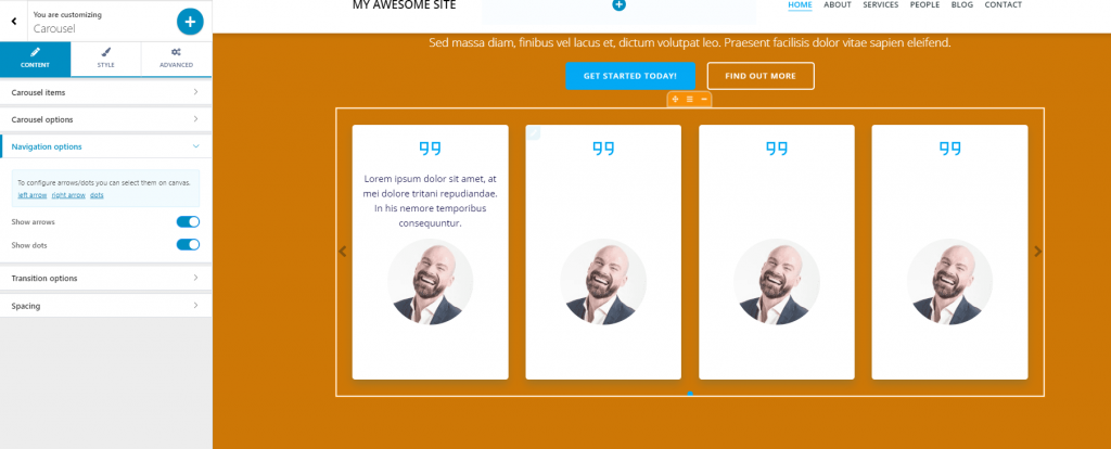
Navigation Options
Navigation within the content of carousel items is made with the help of
- Arrows – enable the option to show arrows, so users can easily use this navigation path to bring to view new carousel items
- Dots – enable the option to show dots, so users can easily bring to front new items in the carousel
For customization of the size, color of navigation elements (arrows, dots), click on the respective elements in the Customizer and open the panel with settings for those elements.
Transition Options
Transition Type – this refer to the way the transition from one item to another is made. Test Slide and Coverflow, and choose what best fits your design.
Transition Speed – this option refers to how fast or slow the transition from one item to another is made. Higher values mean increased speed for the transition from one item to another.
Spacing
Space between items – set how much space you choose to have between the carousel items. The space can have the following values: no gap, small, medium, large, or custom.
Item inner padding – set the padding for each item in the carousel. The values can be: no gap, small, medium, large, or custom.
Style
Background Color – select the color of your choice, from the color picker, and apply it to the background of the carousel
Background Type – you can set the background type to image or gradient (upload an image of your choice or select a gradient of your choice)
Background Overlay – an overlay is a semi-transparent color that is applied on top of the background, to obtain a nice visual effect. Enable the option and click on the pencil icon to open the panel with customization options for the overlay.
Advanced
From here, you can make advanced customizations to the carousel. You can customize border & shadow, spacing and typography.