With ColibriWP, you have the possibility to customize your website differently for desktop and mobile devices.
Note that:
- Settings you apply for the desktop will also apply to tablet and mobile
- Settings you apply to the mobile site version won’t replicate for tablet
- Settings you apply for the tablet site version won’t replicate for desktop
Create offscreen menu (hamburger menu for mobile devices)
For ease of use, you might want to create a hamburger menu for the site as it’s displayed on mobile and tablet.
To do so, switch to tablet or mobile view, and click inside the menu element. Clicking inside the component will open the panel with customization options for that menu.
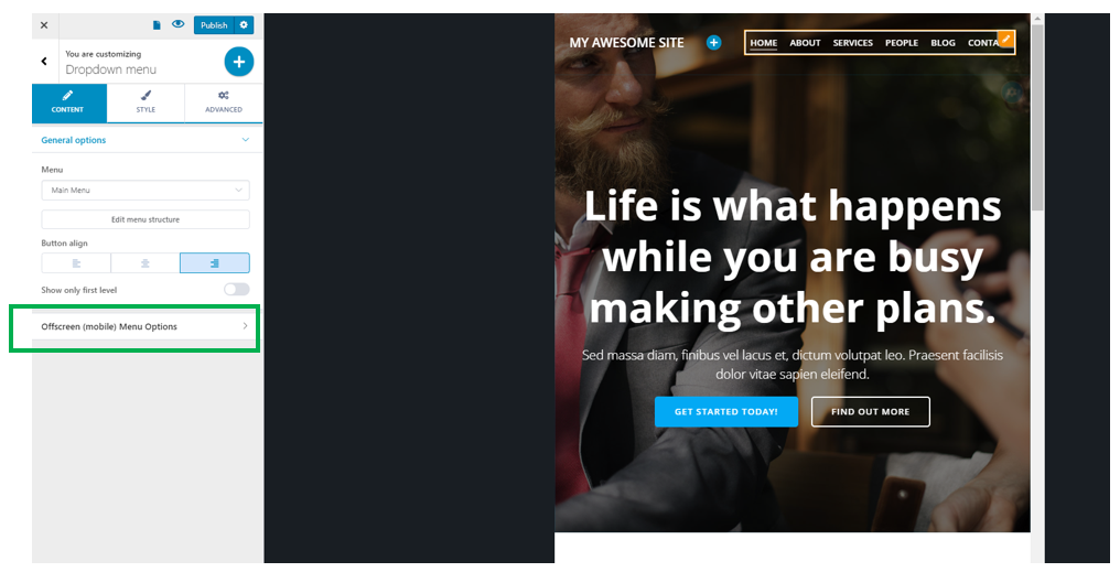
In the lower part of the Content Settings tab, you have the options for Offscreen (mobile) Menu.
Click to expand the options corresponding to the mobile menu:
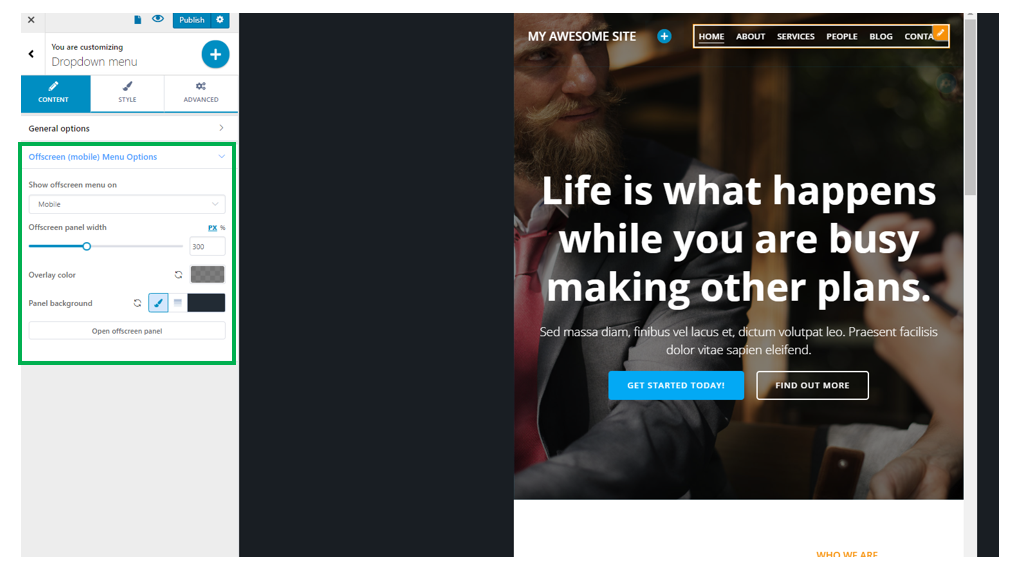
Show offscreen menu – you can choose to show offscreen menu on:
- Mobile
- Mobile & tablet
- Mobile, tablet & desktop
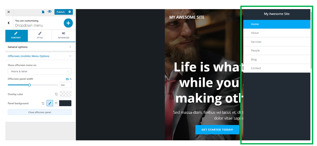
Offscreen panel width – from here, you can set the horizontal distance onto which the offscreen panel is deployed, when users click on the hamburger menu. Choose an appropriate value on the slider, and check the appearance of the offscreen panel, when it’s expanded after clicking on the hamburger menu.
Overlay color – this is a color that’s applied on top of the page, excepting the offscreen panel. Choose a color from the color picker and check how it shows in the page on mobile devices.
Panel background – this is the color of the offscreen panel, as it appears when the offscreen panel is expanded. You have the possibility to choose:
- A color
- A gradient
Open offscreen panel – to check the modifications you make to the offscreen panel, you need to click on this option and open the offscreen panel.
Choose different style options for desktop, tablet and mobile
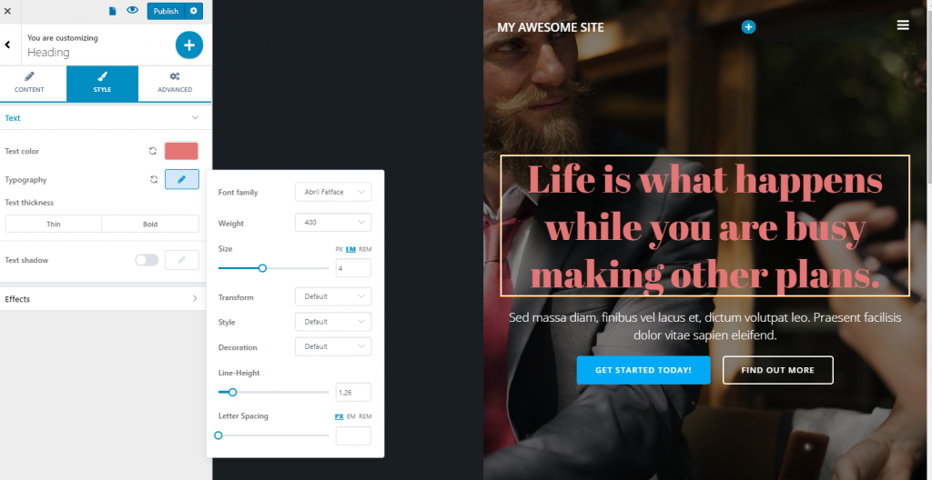
Example: change typography settings for tablet
Switch to page view on tablet and click inside the text element you want to change settings for.
Open the corresponding panel for that text, and go to the Style tab.
Change the color of the text and typography:
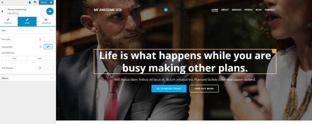
Switching back to the desktop view, you can see the original heading style has not been modified:
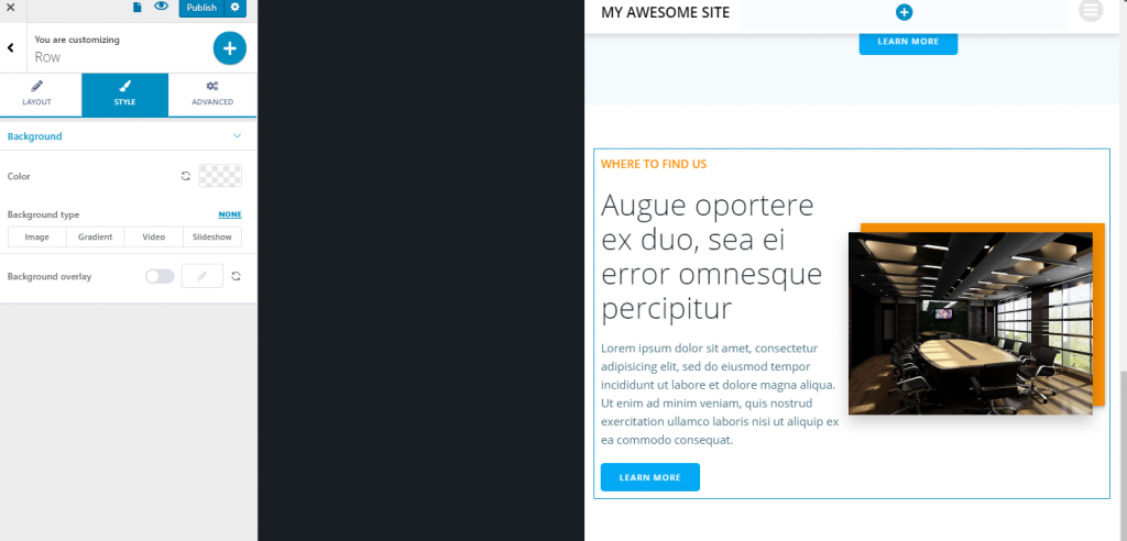
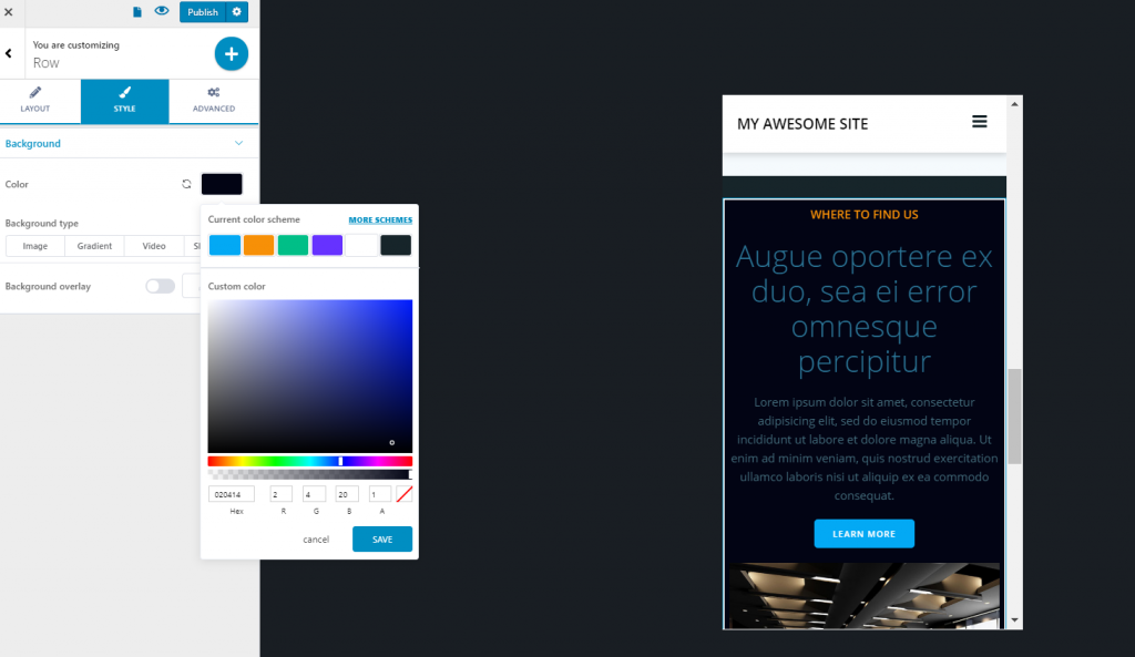
Example: change background color for a content section on mobile
Switch to page view on mobile and click on the content section you want to change the background for.
Go to the corresponding Style tab, and choose the preferred colors for the background and text, using the color picker:
Switching back to tablet and desktop, you can see the initial design stays the same, as it hasn’t been modified: