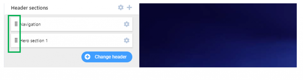
In the left-hand menu of the Customizer, go to Header Sections.
Either
- you’ll find a default HERO section that’s already been added to the page (you can start customizing it to your wishes)
- or you need to click on the + icon next to Header Sections to expand the list of available sections and choose HERO from the list.
Customize the HERO section
General Options
You can change the order of the HERO section in the list of Header elements, by using drag-and-drop. For this doing, use the grid sign at the left of the section:
You can delete the current HERO section from the Header, by using the red (Remove) button that appears when you hover with the mouse over the section.
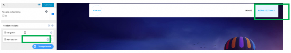
You can add the HERO section to the menu, by using the orange (Add to menu) button that appears when you hover with the mouse over the section. This option is useful when you set the navigation bar to sticky, the users scroll down the page and they want to go back to the first sections of the page: a menu link to the HERO comes in handy, in such a case.
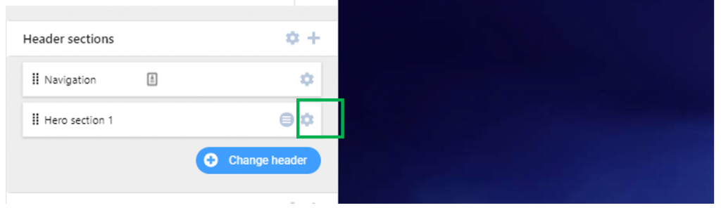
You can adjust different settings for the HERO section, making it look the way you want. Click on the grey cog icon next to the HERO section and expand the list of features for the HERO:
Specific Customizations for the HERO
Customizations of the Content
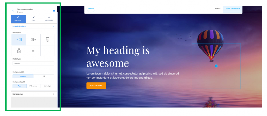
Define the layout structure
Hero Layout
You have 5 different layouts for the HERO. You can easily visualize them in a table as:
- text
- text on left, media on right
- media on left, text on right
- text below media
- text above media
- centered text
- custom layout.
Below is an example of HERO with text on left, media on right (the first layout selection):
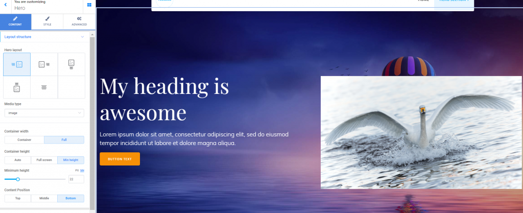
We referred to media as one of the elements included in the layout structure. Media files might be:
- images
- videos
- image collages
To edit the image/video/image collage you want to insert in the HERO section, you need to click on the element (image, video) and open in Customizer the panel with settings for the respective component.
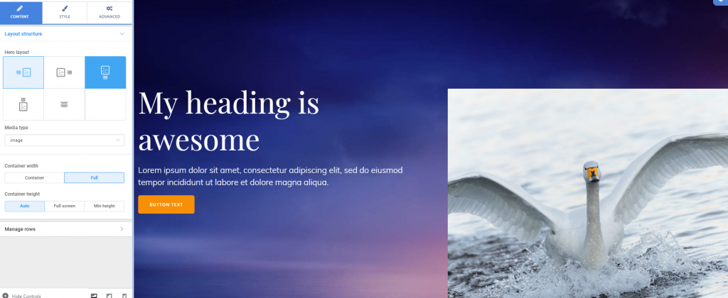
Set the Container Width
The HERO elements are included in a Container. From here, you define the horizontal distance the HERO elements can span over in their Container. The options are:
- to keep the initial width of the Container
- to span the Container over the full width of the screen
Container Full Width:
Set the Container Height
From here, you define the vertical distance the HERO elements can span over in the Container. This is the height of the Container.
You can set values to:
- auto adjustment of the Container height (the height of the Container is adjusted automatically)
- full screen height of the Container (it spans over the whole part of the screen)
- minimum height of the Container (the height of the Container is set to minimal values)
Spacing of the Hero
These values define the distance of the Hero from the top of the page and to the first content section.
Thus, you can choose values for top spacing and bottom spacing.
Manage rows
From this subsection, you can get a preview of the layout for the HERO.
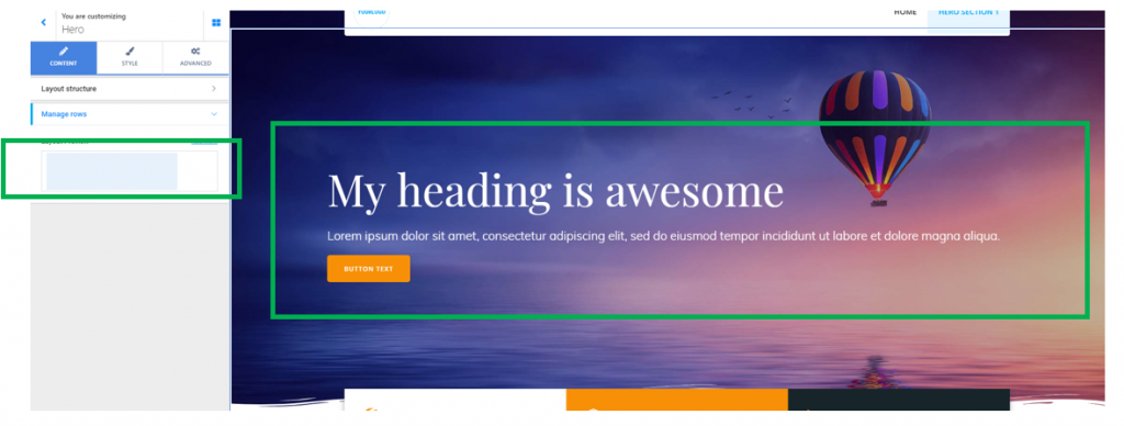
Also from this subsection, you can include additional rows in the HERO layout:
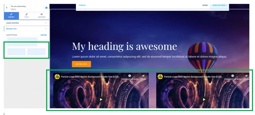
From the Layout Preview, you can delete a redundant row, any time. Simply hover your mouse over that row and an X button will appear in the upper right corner of the element.
Customizations of the Style
This features refer to specific customizations of the style you want to define for the HERO.
Set the color of the background for the HERO
From this option, you can change the color of the background for the HERO section.
Note that, once you set a color for the background, this color won’t be visible unless you have previously set the HERO background type to NONE.
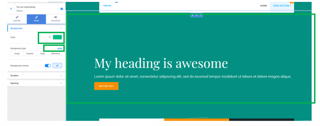
By using the Revert button next to the color picker, you can revert to no color any time.
Define the background for the HERO
You can choose from 4 types of backgrounds:
- set an image as HERO background
- set a gradient as HERO background
- set a video as HERO background
- set a slideshow as HERO background
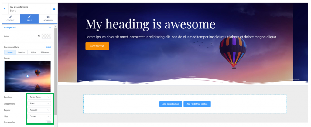
Setting an image as HERO background
- Decide on the optimal positioning of the background image, so it is showcased, without obscuring the HERO content (you can choose among top left, top center, top right, center left, center center, center right, bottom left, bottom center, bottom right, custom)
- Decide on how the image is displayed when users scroll down the page: it can be fixed (and it will stay in place when users scroll down the page and the foreground moves, creating a parallax effect) or it can be set to scroll (it will move along with the foreground, and get out of sight when users scroll down towards the bottom of the page).
- Decide whether to repeat the image set as background (you can set it to no repeat, simple repeat, repeat X – horizontally, repeat Y – vertically).
- Set the size of the background image, according to one of the following options: automatic adjustment of the image dimensions; cover image; set the image to contain
- You can enable the option to use parallax (the parallax effect means that the background is moving at a slower rate than the foreground, when users scroll down the page)
Setting a gradient as HERO background
From here, you can select and customize a gradient you’d like to apply to the HERO background.
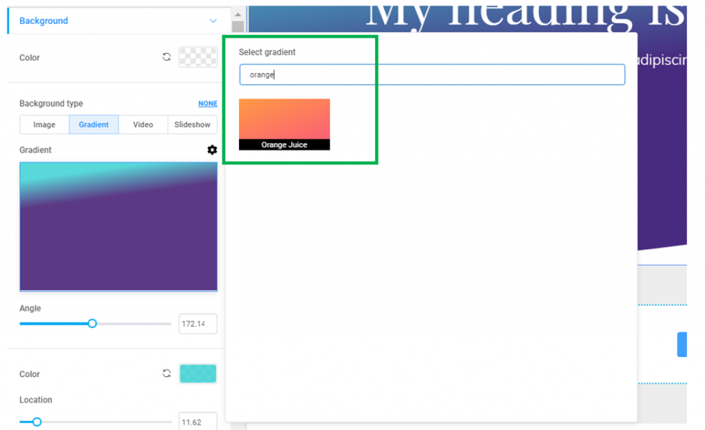
- Click on the default gradient and open the panel with the list of available gradients:
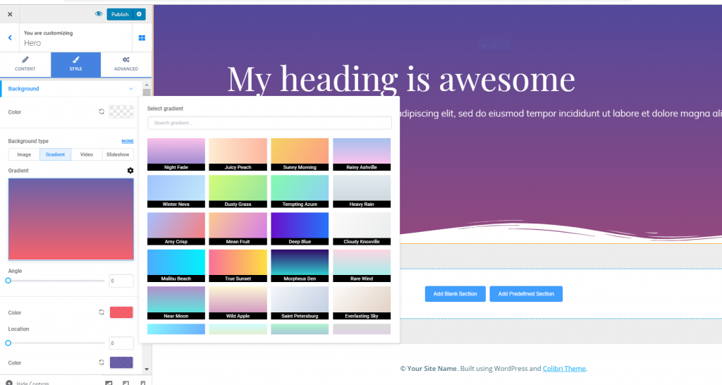
In the panel containing the gradients, a practical option is to type in the search bar on top of the list a color you want to be part of the gradient. The search will return relevant results, if there are any:
For the selected gradient, you have some extra options:
- Adjust the inclination angle for the gradient
- Choose color1 and color2 that will compose the gradient. If you’re not happy with one variant of the gradient, you can use the Revert buttons next to the color pickers and change the colors of the gradient, until they form the perfect gradient for you
- Set specific values on the slider destined to location (for each of the 2 colors) and make changes to how the gradient will finally look.
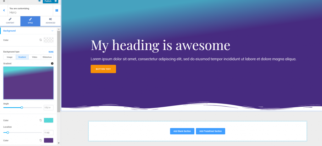
Below is an example of how the gradient for the HERO background can be customized:
- One additional option is to set the background to fixed (it will lead to a nice parallax effect, where the background moves at a slower rate than the foreground, when users scroll down the page) or scroll (as users scroll down the page, the HERO background will go out of sight).
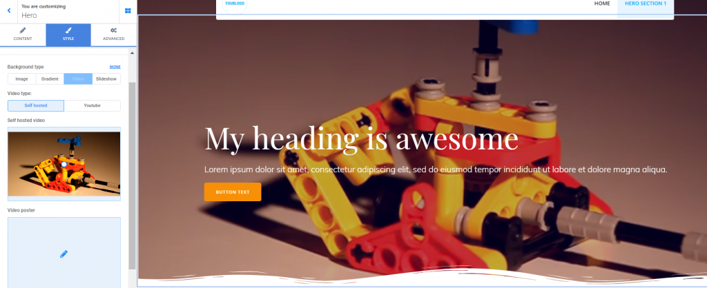
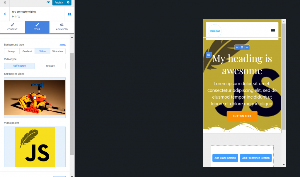
Setting a video as HERO background
From here, you can set a video to be displayed as HERO background.
You can:
- Upload a video file from your device (in this case, you’ll choose “Self-hosted” as video type)
- Insert an external video file – YouTube (in this case, you need to provide the link to the video file, by filling in the corresponding blank space)
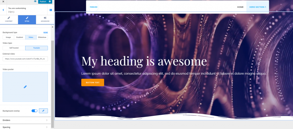
- Regardless of the video type you choose for the background, you can also configure a video poster.
The video poster is an image that’s displayed when the video file is not loading, or when it is not supported by users’ device. Mobile browsers usually disable video backgrounds to save bandwidth. Set a cover image to be displayed in this case. Upload an image you want to set as video poster.
Here’s an example of how it displays on mobile devices:
Setting a slideshow as HERO background
You can opt for inserting a slideshow as HERO background, as well. A succession of carefully chosen images can be the best choice for your website HERO.
From the Customizer, you can both manage the individual images forming the slideshow and apply customizations to the slideshow as a whole.
- Managing images that form the Slideshow (use the button “Add new slideshow image” to complete the slideshow with the images you want; click on a row corresponding to the image you want to make changes to – use the “Remove slide” button to completely remove the image from the slideshow; click on the image to upload a different one from your device and replace the current image)
- Customizations for the Slideshow: adjust slide duration (slide duration refers to how long an image of the slideshow stays visible on the screen; smaller values mean a slide is displayed in a shorter time span, while larger values mean a slide is displayed longer on the screen, until the next slide comes in); adjust the effect speed (the effect speed refers to the type of transition from one slide to another; smaller values mean a sharper transition from one slide to another, while larger values mean a smoother transition from one slide to another in the slideshow).
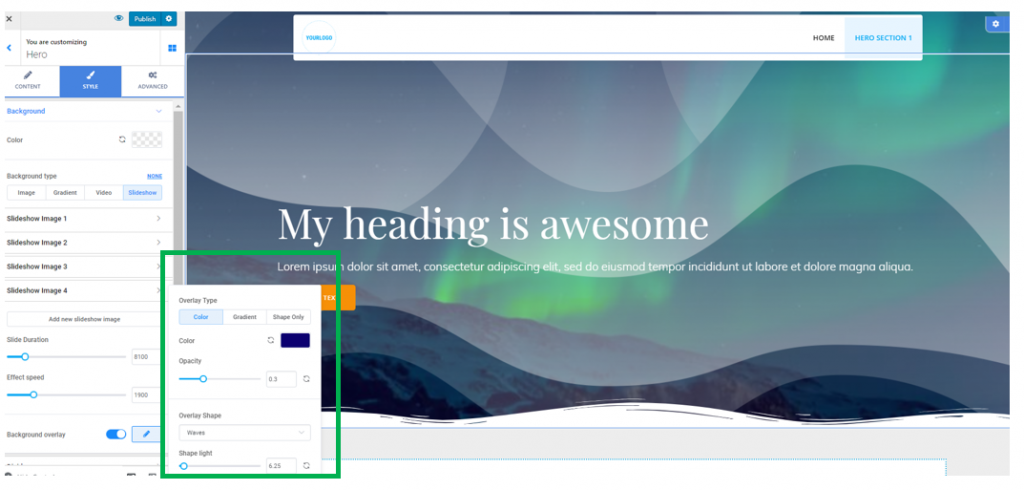
Regardless of the background type you choose (color, image, gradient, video, slideshow), you can enable the feature to apply an overlay to the background.
The overlay is a semi-transparent color that is applied on top of the background, to obtain a nice visual effect. Click on the pencil icon next to “Background overlay”, to open a panel with further customization options. Here, you can select the overlay type:
- Overlay as color (choose the preferred color from the color picker; set appropriate values for the color opacity – smaller values mean the overlay is more transparent, while larger values mean the overlay is opaquer; you can apply shapes to a color overlay – choose from 10+ shapes that give a stylish look to the overlay; adjust the luminosity of the shapes – smaller values represent lighter shapes, while larger values represent darker shapes).
Below is an example of customized overlay for the Hero background:
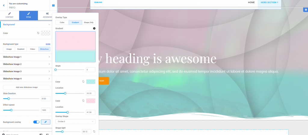
- Overlay as gradient (choose the preferred gradient and click on the cog icon next to “Gradient” to expand the full list of options for a gradient overlay; adjust the inclination angle of the gradient on the corresponding slider; select different colors from the color picker, to create your own gradient; set the location for each of the colors composing the gradient, and decide how the gradient will finally look; you can apply shapes to the gradient and set the shapes to lighter or darker, depending on the values you select on the Shape Light slider)
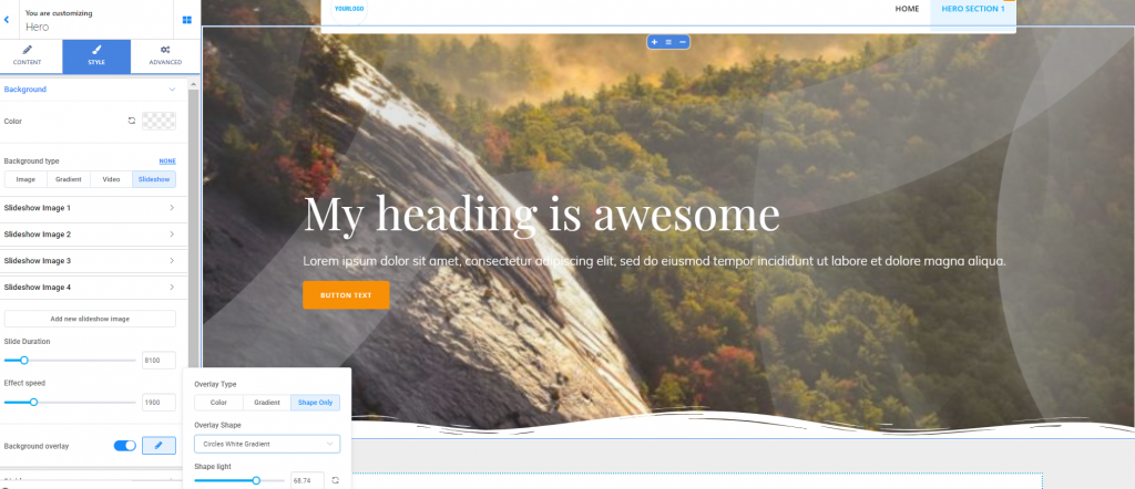
- Overlay as shape only (if you opt for this overlay type, there’s no color attached to the overlay; you can choose among 15+ shapes the one that fits best your HERO background; adjust the luminosity of the shapes to smaller values – they will be lighter, or larger values – they will be darker).
Below is an example of overlay that was customized only with shapes:
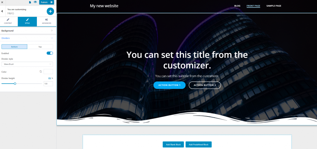
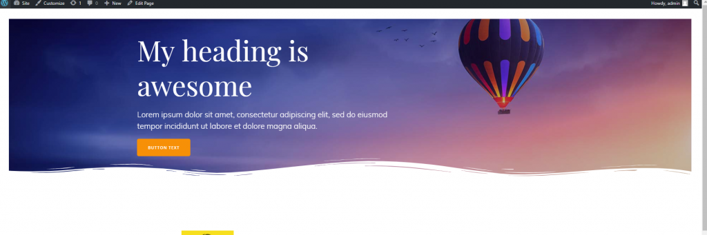
Dividers
Dividers are graphic elements that delimitate the Hero from the rest of the page. With Colibri, dividers can have different graphic forms, from which to choose the shape that best integrates the branding and design style for your website.
Set the shape of the Divider
Some examples of shapes for the Dividers:
- Triangle
- Triangle Asymmetrical
- Book
- Drops
- Zigzag
- Split
- Curve Asymmetrical
- Wave Brush, etc.
Set the color of the Divider
Choose the color that best suits the website color schemes, from the color picker. You can always revert to no color, by using the revert sign at the left of the color picker.
Set the Divider Height
From here, you define to what extent on a vertical axis the Divider can unfold. Select values on the slider and see which value works best for a stylish design.
Advanced Customizations
You can apply advanced customizations to the Hero elements both in normal state and on hover.
Spacing Options
Spacing options refer to adjustments you can make to the width and height of the surface onto which the HERO section is deployed, and the margins of the HERO.
- Padding allows you to set the width and height of the HERO. You can independently set values for top, bottom, right and left sides. The values are expressed in pixels, em, rem or in percentages (so you can estimate the correct padding in relation to other elements of the page).
- Margin refers to the distance of the HERO from the border of the screen. You can set values for top, bottom, right and left, in pixels/em/rem or in percentages.
Below is an example of Header with margins set to 30:
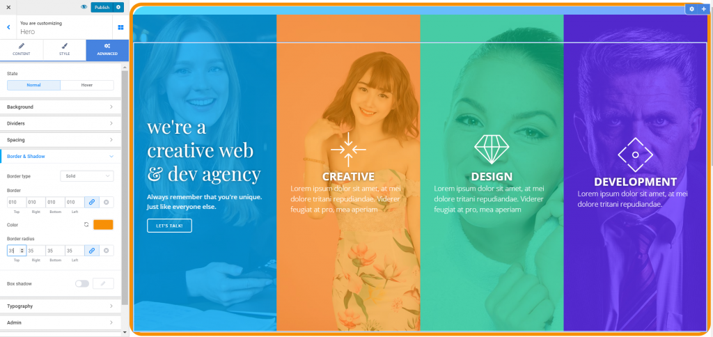
Apply Border and Shadow
Border Type: the border will be visible if you set it to other than none: solid, dashed, dotted, double, groove, ridge, inset, outset.
Border Thickness: also, for the border to be visible, the border thickness has to be set to values other than 0. Give specific values for top, right, bottom and left sides of the border.
Border Color: to give a stylish effect to the HERO by using border, you can add a color to the respective border. Click on the color picker and select a color to your liking. You can revert to no color any time.
Border Radius: this option refers to the roundness of the border corners. The higher the values you set for the border radius, the rounder the corners of the border will be.
Here’s an example of customized border:
Box Shadow: enable this option to apply a shadow for the box containing the Hero. Click on the pencil icon next to Box Shadow, to open the panel with customization options for the shadow of the box:
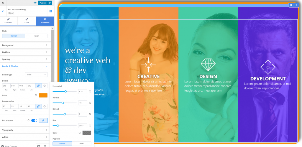
- Horizontal – set on the slider the horizontal distance onto which the shadow is deployed
- Vertical – set on the slider the vertical distance onto which the shadow is deployed
- Spread – decide on the extent to which the shadow is applied
- Blur – give the shadow a slightly or more pronounced blur effect
- Define the color for the shadow, so it matches the overall aspect of the HERO
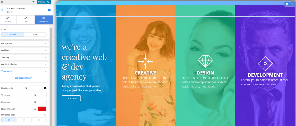
Adjust Typography
From here, you can make adjustments to the style of the typography used for the HERO:
- Heading color – use the color picker to define the color for the heading text
- Text color – use the color picker to define the color of normal text included in the HERO
- Link color – this is the color of the anchor text of the links included in the HERO
- Hover link color – this is the color of the anchor text of the links, when users hover over them with their mouse
- Horizontal align – defines the alignment of the text to the right, at the center or to the left
Below is a screenshot with colors for typography set to white, except for links as they appear on hover: