A drop-down menu is a list of items that appear when clicking on a button or text selection.
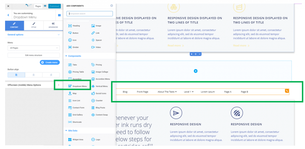
In the Customizer, open the list of components and find the Drop-down menu component.
Use drag-and-drop to add the drop-down menu to your page.
Example of drop-down menu added to a web page:
To customize the drop-down menu, click on the component you have included in the page and make sure the list of corresponding settings is open in Customizer:
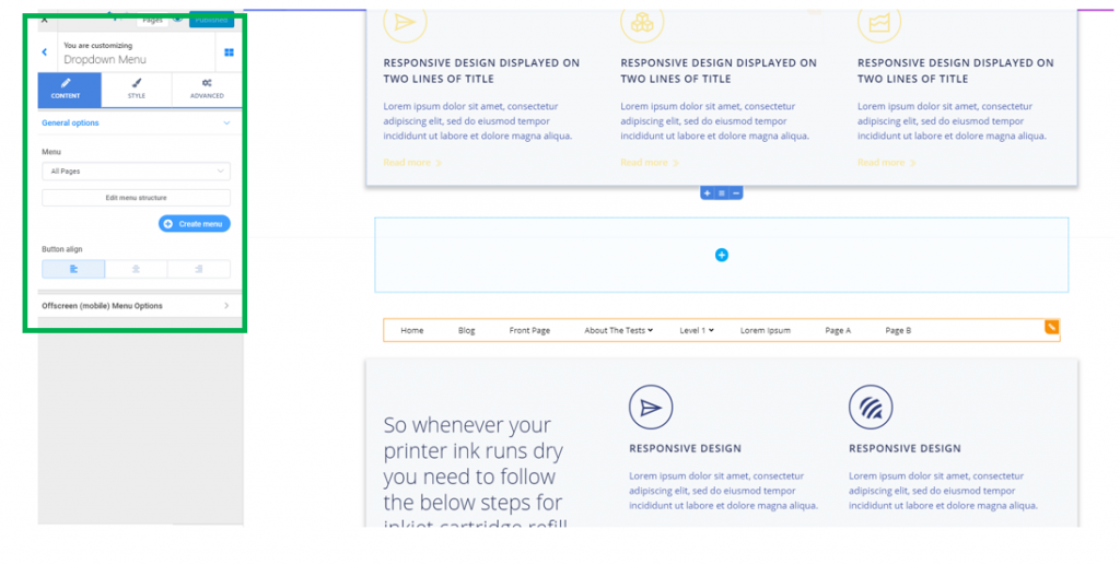
Content
From here, you’ll select what menu you want the drop-down menu component to include.
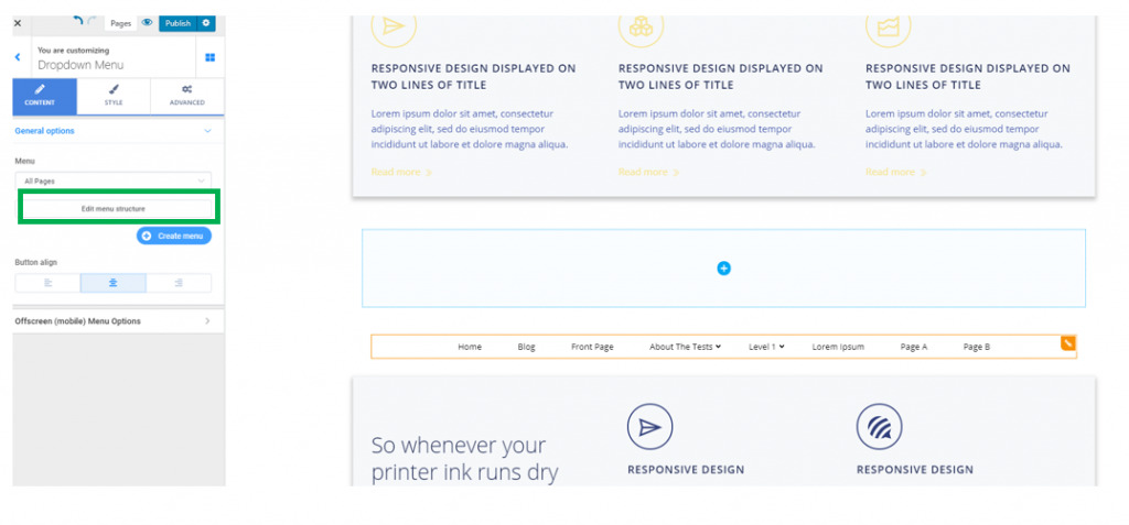
Select, from the drop-down list under Menu, the exact menu you want to display in this section.
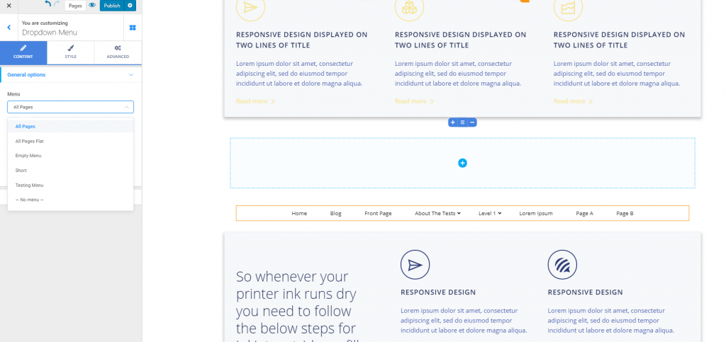
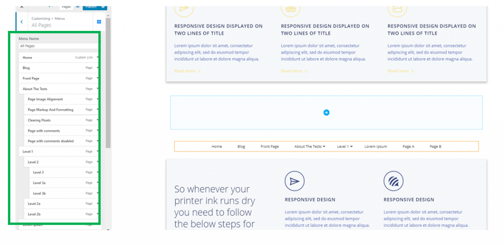
To change the order of the items in the drop-down menu, click on Edit menu structure. You’ll be taken to the Menus section in the Customizer, where you can use drag-and-drop to reorder the menu items, remove items from the menu or add new items to the menu.
If you want to add a different menu to this component, click on the blue button, Create menu.
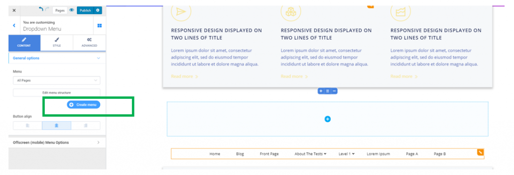
Give the new menu a name and you’ll be taken to the menus section in the Customizer, where you can start adding pages to the new menu.
Button align – from here, you define how the main menu items will be aligned (to the left, at the center or to the right).
Offscreen (mobile) Menu Options
The drop-down menu can be displayed as a hamburger menu on mobile devices (mobile & tablet).
From this settings section, you can adjust settings for the drop-down menu display on mobile devices:
Show offscreen menu: you can choose to show the offscreen menu on
- Mobile
- Mobile and tablet
- Mobile, tablet and desktop
To make it easy to visualize the customizations you make to the offscreen menu, click on Open offscreen panel at the end of the settings list:
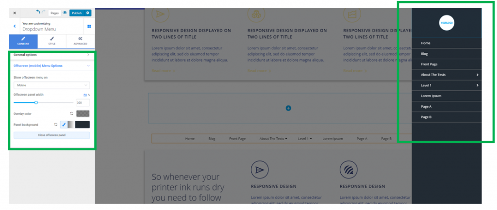
Offscreen panel width – this is the horizontal distance over which the offscreen menu is deployed, when it’s expanded. The higher the values you select on the slider, the wider the offscreen menu will be.
Overlay color – when the offscreen menu is expanded, an overlay color will be applied on top of the rest of the page, so the menu is brought to the front. From here, you can choose a color of your liking, for the overlay.
Panel background – this is the color/gradient of the background onto which the menu items are displayed, when the offscreen menu is expanded. Next to the brush icon, you can choose to apply either a simple color or a gradient to the offscreen menu.
Style
From here, you can configure settings for the style of the drop-down menu.
You can make different configurations, for the following states of the menu items:
- Menu buttons in normal state
- Menu buttons on hover (when users hover over the menu items with their mouse)
- Active menu buttons (when users have clicked over an item in the menu and opened the content associated to it)
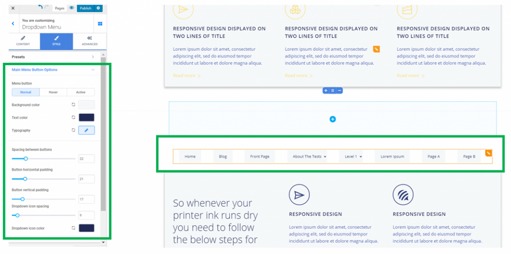
Main Menu Button Options
These settings refer to items of the first-level category in the dropdown menu:
Background color – this is the color of the background onto which the dropdown menu items are displayed.
Text color – this is the color of the text for the items of the dropdown menu.
Typography – click on the pencil icon next to Typography to open the panel with further settings for the typography of the menu items text.
- Choose the font of the items text
- Choose the weight of the items text
- Define the dimensions of the font
- Turn the text to uppercase, lowercase, capitalize it, etc.
Spacing between buttons – this is the distance you set between the items of first-level category, in the dropdown menu.
Button horizontal padding – this is the horizontal distance one item occupies in the dropdown menu. The higher the values, the wider the distance over which the menu items deploy.
Button vertical padding – this is the vertical distance one item occupies in the dropdown menu. The higher the values, the more distance will be between the menu items and the top/bottom of the component section.
Dropdown icon spacing – the dropdown icons are the symbols that indicate an item can be expanded to show second-level items in the menu. Adjusting spacing for the dropdown icons means you define the distance between the menu items and their corresponding icons.
Dropdown icon color – the dropdown icons are the symbols that indicate an item can be expanded to show second-level items in the menu. From here, you can select a color you want to apply to the dropdown icons.
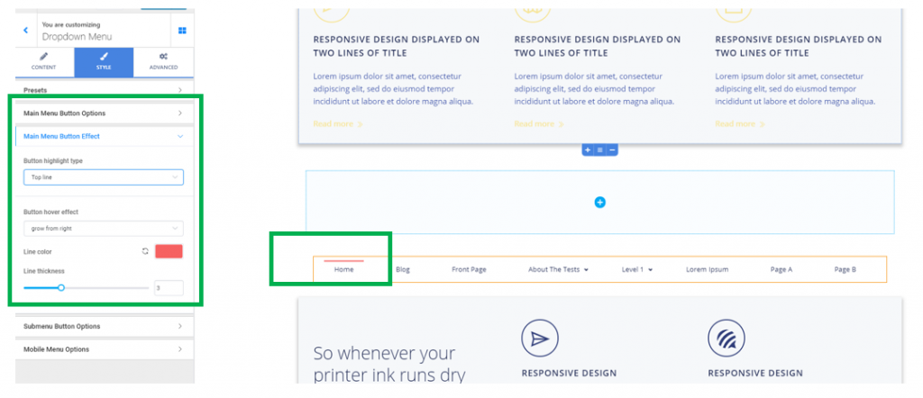
Main Menu Button Effect
From here, you can add effects for highlighting buttons in the dropdown menu.
You can select:
The way the items in the menu are highlighted:
- Top line
- Bottom line
- Double line
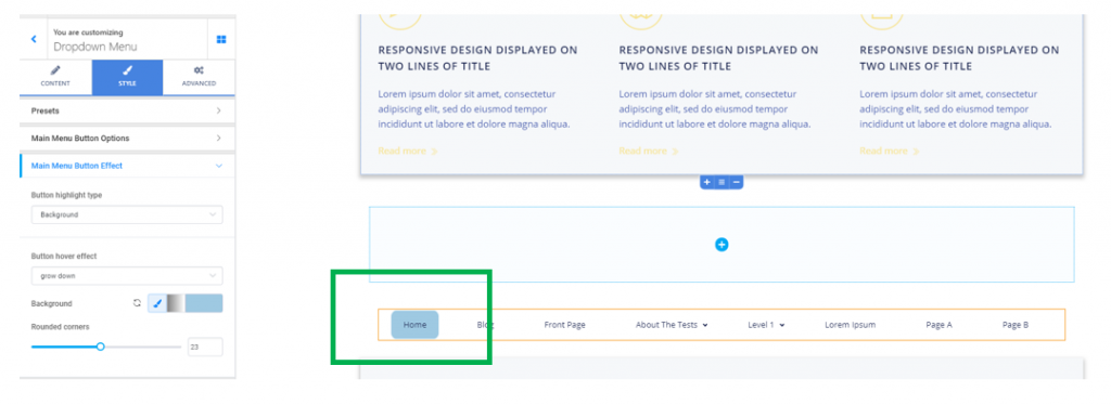
- Background
In case you choose to highlight the active item by using a line, you can select a certain color for the line, and adjust the line thickness by selecting higher/smaller values on the corresponding slider.
In case you choose to highlight the active item by using a background, you can select a certain color or gradient, by using the corresponding icons next to the brush icon:
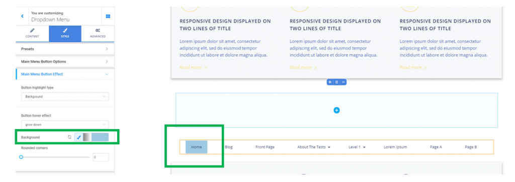
Also, by using a background highlight type, you can adjust how round the corners for the background of the active item should be:
Submenu Button Options
This settings subsection refers to options for the expanded list of second-level items, when users hover over a main-level item that has corresponding submenu items.
Background color – this is the color over which the items of secondary level in the dropdown menu are displayed.
Text color – this is the color the text of the secondary level items in the dropdown menu has. Choose a color you prefer, from the color picker.
Button horizontal padding – this is the surface the secondary-level items occupy horizontally in the dropdown menu. The higher the values, the larger the horizontal distance for the submenu items.
Button vertical padding – this is the surface the secondary-level items occupy vertically in the dropdown menu. The higher the values, the higher the vertical distance the submenu items occupy in the dropdown menu.
Divider – the divider is a graphic element that separates submenu items from one another. Choose the form the divider will take, and you’ll have the submenu items separated by a solid line, a double/dashed line, etc.
Divider color – this is the color the graphic element separating submenu items will have. Select, from the color picker, a color of your choice for the divider.
Divider thickness – this option controls how thick the graphic elements separating submenu items will be. The higher the values you select on the slider, the thicker the divider will be.
Box shadow – if you enable this option, you’ll apply a stylish shadow effect to the box containing the submenu items. Click on the pencil icon next to Box Shadow, to open the panel with customization options for the shadow effect: adjust the horizontal/vertical distance up to which the shadow is deployed, its spread, its color and choose to apply a slight blur effect to the shadow.
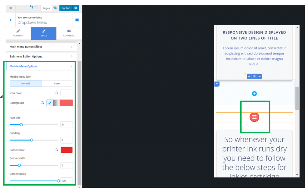
Mobile Menu Options
Icon color – this is the color of the icon representative for the offscreen menu, as it appears on mobile devices.
Background – this is the color of the background onto which the icon representative for the offscreen menu is placed.
Icon size – define the dimensions of the icon representative for the offscreen menu, as it appears on mobile devices.
Padding – this is the surface that the icon corresponding to the offscreen menu occupies in the page, as it appears on mobile devices.
Border width – if you want to better delimitate the icon corresponding to the offscreen menu, give values greater than 0 to the border width.
Border color – for a more stylish effect, you can select a color for the icon border that matches the color of the icon itself and the icon background.
Border radius – decide how round the corners of the icon border will be. In the case below, a value of 100 equals fully round corners for the icon border.