The Masonry Gallery includes a gallery of images in the page you are customizing.
Open the list of Components and find the Masonry Gallery Component.
Use drag-and-drop to add a Masonry Gallery Component to your web page.
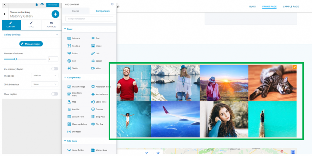
Example of Masonry Gallery added to a page:
Click inside the component in the page and make sure you have the corresponding settings category open in Customizer:
Content
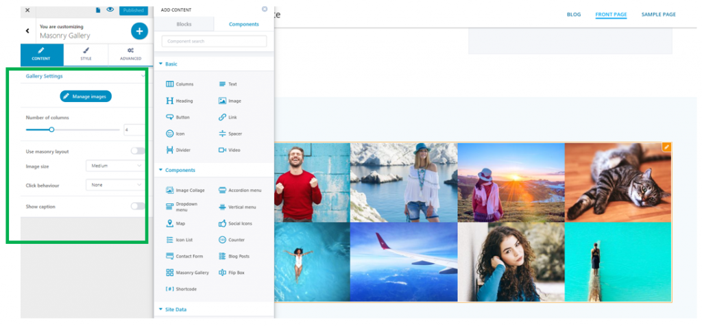
From here, you adjust the gallery settings, as follows:
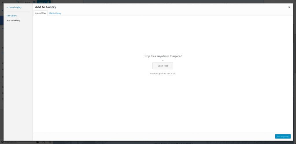
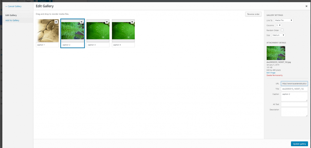
Manage images – if you click on Manage Images, you open a popup where you can add new images to the gallery:
Number of columns – select the number of columns for the images that will be included on a row.
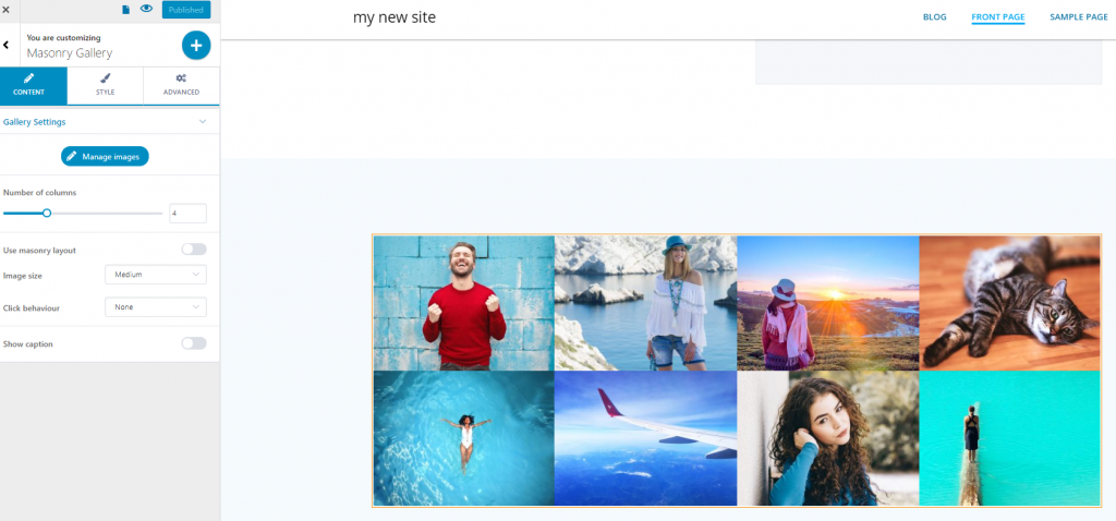
In the example below, the number of columns is set to 4:
Use masonry layout – Masonry is a grid layout based on columns. Unlike other grid layouts, it doesn’t have fixed height rows. Masonry layout optimizes the use of space inside the web page by reducing any unnecessary gaps. If you want to use this feature, enable the option to Use Masonry layout:
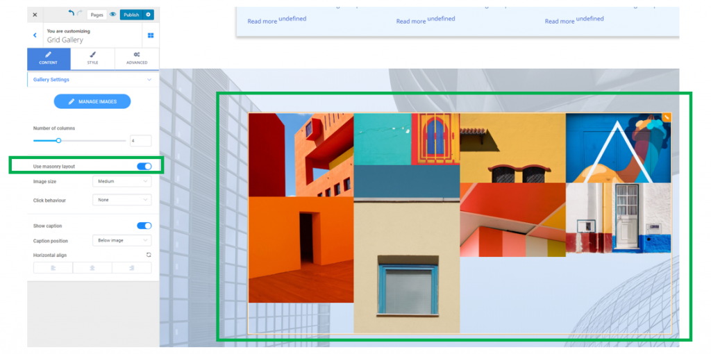
Image size – set the dimensions of the images that form the grid gallery. The size of the images can be set to thumbnail, medium, large, full size, full HD.
Click behavior – this option controls how the images are displayed when users click on them.
They can be set to:
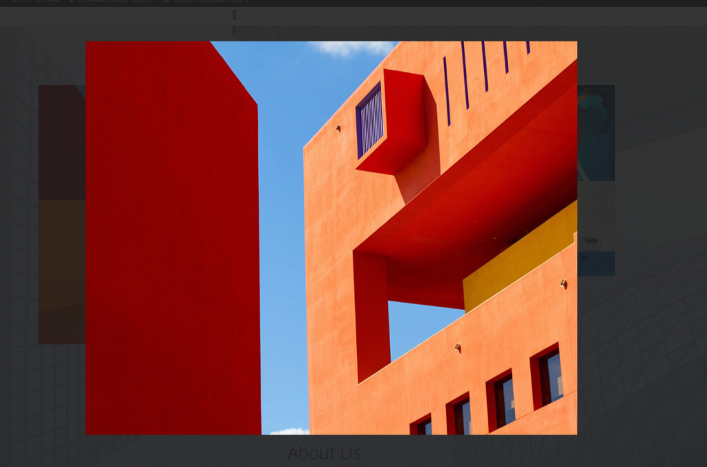
- open in a lightbox
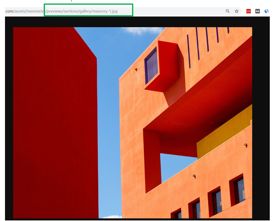
- link to media file
- Link to attachment page
Show caption – the caption is a short description of each image in the grid gallery. Enable the option to Show caption to show these descriptive texts.
Note: the caption is added to an image in the grid gallery when you upload the images, after having clicked on Manage Images:
Caption position – the descriptive text (caption) can be set to display:
- Below the image
- Over the image
- Over the image on hover (when users hover with their mouse over the image)
Horizontal align – define the alignment of the text representing the caption (to the left, at the center or to the right).
Style
Define, from the Style tab, the options for the style of the grid gallery:
Image
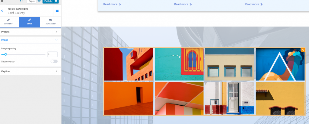
Image spacing – the values you select on the slider define the distance between the images in the grid gallery:
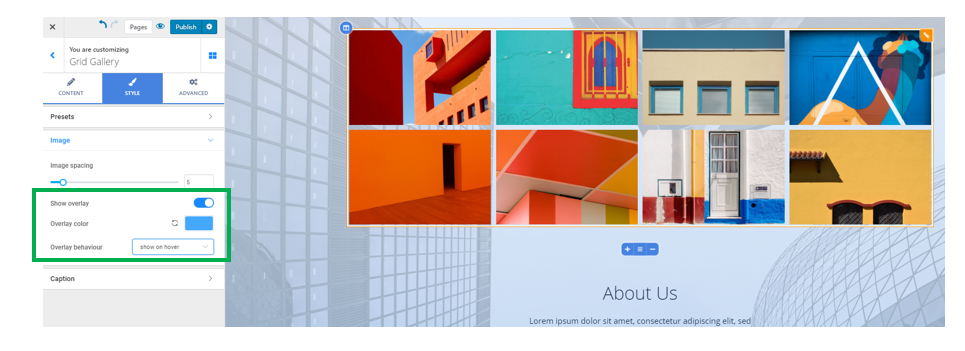
Show overlay – enable this option to show an overlay over the grid gallery (the overlay is a semi-transparent color that is applied on top of the images, to obtain a nice visual effect). You can:
- Choose a certain color for the overlay
- Choose to show the overlay for an image, when users hover over that image with their mouse
- Choose to hide the overlay for an image, when users hover over that image with their mouse.
Caption
Background color – this is the color onto which the captions of the images are displayed. Select a color from the color picker.
Text color – this is the color of the text for the image captions.
Typography – click on the pencil icon next to Typography, to open the panel with further customizations for the text of the image captions:
- Choose a font family
- Choose the weight of the font
- Define the dimensions for the font
- Turn the text to uppercase, lowercase, capitalize it, etc.
- Set the height of the line of text corresponding to the image captions
- Set the spacing between the letters of the text corresponding to the image captions