The Home Button Component is extremely useful for visitors who are used to a certain navigation type. In some cases, they will want to return to the homepage, that’s why it’s necessary to have a link to homepage in every website page.
To add a Home Button, make sure you have the components list open in Customizer. In the subcategory named Site Data Components, find the Home Button Component. Use drag-and-drop to place the component into your page.
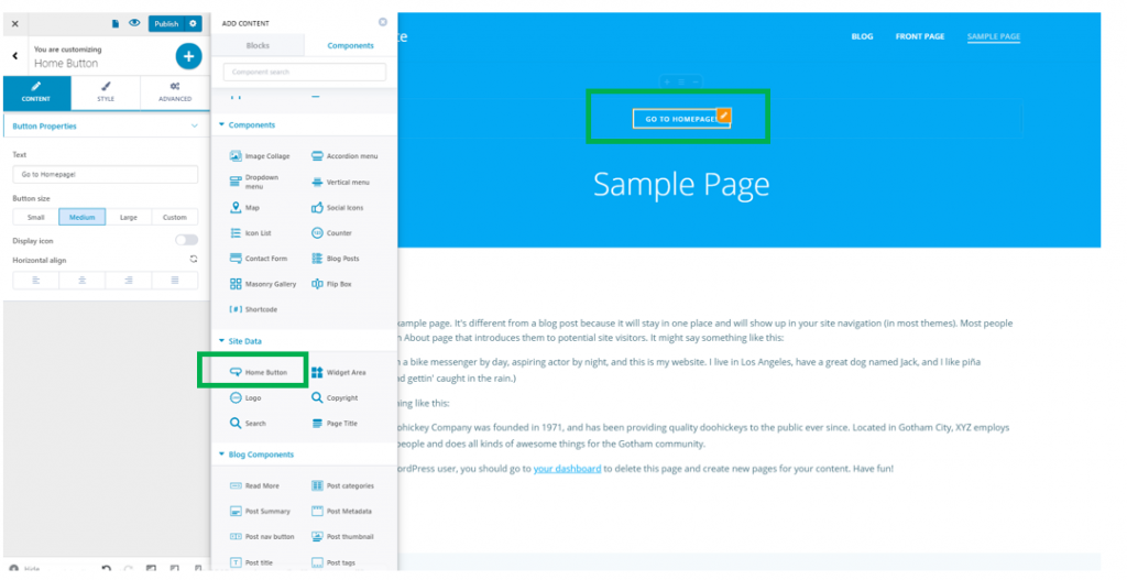
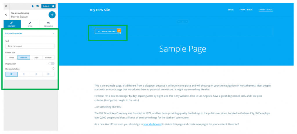
To customize the Home Button Component, make sure you have the corresponding settings category open in Customizer.
Content
Text – this is the text of the link that leads users to the homepage
Button size – define the dimensions of the button. It can be small, medium, large, or have custom dimensions.
Display icon – the text of the link can be accompanied by an icon. Enable this option to show an icon next to the anchor text of the link to the homepage.
Horizontal alignment – the button can be place to the left, at the center or to the right of the page.
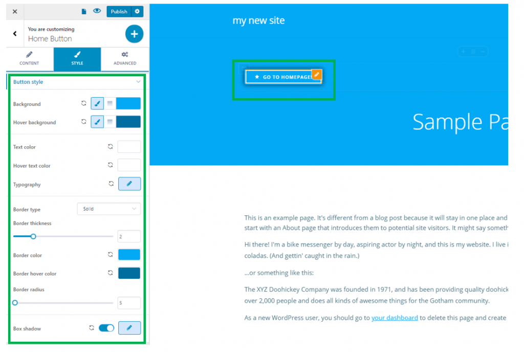
Style
Here, you can make additional customizations to the home button.
Button Style
Background – this is the color of the button background
Hover Background – this is the color of the button background, when users hover their mouse over the respective button
Text color – this is the color of the text associated to the link leading users to the homepage
Hover text color – this is the color of the text associated to the link leading users to the homepage, as it appears when users hover their mouse over the button
Typography – click on the pencil icon next to Typography, to open the panel with customization options: choose a font family, choose the weight and dimensions of the font, give a style to the font, turn the text to uppercase, lowercase, capitalize it, etc.
Border Type – if the border type has other values than none, it will be visible for the home button. It can be solid, dashed, dotted, ridge, groove, etc.
Border Thickness – for the border to be visible, in the page, it also needs values greater than 0 for its thickness
Border color – this is the color of the button border
Border hover color – in case you change the appearance of the button on hover, you can change from here the color of the button border when users hover their mouse over the respective button.
Border radius – this defines how round the corners of the border will be. The greater the values you select on the slider, the rounder the corners of the border will be.
Box shadow – enable this option if you want to give a shadow to the home button. Click on the pencil icon next to it to open the panel with further customization options: horizontal/vertical distance onto which the shadow is deployed, spread – the surface the shadow occupies around the button, blur – you can give a slight or more accentuated blur effect to the shadow, give a specific color for this shadow.
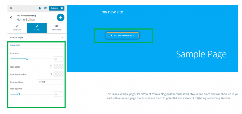
Icon Style
In case you chose an icon to be visible on the home button, you can make additional customizations from here:
Icon size – you can set values on the slider for the icon dimensions.
Icon color – give a specific color to the icon, by selecting it from the color picker
Icon hover color – give a specific color to the icon as it appears when users hover their mouse over it, by selecting it from the color picker
Icon position – you can choose to place the icon before or after the text of the button
Icon Spacing – decide how much space you want to place between the icon and the text of the home button. Choose specific values on the slider.