You can make changes either to the style and appearance of these pages, or to the content of the respective pages.
To edit the content of the blog pages, you need to go to the WordPress admin dashboard, choose the blog/single post page you want to change and click “Edit” (please note that you have to click “Edit”, and not “Edit in Customizer”).
To edit the style and appearance of the blog pages, you can make the changes in the Customizer.
Note: If you want to make changes to content, within the Customizer, the changes you’ll make too one post will apply to all posts!
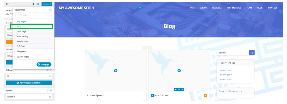
In the upper left corner of the Customizer menu, click on the “page” symbol and select the page you want to change:
Or
We’ll show you how to make changes to the style of the blog/single posts pages, from the Customizer.
How to edit the blog main page
Check in the list that opens when you click on “Add or edit other pages” that you’re editing the Blog page. (the page you’re currently editing appears marked in grey):
Page title
To change the style of the page title, click on the respective title, and open the panel with customization options for it.
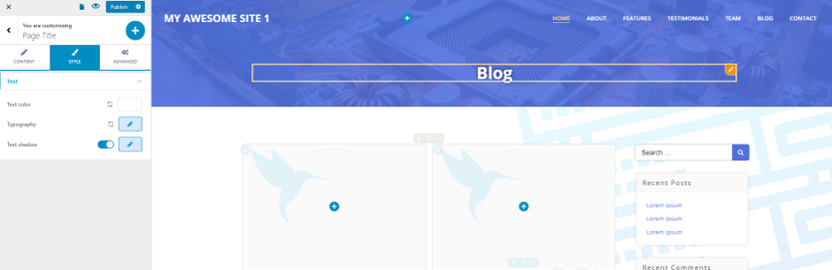
- Select the heading type (H1, H2, H3, etc.). The heading type should be guided by the structure you give to the page content. You should pay attention to have on single H1 in the page. You can have as many H2, H3, etc. headings as you like.
- Choose the alignment of the heading (to the left, at the center or to the right)
- Choose the appropriate color for the heading text (you should be careful to choose a contrasting color, as related to the background onto which it is displayed). Click on the color picker and select the color you want.
- Select the adequate typography for the title. Click on the pencil icon next to Typography and open the panel with settings for the typography (select font family, font weight, text dimensions, line height and letter spacing)
- You can enable the option to apply a text shadow (and customize color, add a blurring effect, etc.).
Post Titles
To change the style of the posts titles, click on one of the titles, and open the panel with customization options for it:
- Select the heading type (H2, H3, etc.). The heading type should be guided by the structure you give to the page content. You should pay attention to have on single H1 in the page. You can have as many H2, H3, etc. headings as you like.
- Choose the alignment of the posts titles (to the left, at the center or to the right)
- Choose the appropriate color for the posts titles text (you should be careful to choose a contrasting color, as related to the background onto which they are displayed). Click on the color picker and select the color you want.
- Select the adequate typography for the posts titles. Click on the pencil icon next to Typography and open the panel with settings for the typography (select font family, font weight, text dimensions, line height and letter spacing)
- You can enable the option to apply a text shadow (and customize color, add a blurring effect, etc.).
Please keep in mind that the modifications you make to one post title applies to all the other post titles.
Post thumbnails
Click on one post thumbnail and open the panel with customization options for posts thumbnails:
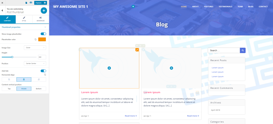
Edit the thumbnail properties by configuring the following settings:
- First, decide to enable/disable the option to show an image placeholder
- Choose the placeholder color (click on the color picker and select the color you want)
- Set up the image dimensions (cover, contain, crop or natural size)
- Select the height of the image, by choosing a value on the slider
- Decide how to position the image (top left, top center, top right, center left, center center, center right, bottom left, bottom center, bottom right)
- You can enable/disable the option to place a link onto the post thumbnail
- Choose the horizontal alignment of the posts thumbnails
- Select the content vertical position (to be aligned to the top, in the middle or to the bottom)
Post excerpts
Click on one of the post excerpts and open the panel with customization options for these post summaries:
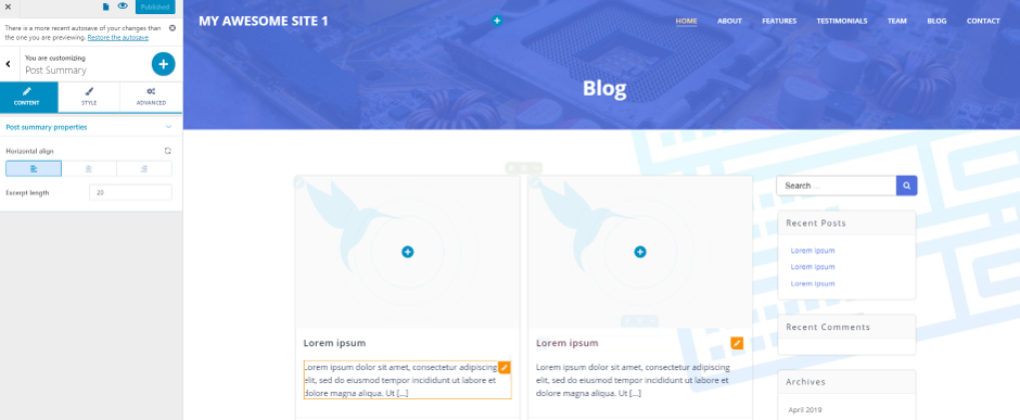
Edit the post summary style using these settings:
- Choose the horizontal alignment of the text (to the left, at the center or to the right)
- Select the number of words that the summary contains and define the excerpt length
- Choose the color of the text contained in the post summary. Click on the color picker and select the color you want to give to this text
- Typography – click on the pencil icon and open the panel with customization options for the text typography (choose the font family, the font weight, the dimensions of the text, line height and letter spacing for the post summary text)
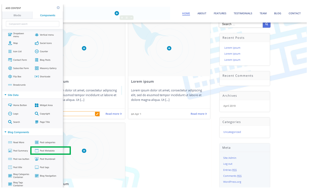
Post Metadata
If the post metadata is not displayed, you can add it with drag-and-drop from the list of Components:
Click on the default post metadata and open the panel with customization options for post metadata:
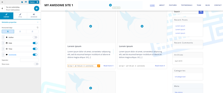
Start editing the post metadata using the following settings:
- Choose the horizontal alignment of the data (to the left, at the center or to the right)
- Enable/disable showing data such as: Author name, Date of publishing, Time of publishing, Number of comments
- If you want to clearly delimitate Metadata, you can fill in the blank space corresponding to Separator with a symbol of your choice. If you don’t want to display separators, leave the field blank
- Enable/disable showing icons representative of the Metadata you want to display for the articles.
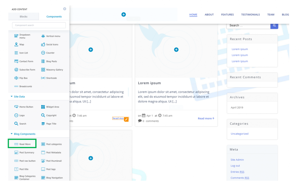
Read more links
If the “Read more” links aren’t visible in the main blog page, you can add them with drag-and-drop from the list of Components:
After you have added the component, click on it and open the panel with customization options for the “Read more” links:
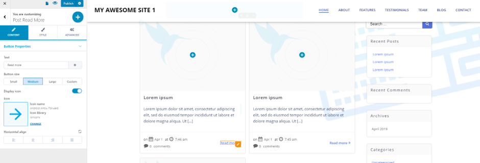
Edit the “Read more” buttons using the following settings:
- Fill in the black space next to Text with the specific text you want to give to this element. By default, the text is “Read more”.
- Select the dimensions of the element (small, medium, large or custom dimensions)
- Enable/disable showing an icon next to the link text. By default, the icon is a horizontal arrow. You can click on Change and select a different icon for this element
- Choose the horizontal alignment of the “Read more” link (to the left, at the center or to the right)
- Choose the color for the button background. Click on the color picker and select the color you want.
- Choose the color of the button background, as it appears when users hover with their mouse over the button
- Select the color of the text for the button
- Select the color of the text for the button, as it appears when users hover with their mouse over the button
- Typography – click on the pencil icon next to Typography, and open the panel with customization options for the button text (font family, font weight, font size, etc.)
- Border Type – you can select to clearly delimitate the button and apply a visible border to the element (solid, dashed, dotted, double line, etc.). In case you don’t want a visible border for the button, select None.
- Border radius – this setting is valid in case you have chosen a visible border for the button. It refers to how round the corners of the button border will be. Choose a value on the slider and see the results.
- Enable/disable box shadow – you can choose to apply a shadow effect to the box. If you enable this option, click on the pencil icon next to Box Shadow and open the panel with customization options for the shadow effect (horizontal/vertical distance to which the shadow extends, spread, blur effect, color of the shadow, etc.)
- Choose the dimensions of the icon corresponding to the “Read more” button (select a value on the slider and see the results)
- Select the color of the icon, by choosing a color from the color picker
- Choose the color of the icon, as it appears when users hover with their mouse over the respective icon
- Choose where you want the icon to display (before the text or after the text)
- Icon spacing – this setting refers to the distance between the button text and the icon. Choose a value on the slider and see the results.
How to edit single posts pages
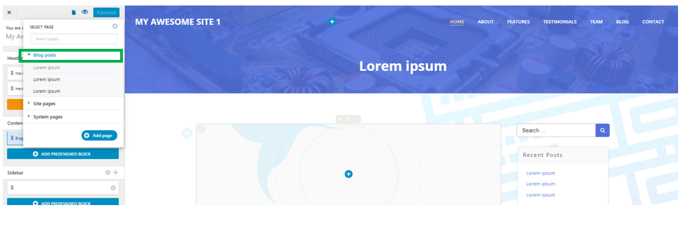
To edit single posts pages in Customizer, you have to click on the “Add or edit other pages” button in the top left corner of the Customizer menu. Upon clicking on it, the list of your website pages will expand:
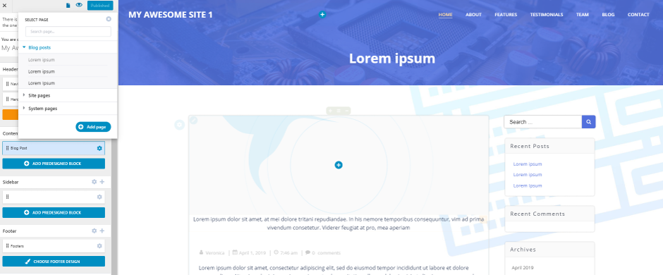
In the list of posts, click on the exact post you want to edit the style for, and go to the respective post page.
Items you can edit the style for, in a blog post page:
- Post title
- Post thumbnail
- Text
For the above elements, you need to click on them and open the panels with customization options for the respective items. The settings for these elements are the same as in the main blog page.
Post Comments
Click on the post comments section and open the panel with customization options for this item.
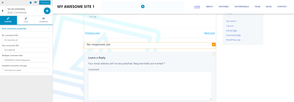
You can adjust the following settings:
- No comments title – fill in the blank space with the message that will be displayed in case there are no comments for the post.
- One comment title – fill in the blank space with the message that will be displayed in case there’s only one comment for the post.
- Multiple comments title – fill in the blank space with the message that will be displayed in case there are multiple comments for the post.
- Disable comments message – fill in the blank with the message that appears when comments for the post are disabled.
- Comments number color – when there are multiple comments, their number is displayed. From here, you select the color of that number of comments.
- Comments number typography – you can select the typography of the number indicating how many comments there are.
- Odd comment background color – this is the color of the comments background. For easy reading, backgrounds for odd and even comments can be set distinctly, and the colors alternate in the comments list.
- Even comment background color – – this is the color of the comments background. For easy reading, backgrounds for odd and even comments can be set distinctly, and the colors alternate in the comments list.
- Comment text color – this is the color of the text contained in the comments.
- Comment text typography – select the typography for the text contained in the comments (font family, font size, font weight, etc.)
- Author name color – this is the color of the text for the author name
- Author name typography – select the typography for the text of the author name (font family, font size, font weight, etc.)
- “Closed comments” text color – this is the color of the text indicating that comments are closed.
- “Closed comments” text typography – select the typography of the text signalling that comments are closed.
- “Closed comments” horizontal alignment – this is the alignment of the text indicating that comments are closed.
Post Comment Form
The post comment form is the form users have to fill in to publish a comment. Click on the form and open the panel with customization options in Customizer:
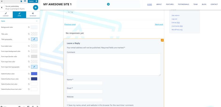
You can adjust the following settings:
- Background color – this is the color of the form background
- Title color – this is the color of the form title
- Title typography – adjust the typography of the form title (font family, font weight, font size, etc.)
- Form label color – this is the color of the fields labels within the form
- Form input background color – this is the color of the background for the form input space
- Form input border color – this is the color of the border delimitating the form input space
- Form input text color – this is the color of the text users fill in the blanks
- Form input text typography – select the typography of the text users fill in the blanks
- Submit button color – this is the color of the button users press to submit their comments
- Submit button hover color – this is the color of the button users press to submit their comments, as it appears when visitors hover over it with their mouse
- Submit button text color – this is the color of the text for the button users press to submit their comments
- Submit button hover text color – this is the color of the text for the button users press to submit their comments, when visitors hover over it with their mouse.
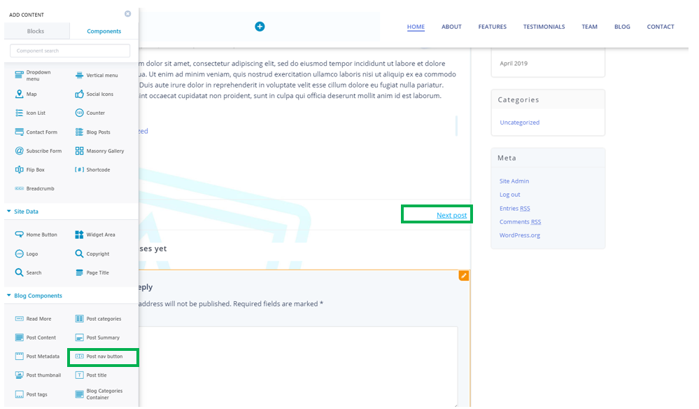
Post nav button
The post nav button allows users to go to the previous/next post. If the element is not displayed in the post page, you can add it with drag-and-drop from the list of components:
Click on the post nav button in the post page to open the panel with customization options for the element:
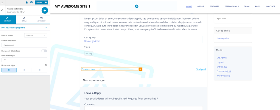
You can adjust the following settings:
- Button action – choose the action that takes place when users click on the button: either they go back to the previous post, or they go forward to the next post
- Button label back/next – this is the text indicating users go back to the previous post, or they
- Horizontal align – this is the alignment of the button, horizontally (to the left, at the center or to the right)
- Button text typography – select the typography of the text for the buttons (font family, font weight, font size)
- Button background color – this is the color of the background for the button
- Button text color – this is the color of the text corresponding to the button
- Button border color – this is the color of the border for the button (the setting is valid in case you choose a visible border for the button)
- Button border type – you can clearly delimitate the button, by selecting a visible border for the button (solid, dashed, dotted, etc.)
- Border radius – this setting is valid in case you’ve chosen to show a visible border for the button. The border radius refers to the roundness of the border corners.
- Box shadow – you can choose to apply a shadow effect to the box. Enable/disable this option, as you want. In case the option is enabled, click on the pencil icon to open the panel with customization options for the box shadow (horizontal/vertical distance to which it is deployed, spread, color of the shadow, etc.)