The Icons List Component includes a list of items into a section of a web page, together with the icons you associate to those items.
To add an Icons List Component to your web page, open the list of components and find the Icons List Component. Use drag-and-drop to add the Icons List Component to the page you are customizing.
Example of icon list included into a page:
To customize an icons list, click on the component you have included into the page and make sure you have the corresponding settings category open in Customizer.
Content
From here, you can make changes to the icon list properties:
Icon and Text Vertical Align
This option allows you to set up the alignment of the items text, as related to the icons attached to those items.
The text can be aligned to the top, in the middle or at the bottom of the icons.
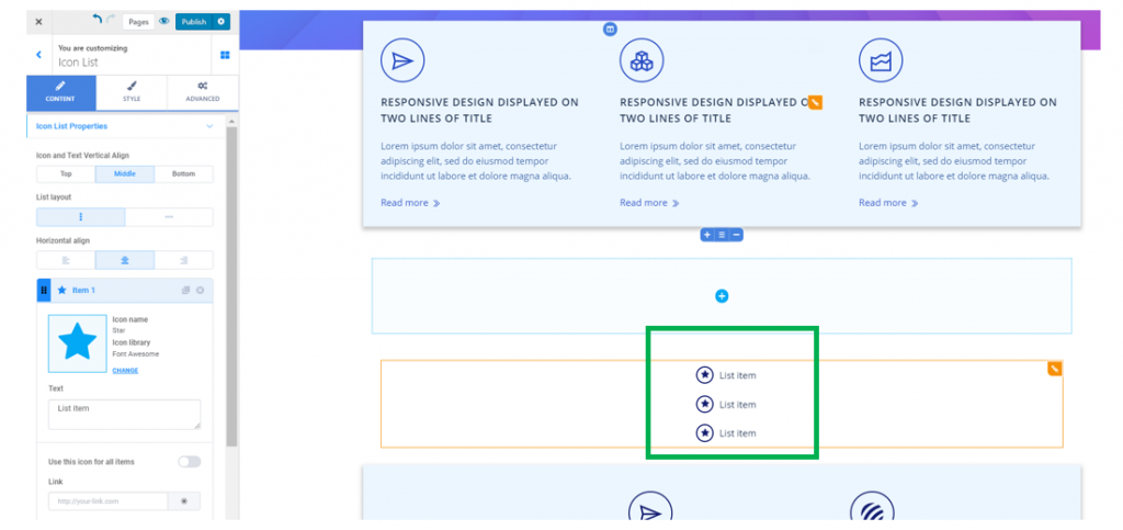
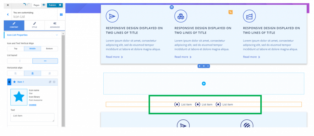
List Layout
The icons list items can be arranged on a vertical axis, like in the screenshot above, or on a horizontal axis, like in this example:
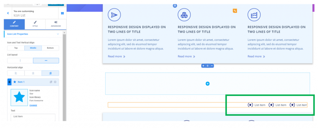
Horizontal Align
This option refers to the alignment of the list in the page section: to the left, at the center or to the right.
Alignment of the icons list to the right:
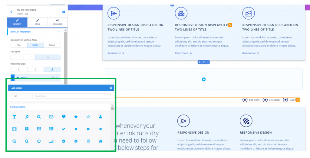
Change the icon corresponding to an item
To change the default icon associated to an item, click on Change and open the panel with available icons in the libraries that Colibri provides you:
Customize the text of an item
Fill in the blank space with the text you want to give to that list item:
Use the same icon for all items
If you enable this option, the same icon will be associated to all items in the list.
Attach a link to an item
Fill in the blank space with the URL for the destination page/page section where you want users to land on, when they click on that item in the list.
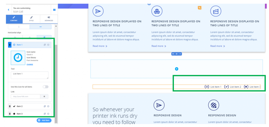
Add items
For adding new items to the list, click on Add Item at the end of the list in the Customizer.
Reorder items
To change the order of the items in the list, use drag-and-drop and rearrange the icons list items.
Remove items
To remove an item from the list, use the x button next to that item in the list and delete it.
Style
You can make changes to the style of:
The list
Item Spacing – decide on the optimal spacing between the items in the list. Higher values mean a greater distance between the items in the list.
Divider – if you enable the option to show a divider, a graphic element will separate the icons in the list. Choose the Divider type (solid line, dashed line, dotted line, etc.), give a color to the divider (select it from the color picker), adjust the thickness of the line representing the divider and set up the height of the dividers:
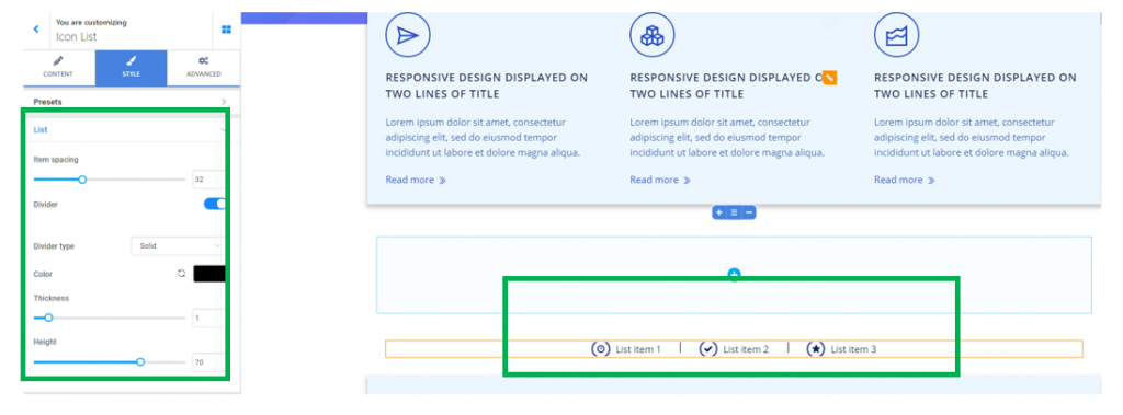
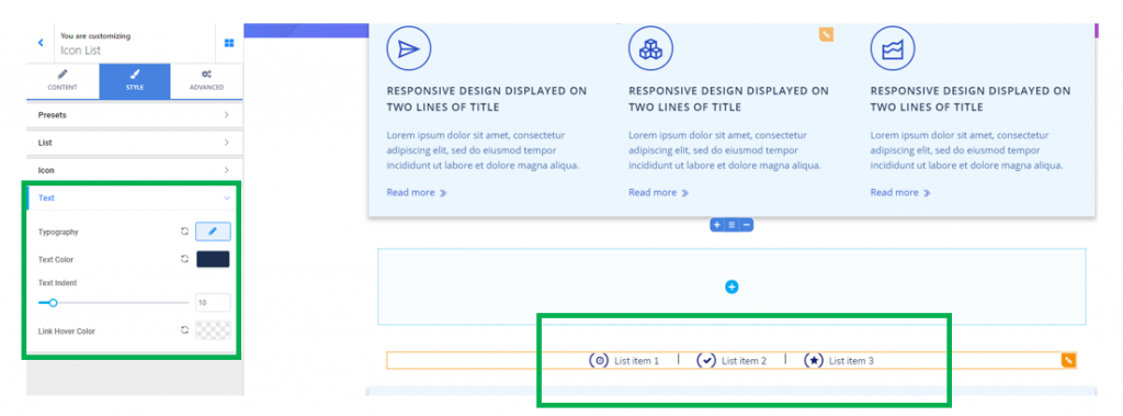
The Icons
Icon color – this is the color of the icons that are associated to the list items
Icon hover color – this is the color of the icons that are associated to the list of items, as they appear when users hover their mouse over the respective icons
Size of the icons – define the dimensions the icons will have. The higher the values, the larger the icons will be.
Icon indent – this value defines how much the icons are indented into the surface that the list items occupy into the section.
The text
These settings refer to the text of the items in the icons list.
Typography – click on the pencil icon next to Typography to open the panel with typography options for the list items text:
- Choose the font for the text
- Select the weight of the text
- Define the size of the font for the items text
- Turn the text to uppercase, lowercase, capitalize it, etc.
- Define the height of the line of text corresponding to the icons list
- Set the spacing between the letters of the text corresponding to the icons list
Text color – choose a color that the text of the icons list will have, by selecting it from the color picker
Text Indent – this value defines how much the text is indented into the surface that the list items occupy into the section.
Link Hover Color – this is the color the anchor text of the links placed on the list items will have, when users hover their mouse over that text.