The Post Navigation Button provides links to previous/next post in the list of blog posts. It can be inserted either in blog pages or in a static website page, where post summaries are included.
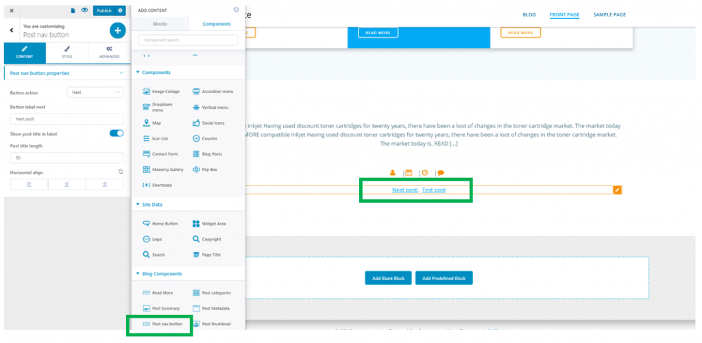
To add this component to your page, make sure you have the Components list open in Customizer. In the subcategory named Blog Components, find Post nav button Component. Use drag-and-drop to bring the component into your page.
To start customizing the elements of this component, please make sure you have the corresponding settings open in Customizer.
Content
Button action – it refers to the action users are supposed to make: they go to next article or go to previous article. In our case, the button action is NEXT.
To add both button action (previous post and next post), you have to include the component once again in the page, and change button action from NEXT to PREVIOUS.
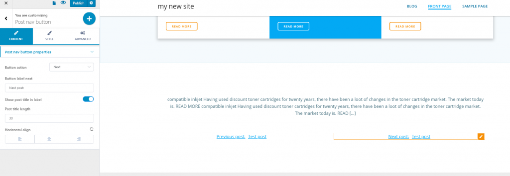
Button label next – this refers to the text placed on the button, or the button label for the link to next post. Here, the button label next is: “Next post:”
Show post title in label – when you enable this option, the title of the next/previous post will display. If the option is disabled, only the button label will be visible, without any title of the next/previous post.
Post title length – enter a value to establish how many characters the post title might have in the link that leads users to the next/previous post.
Horizontal align – this is the alignment you give to the component, which can be placed: to the left, at the center or to the right.
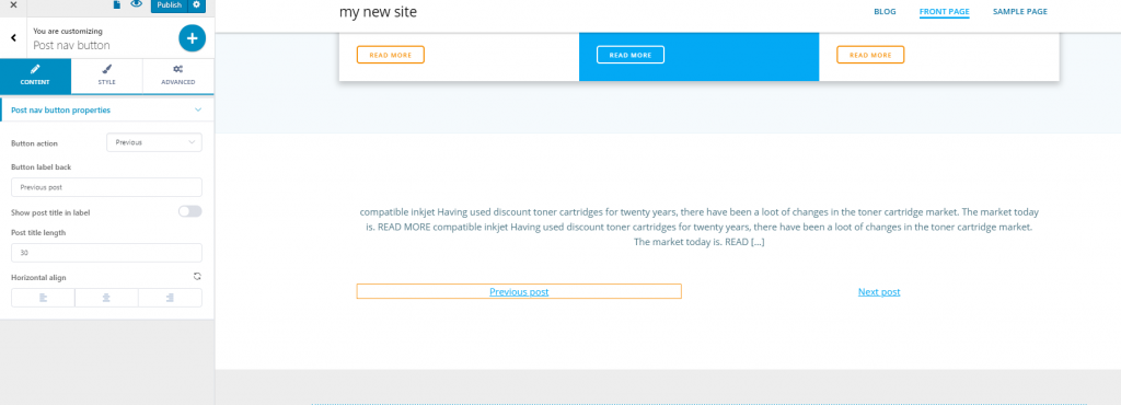
Here’s an example where the post title doesn’t appear after the post navigation button:
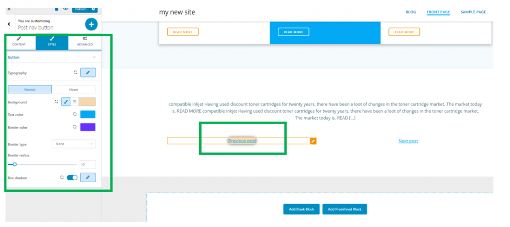
Style
From the Style tab, you can make additional customization related to the appearance of the post nav button in the page:
Typography – click on the pencil icon next to Typography, to open the panel with customization options for the text:
- Choose a font family for the text
- Choose the weight of the font
- Define the dimensions of the font
- You can turn the text into uppercase, lowercase, capitalize it, etc.
- Choose a style for the font
- Establish the height onto which the line of text is deployed
- Letter spacing – define the distance between the letters of the text
Customizations are available both for the button in normal state and for the button on hover. You can make different customizations for each of them.
Background – this is the background color of the space onto which the text of the button unfolds
Text color – this is the color of the text for the navigation button. It’s recommended that you let it be blue, as is the case of links and the color they’re best recognizable for
Border color – for the border to be visible, you have to select a border type other than none, and give it a thickness with values greater than 0. In this case, you can apply the color you want to the border of the post nav button.
Border radius – this refers to how round the corners of the border will be. The greater the values, the rounder the corners of the border will be.
Box shadow – if you enable this option, you will apply a shadow effect to the border of the button. Click on the pencil icon next to Box Shadow and open the panel with customization options:
- Horizontal length to which the shadow is deployed
- Vertical length to which the shadow is deployed
- Spread – the amount of space onto which the shadow is visible
- Blur – you can apply a slighter or more accentuated blur effect to the box shadow
- Color – set the color of the box shadow