To add predefined sections in the page, click on the + sign next to Content sections and expand the list of section categories you can browse in search for the best fit.
Add the sections you want into the body of the page.
Here’s a list of the most common content sections you might want to include into the page:
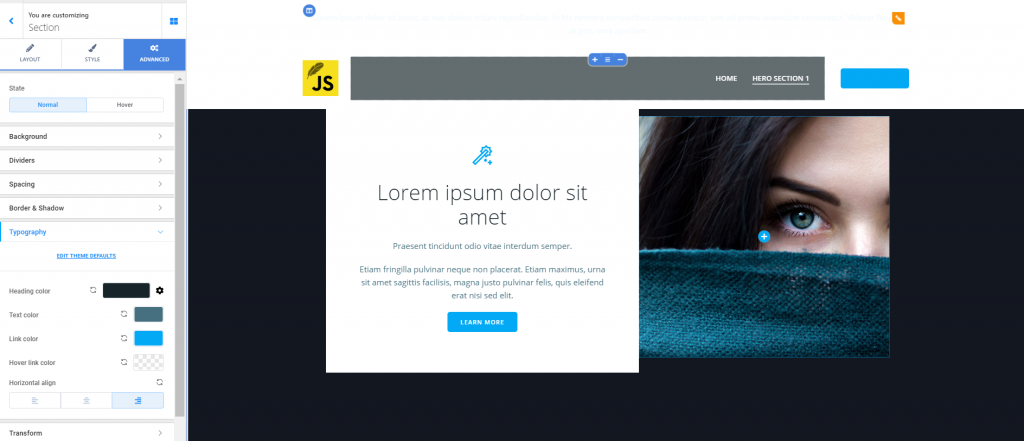
ABOUT sections
The About sections allow you to give users a relevant description of the company.
Click on the grey cog icon next to the section you’ve included into the page and open, in Customizer, the list of options for the About section:
Layout
From here, you define the structure of the layout for the About section:
- Container Width – you can choose to keep the default width of the Container or expand the section to full width.
- Container Height – you can opt for auto adjustment of the Container height, set the section height to full screen or minimum height. If you set it to full screen or minimum height, you’ll have additional options for content placement: at the top of the section, centered or at the bottom of the section.
Manage rows – here, you have a preview of the current layout. You can also include additional rows, if you want to add more content to this section.
Style
The styling options for the About section refer to customizations for:
- The background of the section (choose a color for the section background, or set the background type to image/gradient/video/slideshow; you can also enable the option to apply an overlay on top of the background you’ve configured)
- Dividers for the top and bottom of the section (you can choose among various styles for the top and bottom Dividers, you can select a certain color for the Dividers and set the optimal height for the Divider)
- Spacing for the About section (from here, you’ll select custom values for the distance of the section content from the top and to the bottom; for optimal view on different devices, click on the small icons next to top spacing and Bottom spacing to get a preview of the display on tablet and mobile – you can set distinct values for the display of the section on each device).
Advanced
From here, you can apply additional customizations to the About section:
- Spacing (set values for the padding and margins of the section)
- Border and Shadow (choose to create a visible border for the section and customize its color, define how round its corners will be and apply a slightly or more pronounced shadow effect to the content box)
- Typography (from here, you’ll choose colors for the text included in the About section: heading, text, link/anchor text, link/anchor text on hover, and specify the alignment of the content elements: to the left, at the center or to the right).
FEATURES sections
The Features sections allow you to include a list of the characteristics that make your business unique.
Click on the + sign next to Content sections and choose one of the available FEATURES section.
Click on the grey cog icon next to the Features section and open, in Customizer, the panel with settings you can adjust for the newly added section.
Layout
You can make adjustments to the structure of the layout and the arrangement of items in this content section.
- You can set the width of the container for the section to full (it occupies the entire surface of the screen) or keep its default width
- You can set the height of the container for the section to automatically adjust, full screen (it occupies the entire surface of the screen, in which case the content can be placed at the top, centered or to the bottom), minimal height (you can set your own values for the minimal height, and the content can be placed at the top, centered or to the bottom)
From here, you can get a preview of the current layout, and you can also add new rows to the section.
Style
From the styling options, you can customize:
- The color of the background, by selecting the color you want from the color picker
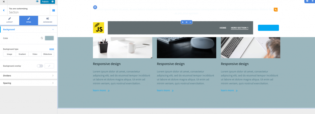
- In case you want a more stylish background, you can switch to a different background type (image, gradient, video or slideshow)
- You can apply an overlay to the section background (a semi-transparent color to which you can add shapes; you can also adjust its opacity, and in case you’ve added shapes, you can adjust the luminosity for those shapes).
- You can enable the option to add a top/bottom divider (choose the most appropriate shape for this graphic element, choose its color, select values for the height of the divider).
- You can modify the distance from the top and to the bottom, for this Features section (top/bottom spacing)
Advanced
In the Advanced section, you have additional settings for spacing, and you can also apply stylish effects (like border and shadow), as well as customise the typography of the Features section:
- Spacing – give specific values for the padding (the surface this section occupies on the left, at the top, on the right and at the bottom) and the margin – input your values for the margin of the Features section
- You can create a visible border for the section, select its exact geometrical shape and adjust the roundness for its corners; you can also add a box shadow, of a certain color, for the Features section
- As to typography, you can give the colors you want to the heading/text, links and links when users hover their mouse over them; you can also set up the alignment of the text to the left, at the center or to the right of the section.
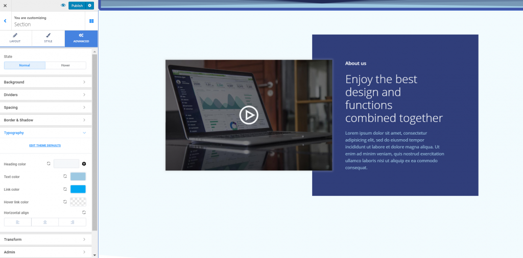
CONTENT sections
Once you’ve added a new content section into the page, click on the grey cog icon next to the section and open, in Customizer, the panel with further customization sections:
Layout
Customize the arrangement of the elements in the content section:
- Keep the default width of the container or make it unfold over the whole screen
- Adjust the height of the container (set it to automatically adjust to the page, make it full screen or set it to minimal height). When you select full screen or minimal height, you can decide the content positioning at the top, in the middle or at the bottom of the section
- You can get a preview of the current layout and you can add new rows to the section, any time.
Style
You can make adjustments for:
- The background of the section (it can have a certain color, or it can be set to image/video/gradient/slideshow); you can add an overlay (a semi-transparent color) to the background of the section, and customize it to your preferences
- You can enable Dividers for the top/bottom of the section (define their height, their color and their shape)
- You can set up distances of the section content from the top and to the bottom, by giving specific values to top spacing/bottom spacing
Advanced
Beside the above settings, you have some advanced options for:
- Spacing – set the padding of the Content section (the surface it occupies in the page) and the margin of the section
- Border and shadow (to better delimitate the Content section from the rest of the page, choose to create a visible border for it; select the shape you want to give to the section border and adjust the roundness of its corners); for a more stylish effect, you can enable the option to apply a shadow to the section border (click on the pencil icon and open the panel with further customization options, among which the shadow color, and the horizontal/vertical distance it spreads over)
- Typography – you can select specific colors for the text elements in the Content section (heading, text, links, links on hover), as well as define the best alignment of the text (to the right, at the center or to the left)
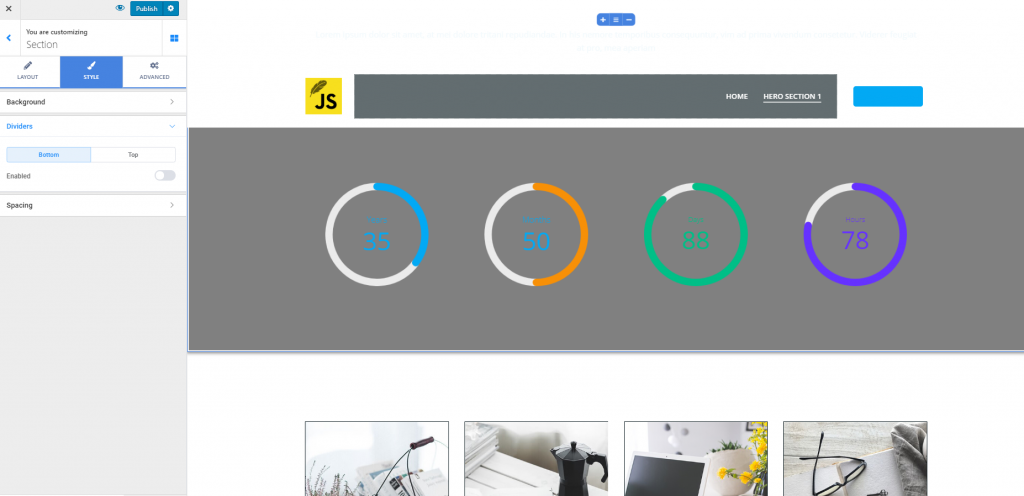
COUNTERS sections
The Counters sections are best for proving the success of the business with figures.
Once you’ve added a Counters section into the page, click on the grey cog icon next to it and start customizing the respective section:
Layout
Make customizations at the level of layout structure and define the best arrangement of items within the section.
- Set the width of the container (you might keep the default width of the container or make it full width)
- Set the height of the container (you might select it to auto-adjust, make it full height or set it to minimal height)
- In case you want to extend the content of the section, you might want to add new rows to the section – click on Add row to add new counters to the section.
Style
For customizations of the section appearance, there are the following options:
- Give a specific color to the background of the Counters section
- In case you don’t want a simple color for the section background, you can change the background to display an image/a gradient/a video/a slideshow
- You can choose to apply an overlay to the section background (enable this option and click on the pencil icon next to it to open the panel with further customizations for the overlay – color, shapes, opacity, luminosity of the shapes)
- Enable the option to show top/bottom Dividers (graphical shapes delimitating the Counters section from the rest of the page). Choose a particular color for the Dividers and set the height to which they are deployed
- Adjust the distance of the section content from the top and to the bottom, by selecting your values on the Top spacing/Bottom spacing sliders.
Advanced
You can further customize the Counters section from advanced settings:
- Spacing – you can set individual values for the surface this section occupies in the page (padding) and the margin of the section
- You can create a visible border for the Counters section, give it a certain shape, color and set it to a certain height
- You can add a shadow effect (of a particular color) to the Counters section. If you enable this option, you’ll need to click on the pencil icon next to it and make further customizations
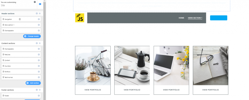
PORTFOLIO sections
Portfolio sections are good for presenting the past and current projects that recommend the business to new possible clients. To convince them, you need to create an excellent portfolio section that turns them from leads to clients. The settings for Portfolio sections will help you customize the presentation of your projects to your wishes.
After you have added a Portfolio section in the page, you need to click on the grey cog icon next to this section and start customizing the respective section.
Layout
First, you’ll have to make optimizations to the layout structure, to find the best fit into the page.
- Adjust the width of the container (that is the horizontal distance over which the section unfolds): you can keep the default width or choose the full width option
- Adjust the height of the container (that is the vertical distance over which the section unfolds): you can set it to automatically adjust, you can set it to full screen or minimal height; for the full screen and minimal height variants, you can further determine the content positioning (at the top, in the middle or to the bottom of the section)
Second, you can add new rows to the current layout, in case you want to expand the section content and give it a clear structure.
Style
Like for other types of sections, the following options are available:
- Change the color of the background for the Portfolio section
- In case a simple color won’t do, you can choose a different background type: image/gradient/video/slideshow)
- You can choose to apply an overlay to the section background (a semi-transparent color that is applied on top of the background, to obtain a nice visual effect). After you have enabled this option, click on the pencil icon next to it and open the panel with further customizations for the overlay (color, opacity, additional shapes and luminosity of those shapes)
- Dividers (they are graphical elements separating the Portfolio section from the sections above it and the sections following it): enable the option to show Dividers and choose their style, color and height to which the deploy
- Spacing – define the distance of the Portfolio content from the top and to the bottom, with the values you select on the Top spacing/Bottom spacing sliders
Advanced
From here, you can further customize the section, by adjusting settings like:
- Spacing – define the surface the Portfolio section occupies in the page (padding), and set values for the margin of the section
- Give an elegant appearance to the section, by creating a visible border that frames it (choose the type of the border – its shape; set values for the roundness of the border corners; you can also apply a shadow to the box corresponding to the Portfolio section and customize it to your wishes)
- Define values for the typography (choose colors for the heading, text, anchor texts of links in normal state and links on hover); also, you can set the alignment of the text: to the right, at the center or to the left.
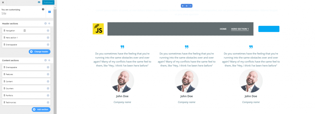
TESTIMONIALS sections
A Testimonials section will help you be more convincing in attracting new clients and selling your services.
After you have added a Testimonials section to the page, click on the grey cog icon next to it and expand the list of settings for the respective section:
Layout
From here, you define the most appropriate arrangement of the items in the section.
- Set the width of the container (the horizontal distance over which the section is deployed); you can keep the default container width or set it to full width
- Set the height of the container (the vertical distance over which the section unfolds); you can set it to automatically adjust, you can set it to full height or minimal height (for the latter 2 options, you can also define the content positioning: at the top, in the middle or at the bottom)
- You can get a preview of the current layout and add rows to it, for extra content you want to add in the section
Style
The styling options contain settings for the background, dividers and spacing:
- You can select a specific color for the background of the section
- There are some alternatives to a colored background: you can change the background type to image/gradient/video/slideshow
- You can choose to show an overlay over the background (the overlay is a semi-transparent color that is applied on top of the background, to obtain a nice visual effect)
- You can add Dividers (Dividers are graphic separators clearly delimitating the section from other sections in the page); you can choose the style of the separators (their shapes), give them a color and set the height of the Divider
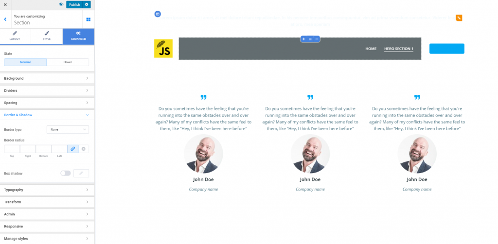
Advanced
From here, you can make additional customizations as follows:
- Set individual values for all sides defining the padding (the surface that the section occupies in the page) and the margin of the section
- You can create a border for the Testimonials section (select its type, the roundness of the corners)
- You can add a shadow effect to the box corresponding to the Testimonials section (enabling this option will allow you to click on the pencil icon next to it and apply further customizations for this shadow effect)
- Related to typography, you can customize colors of the text content in the Testimonials section (the color of the heading, the color of simple text, anchor text for links in normal state and anchor text for links on hover)
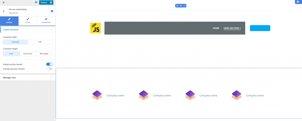
CLIENTS sections
A Clients section helps you put to the front the list of clients you have worked with. After you have added a Clients section into the page, click on the grey cog icon next to it and open, in Customizer, the options corresponding to this section:
Layout
Make adjustments to the layout of the Clients section as follows:
- Set the width of the container (keep the default width of the container or make it full width)
- Set the height of the container (set it to automatically adjust, make it full screen or set a minimal height for it)
- You can have a preview of the current layout and add rows to the section any time, in case you want to add extra content to the section
Style
To configure the style of the section, adjust settings as follows:
- Define the color of the background for the Clients section
- In case a simple color won’t do, change the background type to image/gradient/video/slideshow
- You can enable the option to show an overlay (a semi-transparent color that is applied on top of the section background, to obtain a nice visual effect)
- You can enable the option to show Dividers (Dividers are graphic separators that clearly delimitate the Clients section from the other sections in the page); choose a specific shape for the Dividers, a certain color the Dividers will have, and define the height of the Dividers)
- Select distinct values for the distance of the section content from the top and to the bottom, on the sliders for Top spacing and Bottom spacing
Advanced
From here, you can apply extra customizations to the Clients section:
- Set the padding (surface the Clients section occupies in the page) and margins of the section
- Create a visible border for the Clients section (and customize its color, shape, the roundness of its corners)
- Apply a shadow effect to the box corresponding to the Clients section (enabling this option will allow you to click on the pencil icon next to it and expand the panel with further customizations for the box shadow)
- For typography customizations, you have options such as: color of the heading text, color of simple text, color of the anchor text for the links in normal state, color of the anchor text for links on hover; you can also determine the alignment of the text (to the left, at the center or to the right)
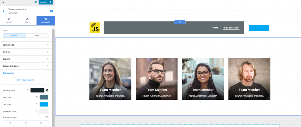
TEAM sections
The Team sections allow you to add a presentation of your team and describe in some words each of its members.
After having added the selected Team section in the page, you need to click on the grey cog icon next to it and open, in Customizer, the list of available settings for the Team section:
Layout
You can make customizations of the structure for the section layout:
- Define the width of the container (the horizontal distance onto which the section unfolds); you can set the width to default values or full width
- Define the height of the container (the vertical distance onto which the section unfolds); you can set the height to automatically adjust, full screen or minimal height
You can get a preview of the current layout and add new rows to it, in case you want to expand the section content.
Style
From here, you can adjust settings as follows:
- Define the color for the section background
- You can set the background to image/gradient/video/slideshow
- You can apply an overlay to the section background (enable this option and click on the pencil icon next to it for further customizations)
- You can choose to delimitate the Team section from the rest by including Dividers (graphic separators that delimitate the section from the sections above and below it); choose the style of the Dividers, the color and height of the Dividers
- Set the distance of the section content from the top and to the bottom, by selecting values on the sliders corresponding to Top Spacing and Bottom Spacing
Advanced
Here, you have additional options for customizing the Team section:
- You can set individual values for each side defining the padding (the surface this section covers in the page) and the margins of the section
- You can create a border for the Team section (select the type of the border, define the roundness of its corners); you can also apply a shadow effect to the border and customize it to fit the presentation
- You can define colors for the text content in the Team section (colors of the heading text/simple text/anchor text of links in normal state, anchor text of links on hover); you can also define the alignment of the text (to the left, at the center or to the right)