Click on the blue sign next to Section, in the upper part of the Customizer menu. You will open the list of components.
In the category of Components, find the Pricing Table component.
Use drag-and-drop to put a pricing table component into the section you are modifying.
Pricing table component added to a page section:
To start customizing a pricing table component, you need to make sure you have the corresponding settings category open in Customizer.
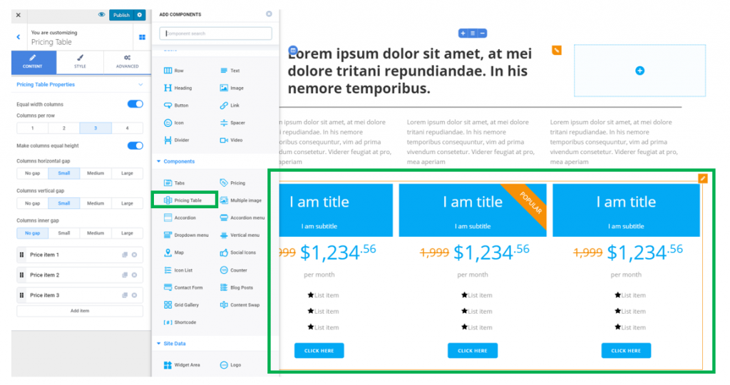
Content
From here, you can edit the properties for the pricing table.
Equal width columns – make columns of equal width, for coherence of the design.
Columns per row – set the number of columns you want to display per one row. Each column will be representative of a price offer.
Make columns equal height – set the columns to have the same height and occupy the same vertical distance in the page section. This is useful for coherence of the design.
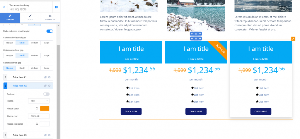
Columns horizontal gap – these values define the space between any two columns, horizontally. Set the values to small, medium, large or no gap at all.
Columns vertical gap – these values define the space between the columns and the top/bottom margins of the component. The values can be set to small, medium, large or no gap.
List of items – in the lower part of the settings category for the pricing table, you’ll find the list of items that form the pricing table.
Click on Add item to place supplemental columns into the pricing table.
Click on the x sign next to an item you want to remove and delete it from the list.
Click on the Duplicate button next to an item and add a copy of it into the table.
Use the button at the left of an item to drag-and-drop and move the item to a different place in the list.
Edit items in the pricing table
Click on the item you want to edit and expand the list of settings for that item:
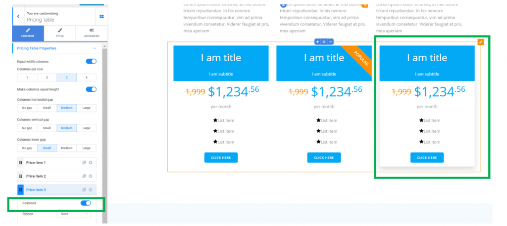
- Featured – if you enable this option, the respective item will be emphasized in the pricing list:
- Ribbon – this refers to a mark for one of the pricing offers, signalling that, for instance, that offer is the most popular in the list:
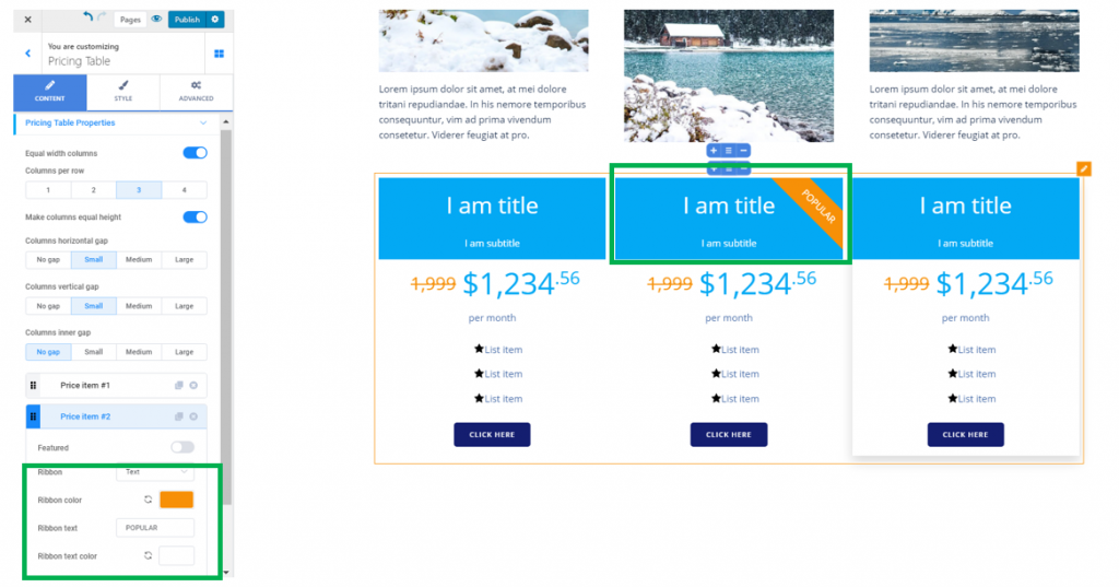
Select the ribbon color, so it puts the pricing offer front and center, drawing the attention to it.
For the “Ribbon”, select it to be represented by:
- A text
Select the text for the ribbon: in our example, the text is “POPULAR”.
Select the color for the text of the ribbon: the color of the text needs to be contrasting as compared to the ribbon color, for the text to be visible and easy to read.
- An icon
Select the icon for the ribbon. In case you want to change the default icon, click on Change next to the Icon and open the available libraries of icons. Select a different icon for the ribbon attached to your pricing offer.
Select the color for the ribbon icon: you need to choose a contrasting color as compared to the ribbon itself, so it is visible and easy to spot by users who are visualizing the pricing offers.