The Read More Component is useful to add a link towards the complete article, once a post summary has already been included in a page.
To add the component, make sure you have the list of Components open in Customizer. From the subcategory destined to Blog Components, drag-and-drop the Read More component you want to add to your page.
For customizations of the Read More component, make sure you have the corresponding settings category open in Customizer.
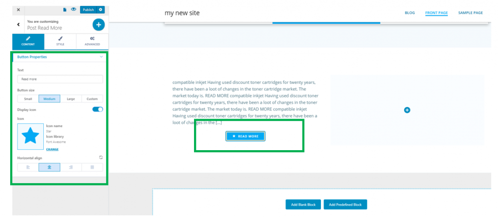
Content
Text
Fill in the blank space with the specific text you want to apply onto the button and the link leading to the complete article.
Button Size
Choose the dimensions of the button: it can be small, medium, large or have custom dimensions.
Display icon
If you enable this option, an icon will accompany the text placed on the button. You can replace the default icon with another one, from one of the available libraries. Simply click Change next to the icon and open the list of available icons.
Horizontal alignment
This option allows you to align the button:
- To the left
- At the center
- To the right
Style
You can make adjustments to the style of the button and to the style of the icon.
Button Style
Background – from the color picker, you choose the color of the button background
Hover background – from the color picker, you choose the color of the button background as it is displayed when users hover their mouse over it
Text color – this is the color of the text applied onto the button
Hover text color – this is the color of the text applied onto the button, as it is shown when users hover their mouse over the respective button. This color should match the color of the button background on hover, for coherence of the design.
Typography – click on the pencil icon to open the panel with customization options for the text of the button. You can choose a font family, select the weight and dimensions of the font, the style, decoration, line height and letter spacing for the text.
Border type – to apply a visible border to the button, choose a border type other than none: solid, dashed, dotted, groove, ridge, etc.
Border thickness – for the border to be visible in the page, you have to select values that are greater than 0 for the border thickness.
Border color – select the color of the button border.
Border hover color – select the color of the button border, as it appears when users hover their mouse over the button.
Border radius – this defines how round the corners of the button border will be. The greater the values, the rounder the corners of the button border will be.
Box shadow – if you enable this option, you allow for a shadow effect to be visible for the button. Click on the pencil icon next to it, to open the panel with customization options for the box shadow: horizontal/vertical distance towards which the shadow is deployed, spread, blur effect, color of the shadow.
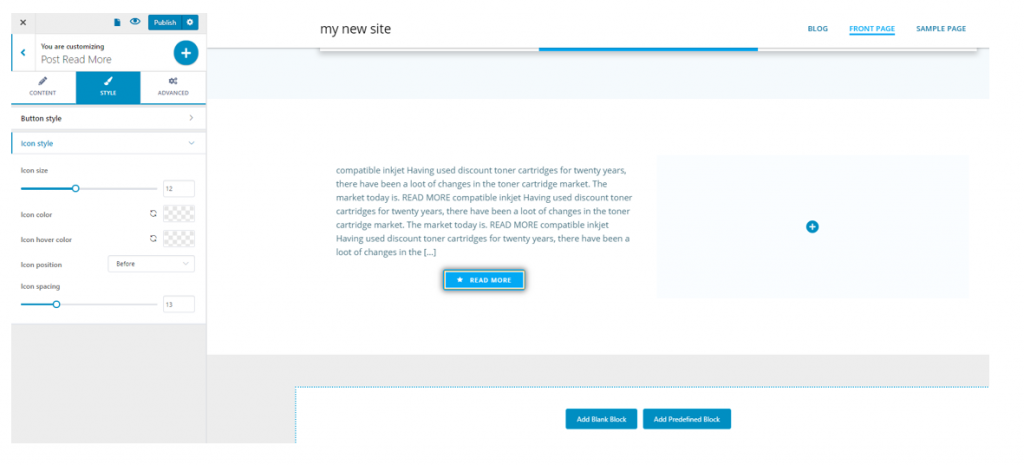
Icon style
Icon size – from here, you set the dimensions of the icon accompanying the text onto the button.
Icon color – from the color picker, you choose the color of the icon that accompanies the text onto the button. Ideally, the color of the text and the color of the icon should match, if not be identical.
Icon hover color – this is the color of the icon accompanying the text onto the button, as it appears when users hover their mouse over the item.
Icon position – the icon can be placed before the text of the button, or after the text of the button you are customizing.
Icon spacing – this defines the spacing between the icon and the text of the button. The greater the values, the more space will be between the icon and the text of the respective button.