The Search Component is useful for visitors who want to perform searches within the website.
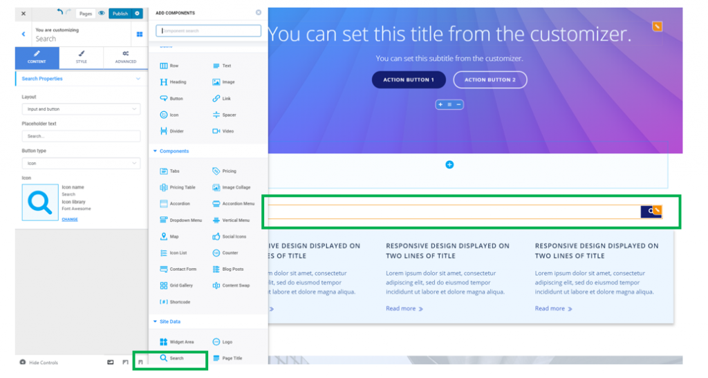
Open the list of Components and go to Site Data Components. Find the Search Component and use drag-and-drop to add it to the pages of your website.
To customize the search bar, click inside the component and make sure you have the corresponding settings category open in Customizer.
Content
Layout
You can choose among different displays for the search box:
- Input for the search terms and button indicating this is a search box
- Input only (the field that will be filled in with the search terms is the only element displayed)
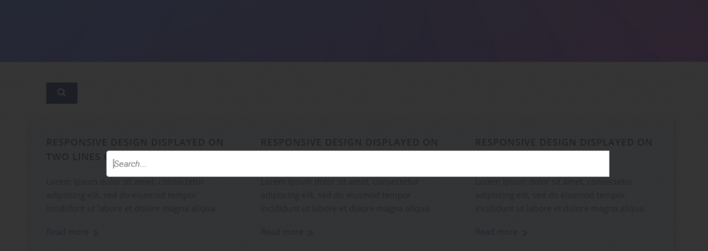
- Button with lightbox (the button indicating this is a search box will be displayed; upon clicking on the button, a lightbox will open, that users will fill in with their search terms)
Example of layout for button with lightbox:
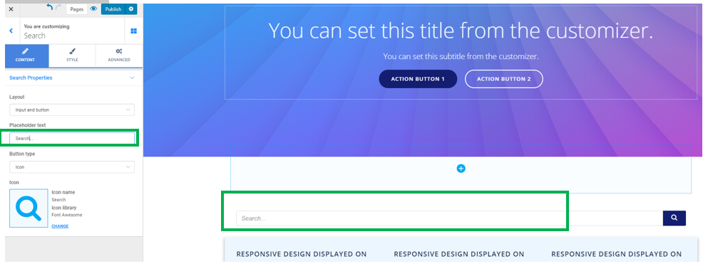
Placeholder text
This is the default text being displayed into the search box, before users fill in the field with their search terms:
Button type
The button will have the form of:
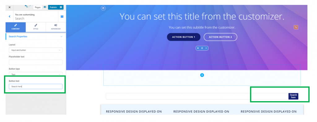
- An icon (usually the icon represents a magnifier, suggestive for the search box). If you want to replace the icon by another one, click on Change next to the icon and open the available libraries of icons
- A text (usually, the text will be indicating this is a search field; therefore, an appropriate term would be “Search”). If you want to replace the default text, “Search”, fill in the blank space under Button text with a text of your own.
Style
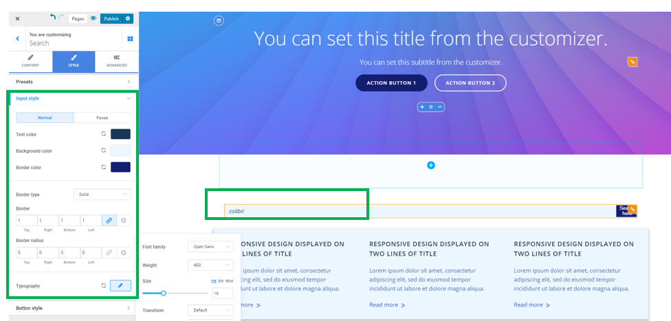
Input Style
Text color – this is the color of the search terms, as they appear when users fill in the search box with the respective search terms
Background color – this is the background color onto which the search terms are displayed
Border color – when you choose to create a visible border for the search box, you can select a color of your choice for that border
Border type – to create a visible border for the search box, select among solid line, dashed line, dotted line, double line, etc.
Border thickness – these values define how thick the border of the search box will be. The higher the values, the thicker the border of the search box.
Border radius – this option refers to the roundness of the border corners. If you select higher values, the border corners will be rounder
Typography – click on the pencil icon next to Typography, to open the panel with further customization options for the text of the search terms users put in the search box:
- Select a font family
- Choose the weight of the font
- Define the dimensions of the text
- Turn the text to uppercase, lowercase, capitalize it, etc.
- Choose the style of the text (normal, italic)
- Set the height of the line of text for the search terms in the search box
- Set the spacing between the letters of the text for the search terms in the search box
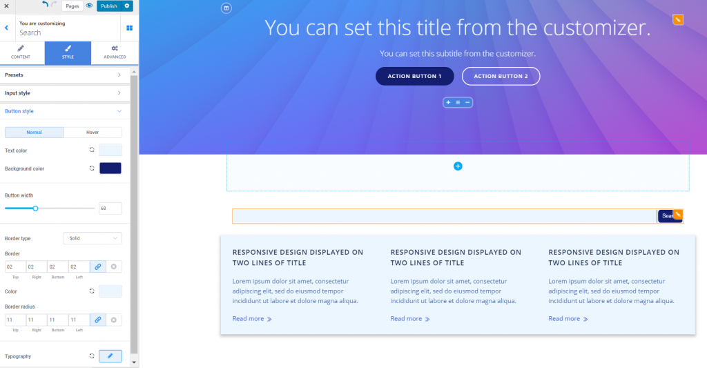
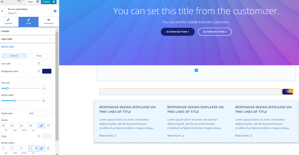
Button Style
These options refer to the style of the button attached to the search box.
The values can be set differently for the button in normal state and on hover (the button as it appears when users hover their mouse over that button):
When the button type is set to text:
Text color – this is the color of the text that appears onto the button
Background color – this is the color of the background onto which the text of the button is placed
Button width – set the horizontal distance over which the button unfolds
Border type – to create a visible border for the Search button, select among solid line, dashed line, dotted line, double line, etc.
Border thickness – these values define how thick the border of the button will be. The higher the values, the thicker the border of the button will be.
Border color – select an adequate color for the border of the button
Border radius – these values define how round the corners of the button border will be. Higher values equal rounder corners of the border for the search button.
Typography – click on the pencil icon next to Typography, to open the panel with further customization options for the text placed on the button:
- Choose a font family
- Select the weight of the font
- Define the dimensions of the text placed on the search button
- Turn the text to uppercase, lowercase, capitalize it, etc.
- Choose the style of the button text (normal, italics, etc.)
- Set the spacing between the letters of the text for the search button
When the button type is set to icon:
Icon color – this is the color of the icon for the search button (in our case, the color of the magnifier)
Background color – this is the color of the background onto which the icon of the search button is placed
Icon size – define the dimensions of the icon placed on the search button
Button width – set the horizontal distance over which the button unfolds
Border type – to create a visible border for the Search button, select among solid line, dashed line, dotted line, double line, etc.
Border thickness – these values define how thick the border of the button will be. The higher the values, the thicker the border of the button will be.
Border color – select an adequate color for the border of the button
Border radius – these values define how round the corners of the button border will be. Higher values equal rounder corners of the border for the search button.
Example of customized search button with icon:
Example of customized search button with text: