After you have decided on the layout of the blank section, and added components to it, you can proceed to creating a particular style for that section.
Click inside the newly added section, and open in Customizer the list of settings for that section.
Click on the second tab, destined to Styling options:
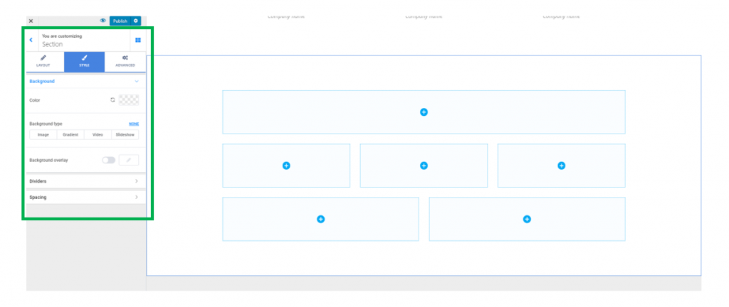
Background Options
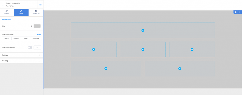
You can choose a simple color for the background of the section, by selecting it from the color picker.
In case a simple color won’t do, choose a different background type:
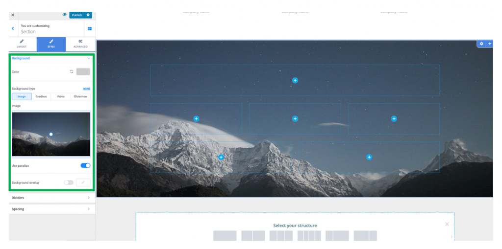
- Image
Upload an image you want, from your device, to apply it as section background.
Choose the best positioning for the background image (top left, top center, top right, center left, center center, center right, bottom left, bottom center, bottom right or custom).
Set the background image as fixed (the background image stays in place while the foreground moves, when users scroll down the page) or scroll (the background image moves together with the foreground, when users scroll down the page).
Set the image to repeat into the background, or no repeat for a single occurrence of the image into the background.
Decide the optimal dimensions of the image (auto adjustment of the image, cover or contain).
You can enable the option to use a parallax effect (the parallax effect means the background moves at a slower rate than the foreground, when users scroll down the page).
- Gradient
Choose a gradient of your choice for the section background.
For more options, click on the cog icon next to Gradient.
You can thus select your own colors to compose the gradient you’ll apply to the section background.
You can adjust the angle of inclination for the gradient, by selecting your values on the slider.
Choose the location where one color of the gradient is changed with the other.
Attachment – you can set the gradient to be fixed and move at the same speed as the foreground, when users scroll down the page or to scroll and move at a slower rate than the foreground, as users scroll down the page.
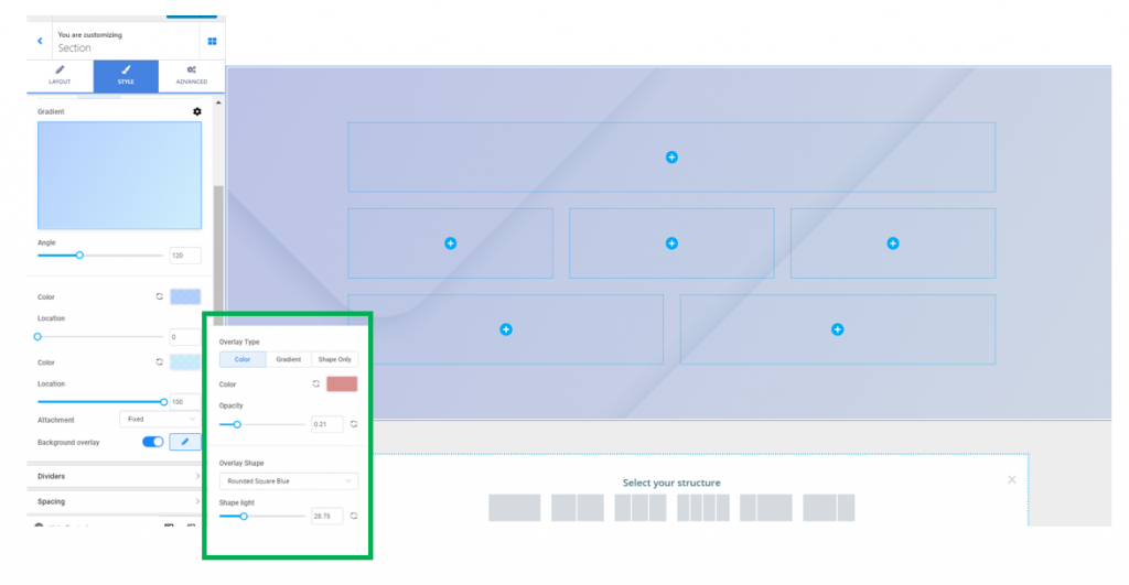
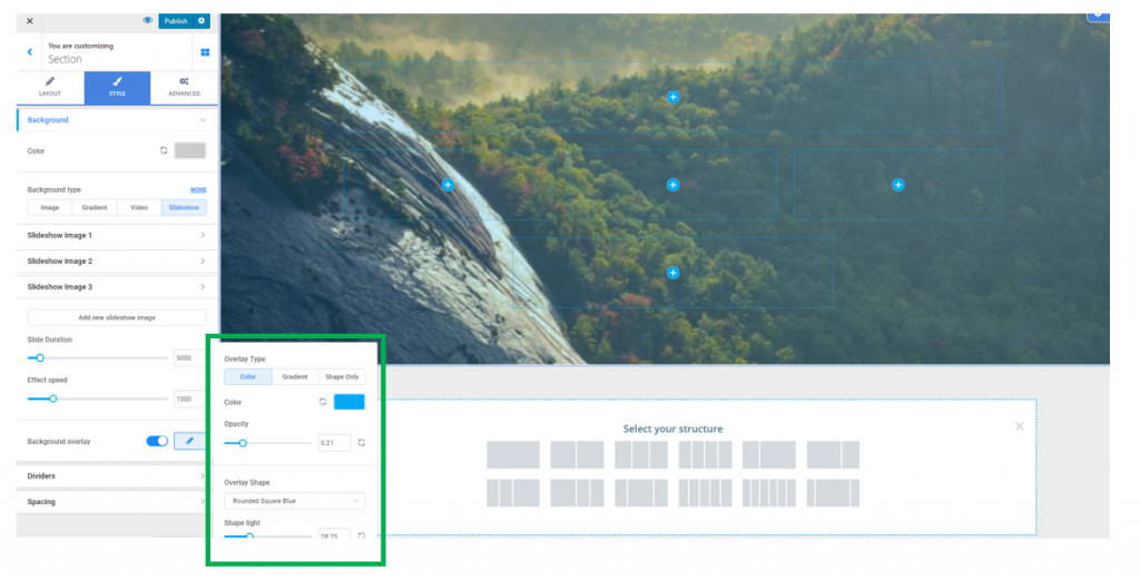
You can enable the option to apply an overlay (the overlay is a semi-transparent color that is applied on top of the background, to obtain a nice visual effect). Click on the pencil icon next to Background overlay to open the panel with customization options for the overlay:
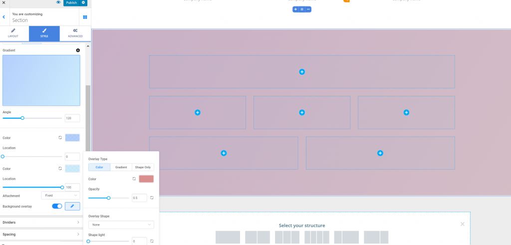
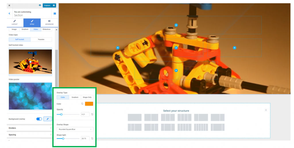
Select the type of the overlay (simple color, gradient or simple shapes).
Then, select the color, gradient or shapes you want to attach to the background overlay.
In case you choose a simple color for the overlay, adjust the opacity for it (set smaller values for a more transparent color or higher values for an opaquer color).
In case you choose to attach shapes to the overlay, adjust the luminosity for those shapes.
Below is an example of an overlay we have customized with the values that are shown in the screenshot:
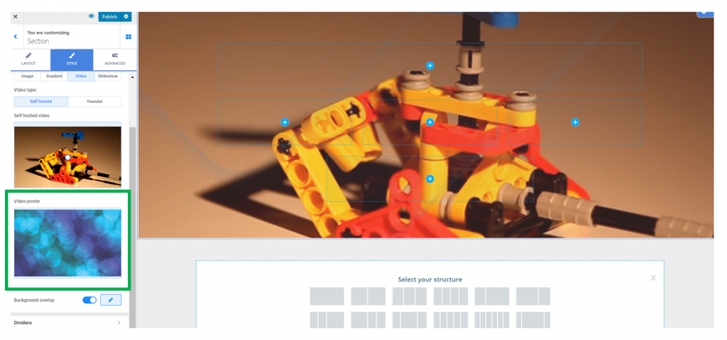
- Video
There are 2 options for a video background: you can either upload a video file from your device or provide the link to an external file.
Video Poster – the video poster is an image that will be displayed in the background of the page section, when the video file doesn’t load or is not playing. It is the equivalent of an alternate text for an image.
You can enable the option to apply an overlay (the overlay is a semi-transparent color that is applied on top of the background, to obtain a nice visual effect). Click on the pencil icon next to Background overlay to open the panel with customization options for the overlay:
- Slideshow
You can choose to place a slideshow in the background of the section. Click on each of the default images to replace them with the images of your own.
To add new elements to the slideshow, click on Add new slideshow image at the end of the slides list.
To remove a slide from the list, click on it and press the Remove slide button corresponding to that slide.
Slide Duration – set your values for the time a slide is displayed onto the screen, until the next slide comes in. Smaller values mean an image is displayed for a shorter time onto the screen, while higher values mean an image is displayed longer onto the screen, until the next image replaces it.
Effect Speed – this option refers to how smooth or sharp the transition from one image to another in the slideshow is. Smaller values equal a sharper transition from one slide to another, while higher values mean a smoother transition from one slide to another.
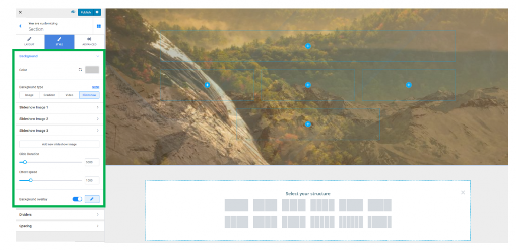
You can enable the option to apply an overlay (the overlay is a semi-transparent color that is applied on top of the background, to obtain a nice visual effect). Click on the pencil icon next to Background overlay to open the panel with customization options for the overlay:
Dividers for the section
Dividers are graphic elements separating the section from the rest of the page.
You can enable to show both a Top and a Bottom separator, or just one of them, depending on your styling options.
For each of the Dividers, set the following options:
- The shape of the Divider (there are 15+ different shapes in Colibri)
- The color of the Divider (choose it from the color picker)
- The height of the Divider (the vertical distance over which the Divider is expanded)
Spacing Options
From here, you can set specific values for the distance of the content from the top and to the bottom of the section.
Select values on the sliders for Top spacing (distance from the top of the section) and Bottom spacing (distance to the bottom of the section).