The Subscribe Form allows users to register their email and further receive fresh website content directly in their inbox.
To add a subscribe form into a page, open the Customizer and select the page where you want the subscribe form to be added.
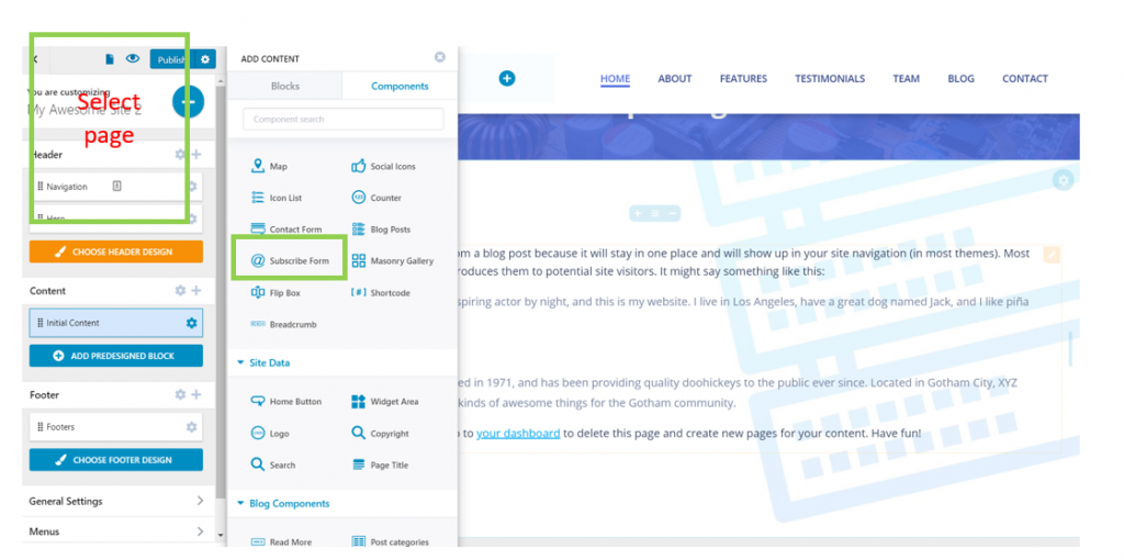
In the left-hand menu of the Customizer, select the second tab, named “Components”, and search for the “Subscribe Form” component.
Use drag-and-drop to add the Subscribe Form in your page, in a section of your choice.
Note: if you want the subscribe form to be displayed on each page in the website, you can use drag-and-drop and place the Subscribe Form component in the footer of the website pages. This way, the footer will be the same on every page in your new website.
Once you add the component into your page, click on it and open the panel with the corresponding customization settings:
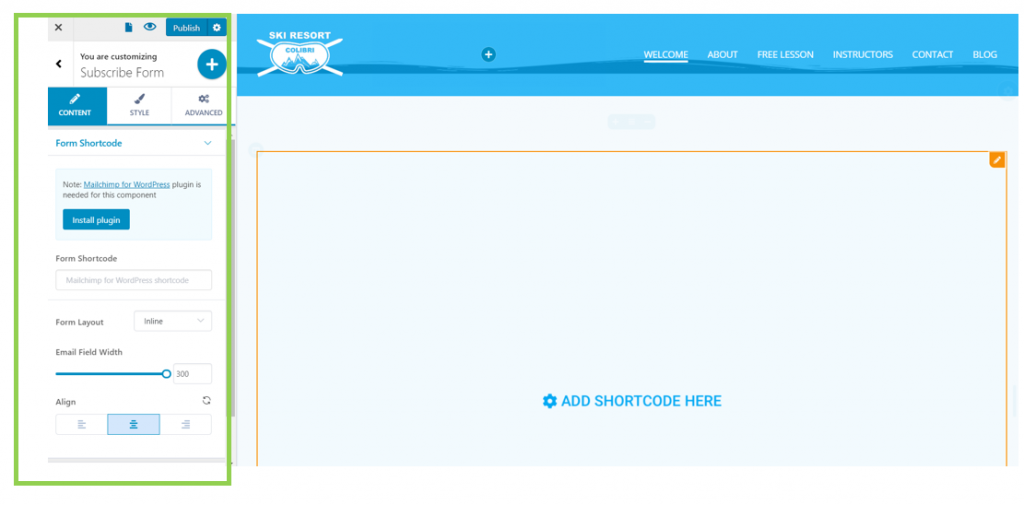
In the Customizer, you’ll be prompted to add a specific shortcode for the form to be visible.
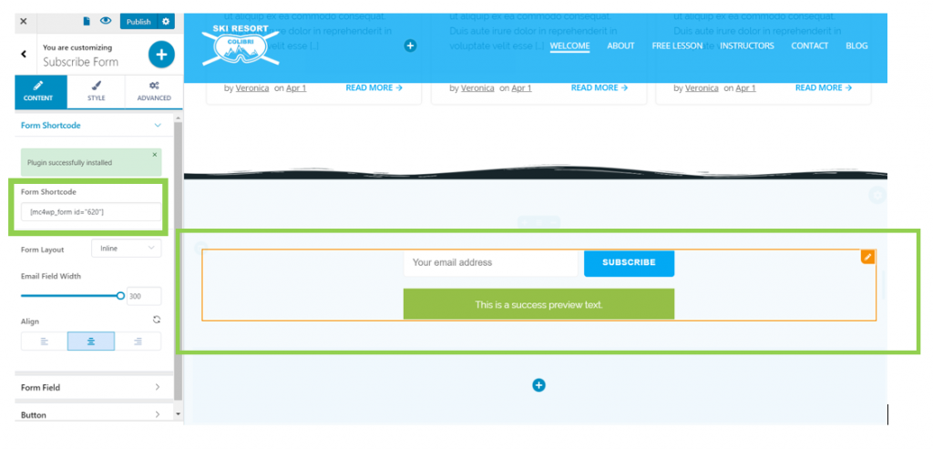
Under the first tab in the left-hand menu of the Customizer, you have the possibility to install and activate Mailchimp For WordPress (without going back to the WordPress Admin dashboard). Click on the blue button: Install plugin.
After having installed the plugin, you’ll get a shortcode that’s automatically embedded in the page and create the Subscribe Form:
Content
Under the Content tab, you’ll find settings for the content of the Subscribe form.
Form Shortcode
After you get the shortcode for the subscribe form, you can further customize it as follows:
Form Layout
You can arrange elements:
- On a vertical axis (the form elements are placed one below the other)
- Inline (the form elements are placed one after another)
Email Field Width
This parameter defines the horizontal distance over which the email field is deployed. Adjust values on the slider (the maximal value is 300).
Form Alignment
From here, you set the Subscribe Form to be placed to the left, at the center or to the right of the page section.

Form Field
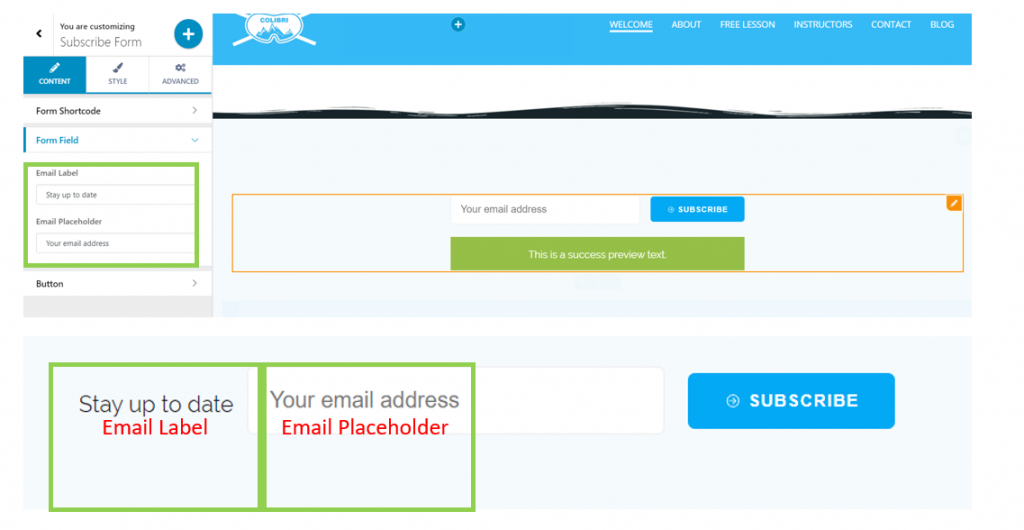
Email Label
This is the name you give to the email field element. Fill in the blank space in the corresponding section of the left-hand menu, with the appropriate text.
Email Placeholder
This is the default text of the email placeholder, where users will replace the default with their own email address. Fill in the blank space with the default text you want to appear for the email placeholder.
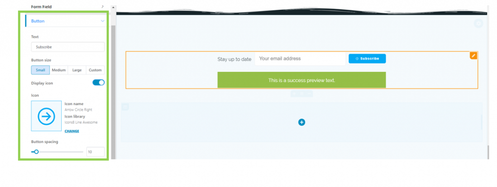
Button
These settings refer to the button that has to be clicked to complete the subscription.
Text
Fill in the blank space with the text you want to display onto the button. In this case, the text that appears onto the button is “Subscribe”.
Button size
From here, you can adjust the dimensions of the button:
- Small size
- Medium size
- Large size
- Custom size (you can define the parameters for a specific dimension you want to add to the subscribe button).
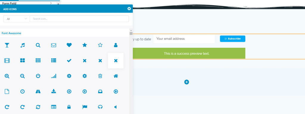
Display icon
You can enable/disable this option, as you want. If you enable the option to display an icon, you can choose a relevant icon, by pressing Change and changing the default.
Button Spacing
This defines the space between the button and the email placeholder. Adjust its values on the slide, choose the best distance and set the button spacing to your liking.
Style
Under the second tab, you’ll find settings for the style of the Subscribe Form.
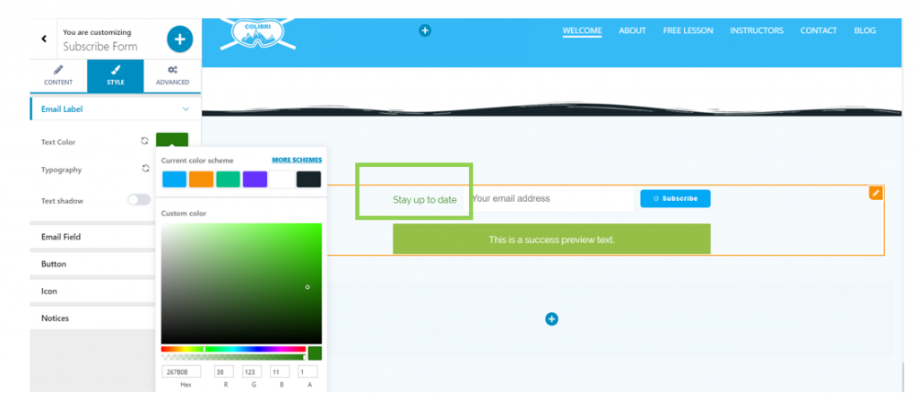
Email Label
Text Color
From here, you can change the color of the text you choose for the Email Label. Click on the default color and open the panel with color schemes:
Typography
Click on the pencil icon next to Typography and open the panel with customization settings for the text typography.
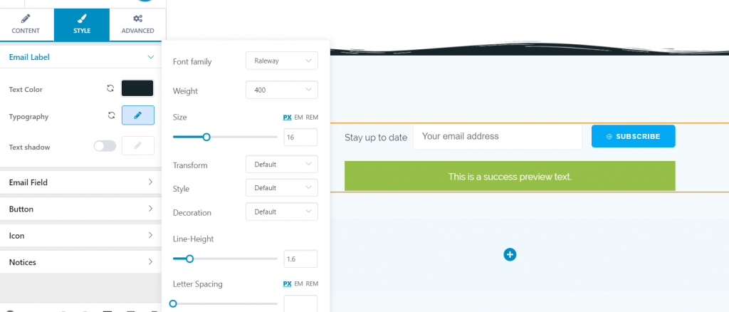
You can choose:
- The font family for your text
- The weight of the text font
- The dimensions of the font
- You can turn the text into uppercase, lowercase, capitalize it, etc.
- You can choose the text to be displayed as normal or in italics
- Choose the height of the line of text
- Choose the spacing between the letters of the text
Text Shadow
If you enable this option, you can add a shadow effect to the text accompanying the subscribe form.
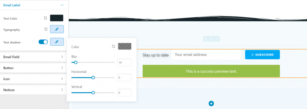
For the text shadow you can:
- Choose a specific color
- Add a slightly or more pronounced blur effect to the shadow
- Decide onto the surface the shadow deploys over, both horizontally and vertically
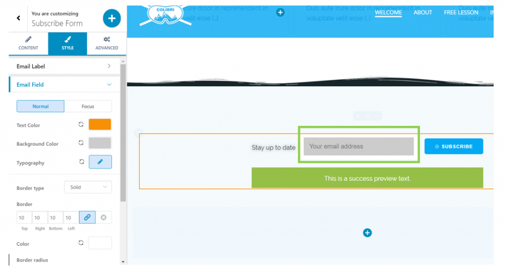
Email Field
Text color – this is the color of the text users input into the email field (their email address)
Background color – this is the color of the background for the email field where users input their email address
Typography – click on the pencil icon and open the panel with customization settings for the text users type into the email field.
Border Type – from here, you can choose what type of border you give to the email field.
It can be:
- Solid
- Dashed
- Dotted
- Double
- Groove
- Ridge, etc.
Border – for the border to be visible, you need to choose larger values. You can select specific values for the top/right/bottom/left side.
Color – this is the color you give to the border of the email field. Click to open the color picker and choose the color of your preference.
Border radius – this defines the roundness of the border corners. Larger values give rounder corners, while smaller values result in sharper corners.
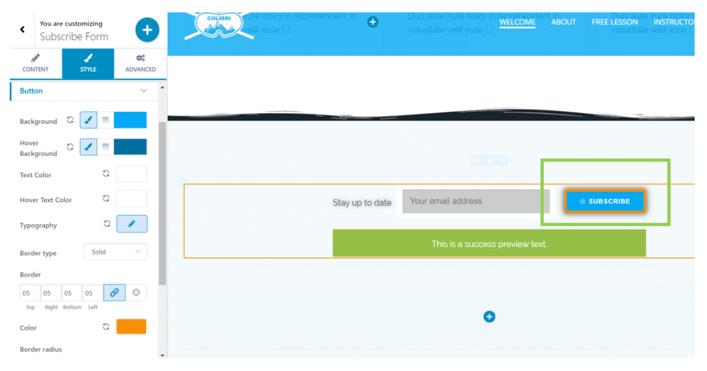
Button
Background – this is the color of the background for the Subscribe button. Click to open the color picker and choose the color that best matches the design of the website.
Hover Background – this is the color of the background for the Subscribe button, when users hover with their mouse over the respective button. Click to open the color picker and choose the color that focuses users’ attention on the respective button.
Text Color – this is the color of the text that is place onto the button. It’s the text of the call-to-action, in this case, it’s “Subscribe”.
Hover Text Color – choose a specific color for the text placed on the button, as it appears when users hover with their mouse over that text. Click on the color picker and select the color of your choice.
Typography – click on the pencil icon and open the panel with customization options for the text placed on the button.
Border Type – from here, you can select what type of border you want to add to the button. For the border to be visible, you need to choose one of the following: solid, dashed, dotted, etc.
Border – from here, you select how thick the border of the button will be. Larger values mean a thicker border of the button. You can select different values for the top/right/bottom/left side.
Color – this is the color of the border you attach to the Subscribe button. Click on the color picker and select the color you want. If you want to keep the same color as for the background, copy the HEX code of that background color and paste it into this Color panel.
Border Radius – this parameter refers to the roundness of the button border corners. The larger the values, the rounder the corners of the border will be.
Box Shadow – if you enable this option, you need to click on the pencil icon to open the panel with customization options for the shadow of the box. You can adjust the horizontal and vertical distance over which the shadow is deployed, you can decide onto what surface the shadow is spread around the box, and you can add a slightly or more pronounced blur effect. Last, but not least, you can select a specific color for the shadow of the box.
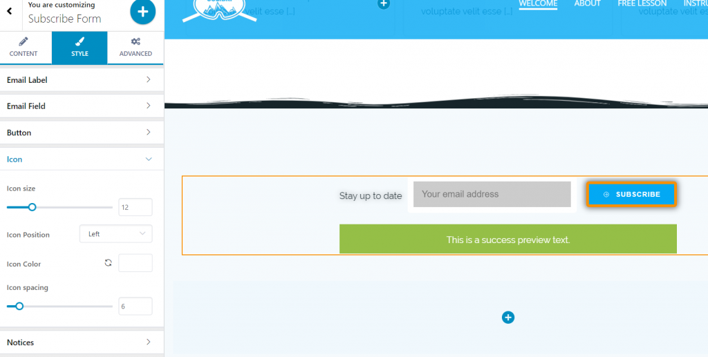
Icon
These settings are only visible if you have previously enabled the option to display an icon next to the text, onto the button.
Icon size – select a specific value on the slider and define the dimensions of the icon accompanying the text onto the Subscribe button.
Icon position – select the positioning of the icon, to the left or to the right of the text.
Icon color – from here, you select the color of the icon that accompanies the text onto the button. Click on the color picker and select the color of your choice.
Icon spacing – this option refers to the spacing that is set between the icon and the text of the button. Larger values mean a greater distance between the icon and the text of the button.
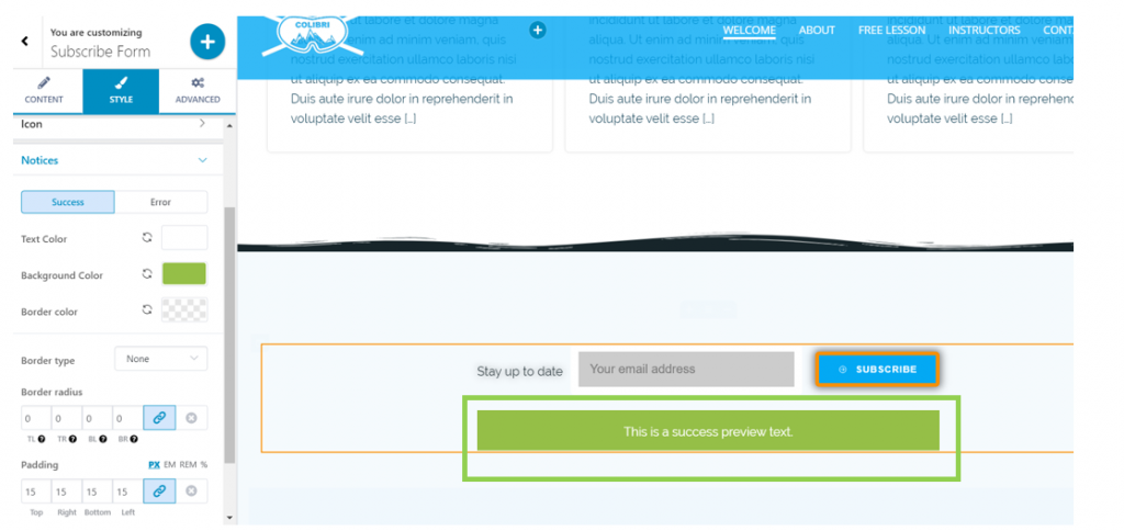
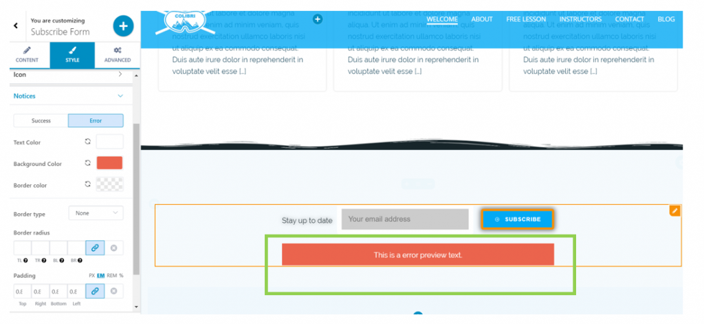
Notices
These settings refer to customizations related to the messages received in case of success or failure of the subscription process.
The settings are the same for both cases, and you can customize the messages differently in case of success and error, using different values.
Text color – this is the color of the message text saying the subscription was a success.
Background color – this is the color of the background onto which the text appears.
Border color – this is the color of the border for the box containing the message, in case the subscription was a success.
Border type – for the border to be visible, you have to select one of the following: solid, dashed, dotted, etc.
Border radius – this refers to the roundness of the border for the text box that appears when the subscription was a success. The larger the values, the rounder the corners of the border will be.
The same settings are also valid for the message in case the subscription fails.
Advanced
For further customizations of the Subscription form, go to Advanced Settings.