The tabs component refers to a design pattern where content is separated into different panes, and each pane is viewable one at a time.
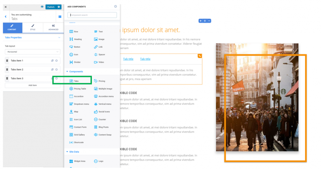
Click on the blue sign next to Section, in the upper part of the Customizer menu. You will open the list of components.
In the category of Components, find the Tabs component.
Use drag-and-drop to put a tabs component into the section you are modifying.
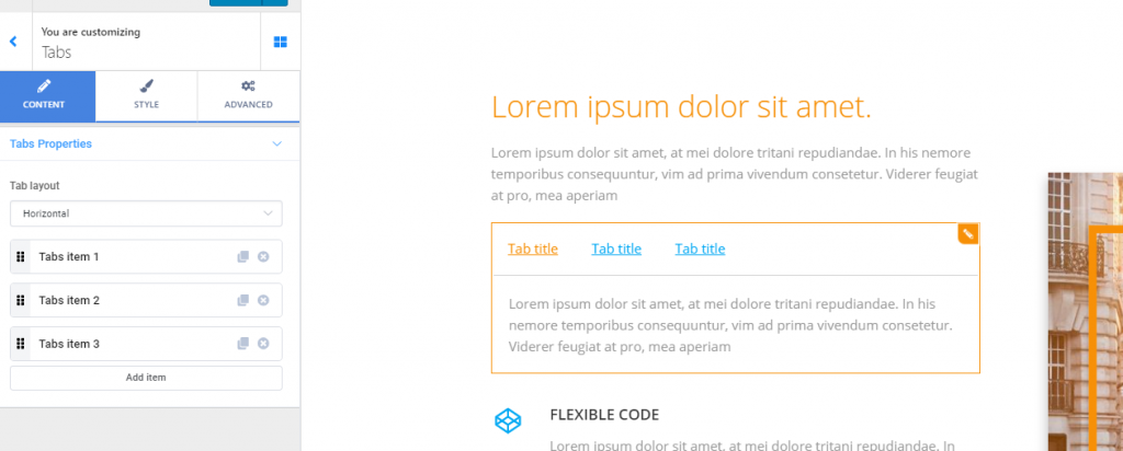
Tabs component added to a page section:
To start customizing a tabs component, you need to make sure you have the corresponding settings category open in Customizer.
Content
Tab layout – you can make the tabs to align horizontally or vertically:
Horizontal tab layout
Vertical tab layout
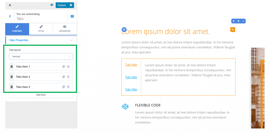
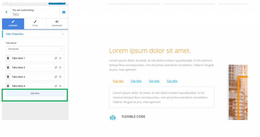
Under Tab properties, you have the list of items that are integrated in the tabs component. They are named, in the screenshot above: Tabs item 1, Tabs item 2, Tabs item 3, etc.
To rearrange the items in the tabs component, place the cursor over the dots icon on the left of an item and use drag-and-drop to move it elsewhere in the list.
To remove an item from the list, use the X button at the right of that item.
To duplicate an item in the list, use the green button for Duplicate item at the right of that item.
Let’s see how you can customize each element in the tab items list:
Click on the item you want to modify:
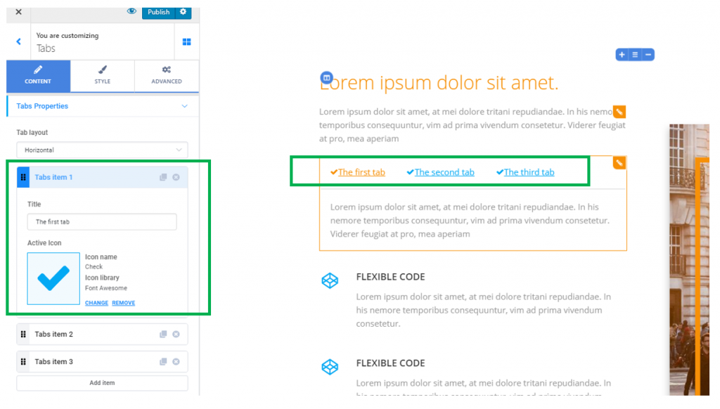
Fill in the blank field under Title, with the name you want to give to that tab.
You can also attach an icon to the tab. To change the default icon, click Change and open the icon libraries that Colibri makes available for you. Browse the list of icons and select the one you want to attach to your tab.
If you want no icon next to the tab, click on Remove at the bottom right of the icon and delete it from the tab.
You will customize each of the items, the same way.
To add a new item to the list, use the Add item button at the end of the tabs list.
Style
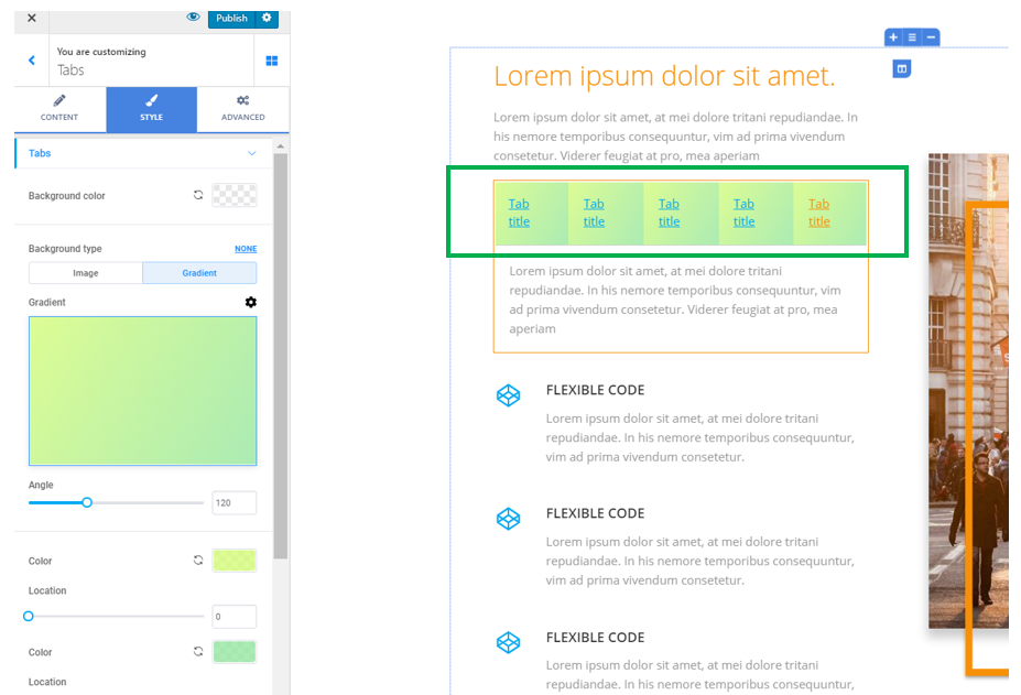
Style for the tabs
Background color – select, from the color picker, a color for the background of the tabs.
The background can also be set to display an image or a gradient.
For the image background type:
- Upload an image from your device
- Position the image so it is best showcased and expressive enough to draw attention to the tabs
- You might make the background image move at the same time as the foreground, when users scroll down the page (scroll) or make it stay in place while the foreground moves, when users scroll down the page
- Choose the optimal dimensions of the image (Auto, Cover or Contain)
- You can enable the option to create a parallax effect (the background image moves at a slower rate than the foreground, when users scroll down the page).
For the gradient background type:
- Select the gradient you want to apply to the tabs background
- Click on the cog icon next to gradient and choose the colors that will form your gradient
- Click on the cog icon next to gradient and choose the angle of inclination for your gradient
- Choose the location where one color of the gradient fades into the other
You can give a solid border to the tabs component. Choose the type of border you want to add to this section (solid, dashed, dotted, etc.)
Note: the border won’t be visible unless you give values that are greater than 0 to its thickness.
Choose a color for the border of the tabs component, by selecting it from the color picker.
Set how round the corners of the border will be. The greater the values, the rounder the border corners will be.
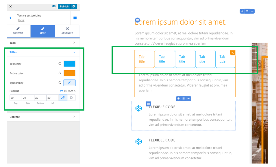
Style for the titles
The titles are the names associated to each of the tabs.
Text color – give a specific color to the text of the tab titles.
Active color – give a distinct color to the text of the active item (this is the item users have clicked on and which they are seeing).
Typography – click on the pencil icon next to Typography, to open the panel with typography settings for the tab titles (font, font weight, dimensions, style, line height & letter spacing, etc.)
Padding – this refers to the surface the tab titles are deployed over. Select higher values for a wider surface the titles are deployed over.
Style for the content
The content is the text that appears under a tab, after you have clicked on that tab.
Text color – give a specific color to the text of a tab content.
Typography – click on the pencil icon next to Typography to open the panel with customization settings for the text typography (font, font weight, dimensions of the font, line height, letter spacing, etc.)
Padding – this refers to the surface the text under a tab is deployed over. Select your values and preview the results.
Advanced
To make further customizations for the Tabs section, use the Advanced settings category.