After you have added predefined sections to a page, you can further add elements to them and customize them to your wishes, with any components you want.
Here are some examples of elements you might add to the sections of a page:
Icons
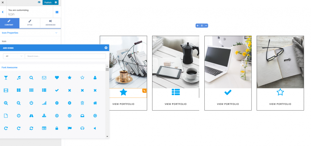
Open the list of Components and choose, from Basic, the Icon component. Use drag-and-drop to add icons to page sections.
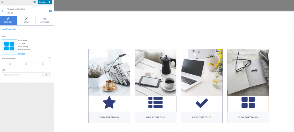
To customize the icons you included in a page section, you need to have the settings category for Icons open in Customizer.
Content
From here, you can adjust the icon properties.
Choose the icon – you can change the default icon with another one, from the Font Awesome library, Ionicons library, Materials library, etc.
Align the icons – you can align the icons to the left, at the center or to the right.
Add links on the icons – to place links on the icons, you need to fill in the blank space dedicated to Link with the full URL of the destination page.
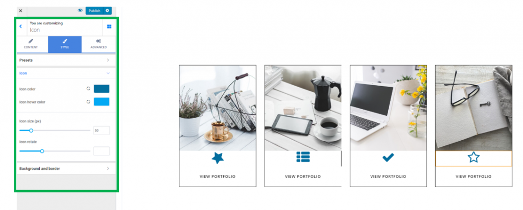
Style
From here, you can modify the way icons appear in the page section.
Color of the icons – change the color of the icons, by choosing the wanted color from the color picker.
Color of the icons on hover – change the color of the icons as they appear when users hover their mouse over them, by choosing the wanted color from the color picker.
Define the dimensions for the icons – try different values on the slider to check the appearance of the icons in the page section. Higher values equal greater dimensions of the icons, while smaller values mean smaller dimensions of the icons in the page section.
Icon rotate – this feature refers to how you rotate the icon and change its inclination, so as it is displayed the way you want, in the respective section.
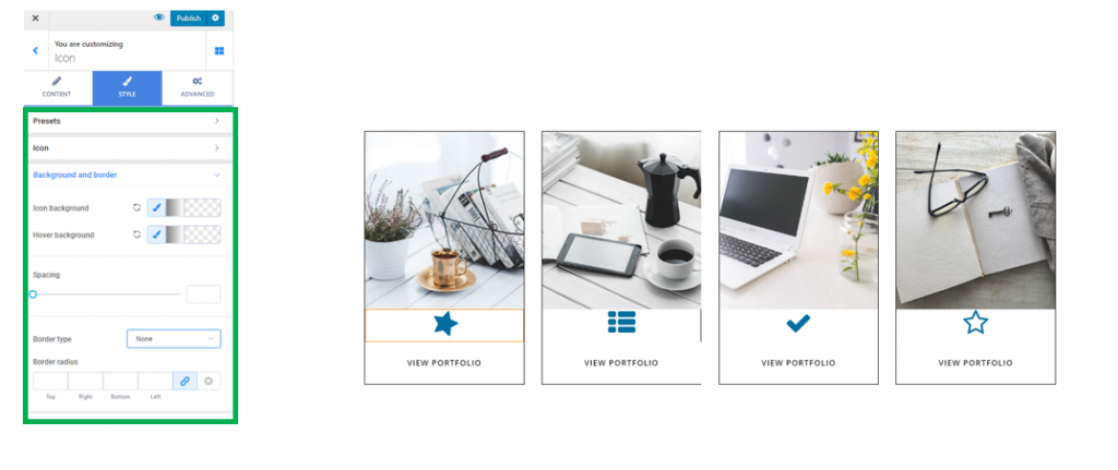
Background and border
Background color in normal state and on hover – from here, you can create a colored background for the icons you’ve added to the section. Also, you can choose a different color for the icons as they appear when users hover their mouse over them, to make them more salient in the page section.
Border Type – you might want to create a border for the icons. Select one of the available types of border and adjust values for it.
Note! When applying a visible border to an icon, you need to also check the values you set for icons rotation, as the border will follow the rotation of the icons.
Border Thickness – give individual values for each side of the icon border. Thus, you decide how thick the icons borders will be.
Border Color – you define, from here, the color of the visible border for an icon.
Border Radius – from here, you decide how round the border corners will be. The higher the values you select, the rounder the border corners will be.
Text
Open the list of Components and choose, from Basic, the Text component. Use drag-and-drop to add text to page sections.
To customize the text you added into a section, make sur you have the settings category for text in the Customizer.
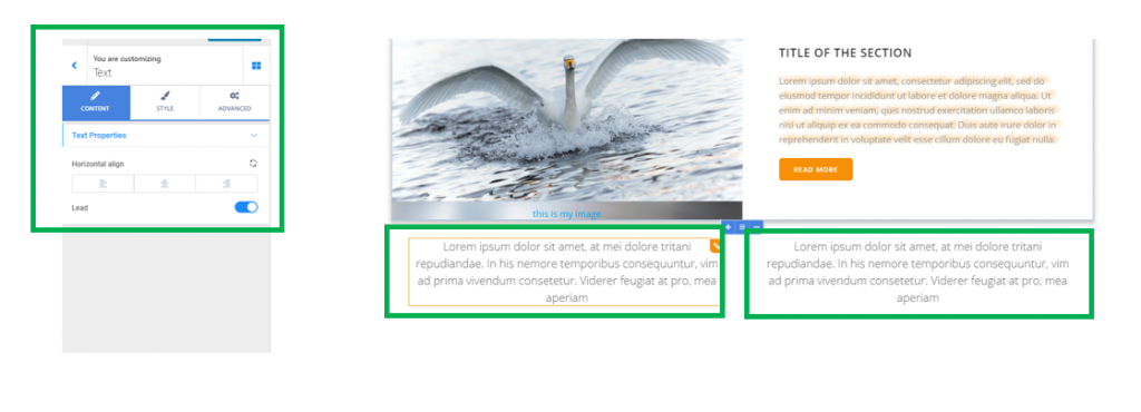
Content
You have the possibility to make some adjustments for the text content:
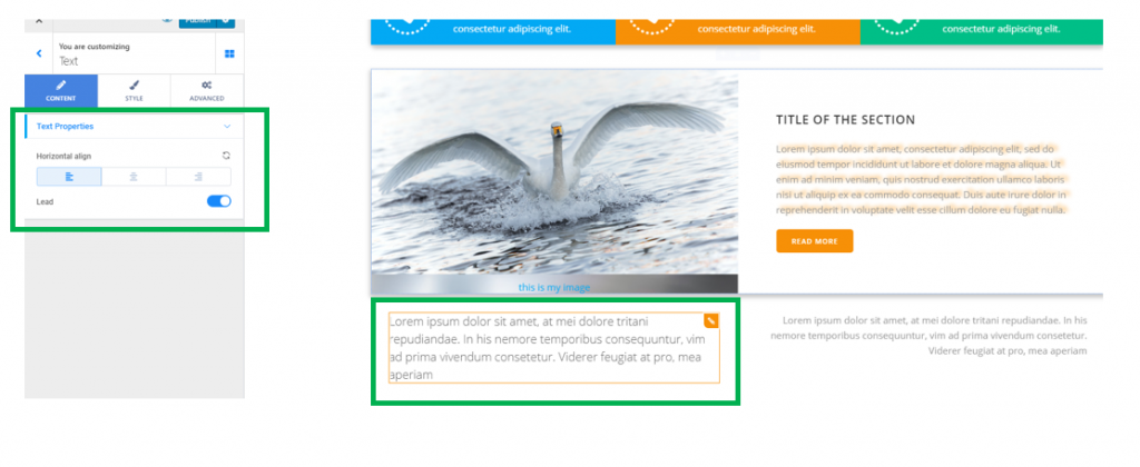
- Alignment of the text – align the text to the left, at the center or to the right.
- Lead – if you mark a text as lead, it will have the value of a short opening paragraph that summarizes the text following it. Enable this option and the lead text will have larger dimensions.
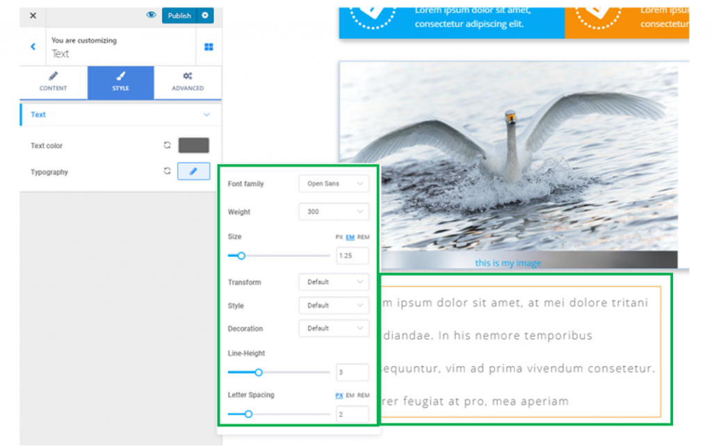
Style
Style options refer to the color and typography of the text you included in the page.
- Text color – select a color that’s most appropriate for the text, from the color picker
- Typography – click on the pencil icon next to Typography and open the panel with customization options for the text:
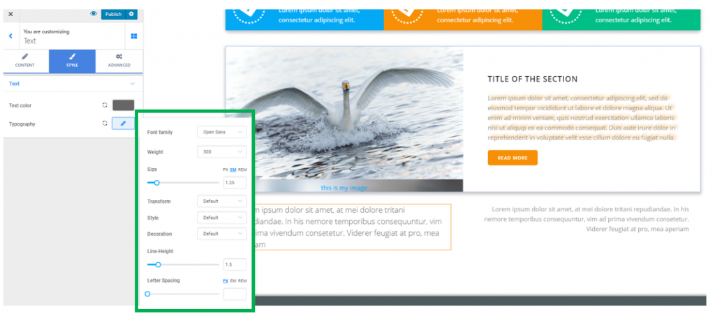
- Select the font family for the text
- Select the weight of the text, from different values that are available
- Set the dimensions for the text, by selecting specific values on the slider (the values can be expressed in pixels, em or rem).
- Make the text uppercase, lowercase, capitalize it, etc.
- You can set the style of the text to normal or italic
- From Decoration, you can underline the text, add a line above the text or a line through the text
- Line Height – the line height defines the vertical distance a line of text occupies in the container. Select higher values and the lines of text will be more distanced from one another
- Letter Spacing – also known as kerning, letter spacing refers to the distance between the letters in the text. Select higher values to place more distance between the letters of the text.
Links
Open the list of Components and choose, from Basic, the Link component. Use drag-and-drop to add links to page sections.
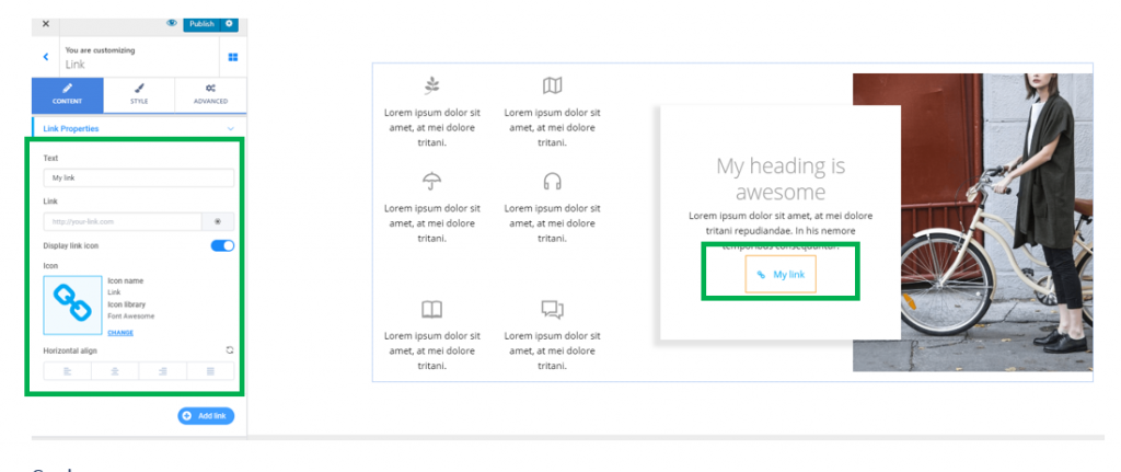
To customize the link you included in a page section, you need to have the settings category for Links open in Customizer.
Content
Anchor text of the link – fill in the blank space under Text with the words you want to place a link over. This will be the anchor text of the link.
URL of the link – fill in the blank space under Link with the full URL of the target page, that you want users to land on after they click on the link.
Link Icon – enable the option to Display link icon, to add a suggestive icon next to the link. You can change the default icon with one of your choice, by selecting an icon from the Font Awesome library, Ionicons library, Materials library, Typicons library, etc.
Alignment of the link – you can place the link to the left, at the center or to the right of the section where you included it.
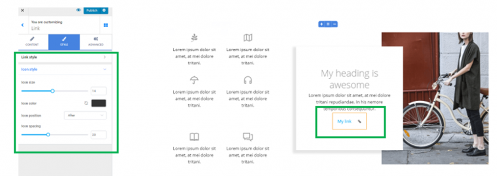
Style
From here, you can modify settings for the style of the link, as well as the icon associated to it.
Customize the Link Style
Typography – this option refers to the typography of the anchor text that the link will be placed over. Click on the pencil icon next to Typography and open the panel with typography options for the text (choose the font, choose the weight of the font, define the dimensions of the text, turn the text to uppercase/lowercase/capitalize it, adjust the height of the line of text, etc.)
Text color – from here, you can change the color of the anchor text for the link. By default, the color associated to the link text is blue. It’s best practice that you should keep the blue color for the links, as users are accustomed to recognizing links by this color.
Hover text color – this is the color of the anchor text for the link as it appears when users hover with their mouse over that link. Choose an appropriate color from the color picker.
Visited text color – this is the color of the anchor text for the link as it appears after users have accessed that link. The distinctive color will mark to users that they have already visited that link.
Customize the Icon Style
From here, you can make adjustments to the way the icon associated to the link displays in the page section.
Icon size – determine the best dimensions for the icon associated to the link.
Icon color – choose a representative color for the icon, from the color picker.
Icon position – from here, you can select whether the icon is placed before the link or after it.
Icon spacing – this option helps you adjust the distance of the icon from the anchor text of the link.