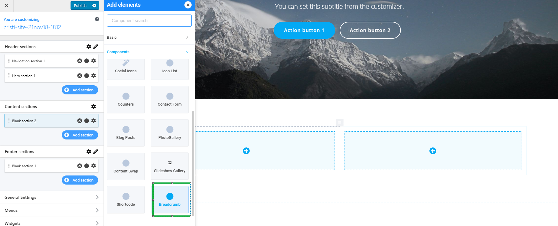
In the Customizer, click on the + sign on the right side of the screen, and a panel will open with the elements list.
You will find the Breadcrumb component in the Components list. To add this element in the web page, simply drag-and-drop the “Breadcrumb” element to the page in preview mode.
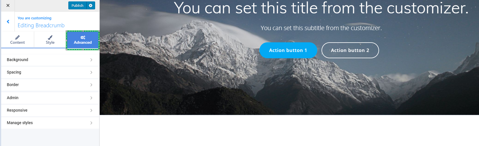
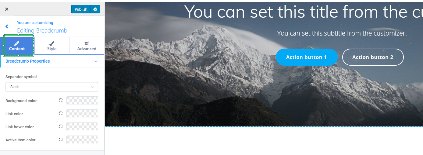
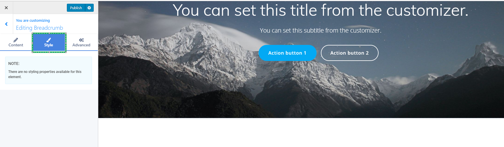
From there, you have the possibility to edit the three main tabs of your component: Content, Style and Advanced.
Content
The Content tab consists of the Breadcrumb properties which are:
- Separator symbol ( you can choose from one of the available separators: Slash, Greater than, Angle right and Bull )
- Background color
- Link color
- Link hover color
- Active item color
Color
To apply a color, you have to click on one of the added columns, and the color will be set especially for that respective column.
You should click on the color picker next to “Color”, and a new panel will open, with your options. This panel includes the whole range of tints and hues for colors in the color spectrum, and their corresponding HEX value. The HEX value helps you keep one color for later, when you’ll want to apply exactly the same color to another section in the website pages.
In addition, the color picker provides suggestions of color schemes.
Color schemes are combinations of colors that work well together, so you can envisage the exact tints and hues that give the design a professional look.
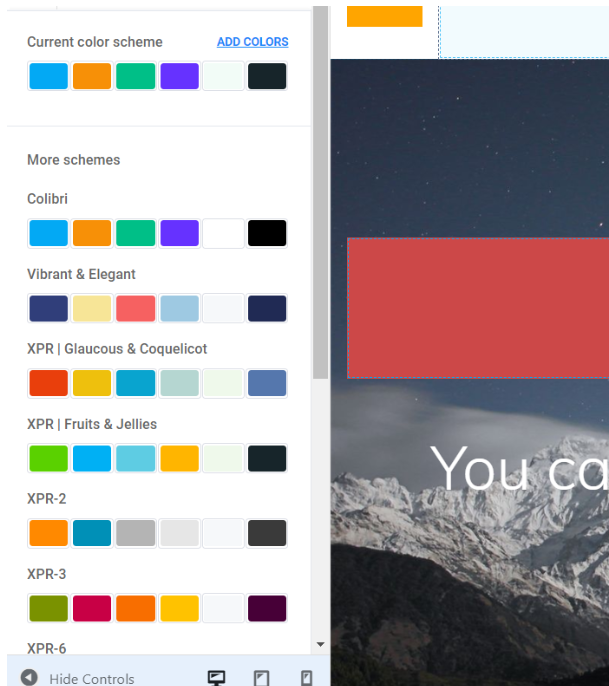
Also, the color scheme you’ve chosen can be enriched with new colors, when you click on the button “Add Colors” and you make a selection.
Style
In the second one, the Style tab you do not have any styling properties available for this type of component.
Advanced
The last tab is the Advanced tab, in which you have the more advanced options for your component:
- Background
- Spacing
- Border
- Admin
- Responsive
- Manage styles