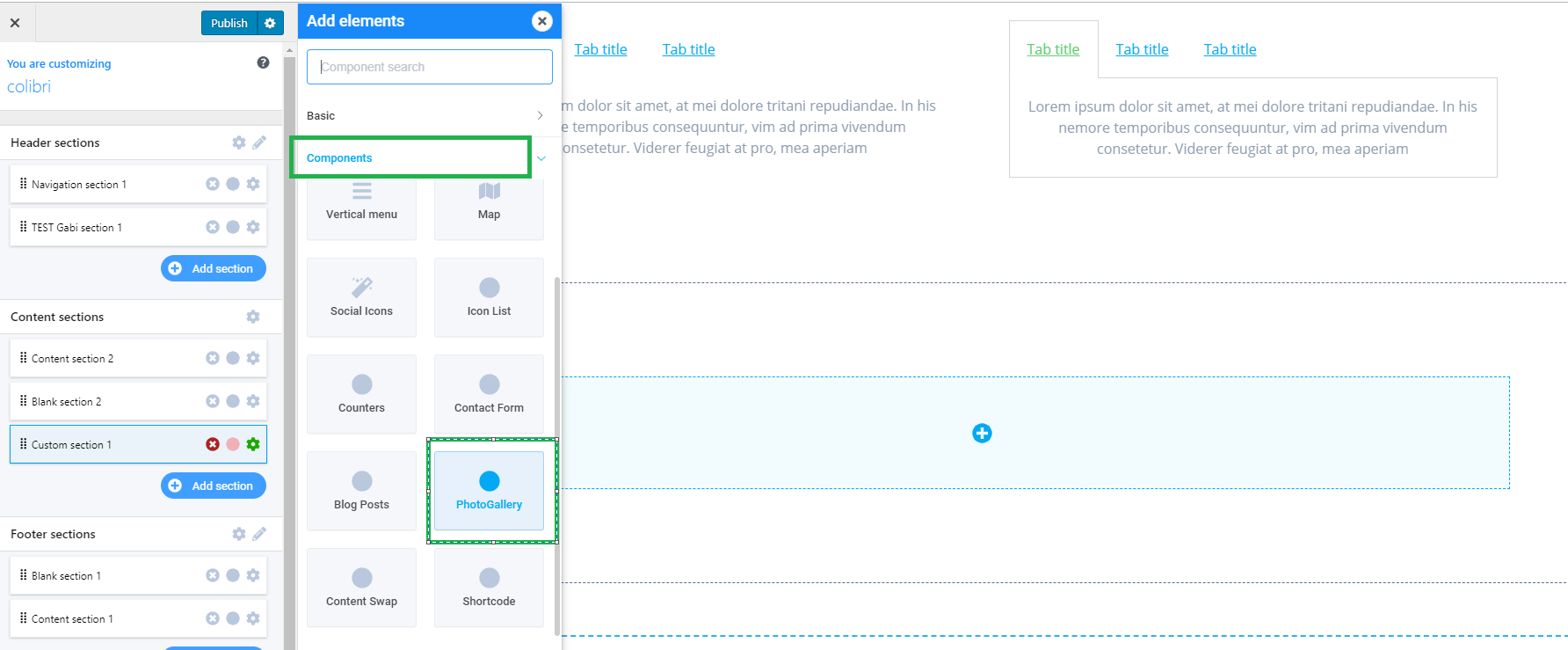
In the Customizer, click on the + sign on the right side of the screen, and a panel will open with the elements list.
You will find the PhotoGallery component in the Components list. To add this element in the web page, simply drag-and-drop the “PhotoGallery” element to the page in preview mode.
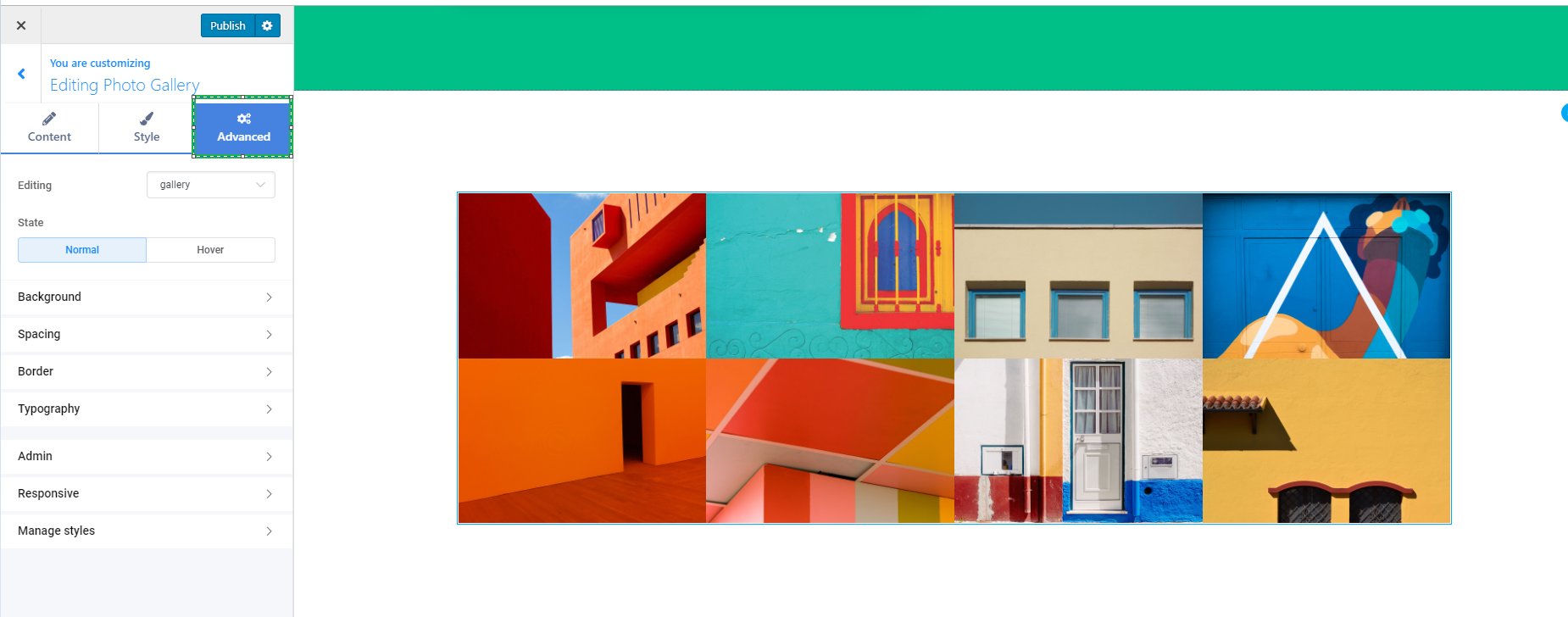
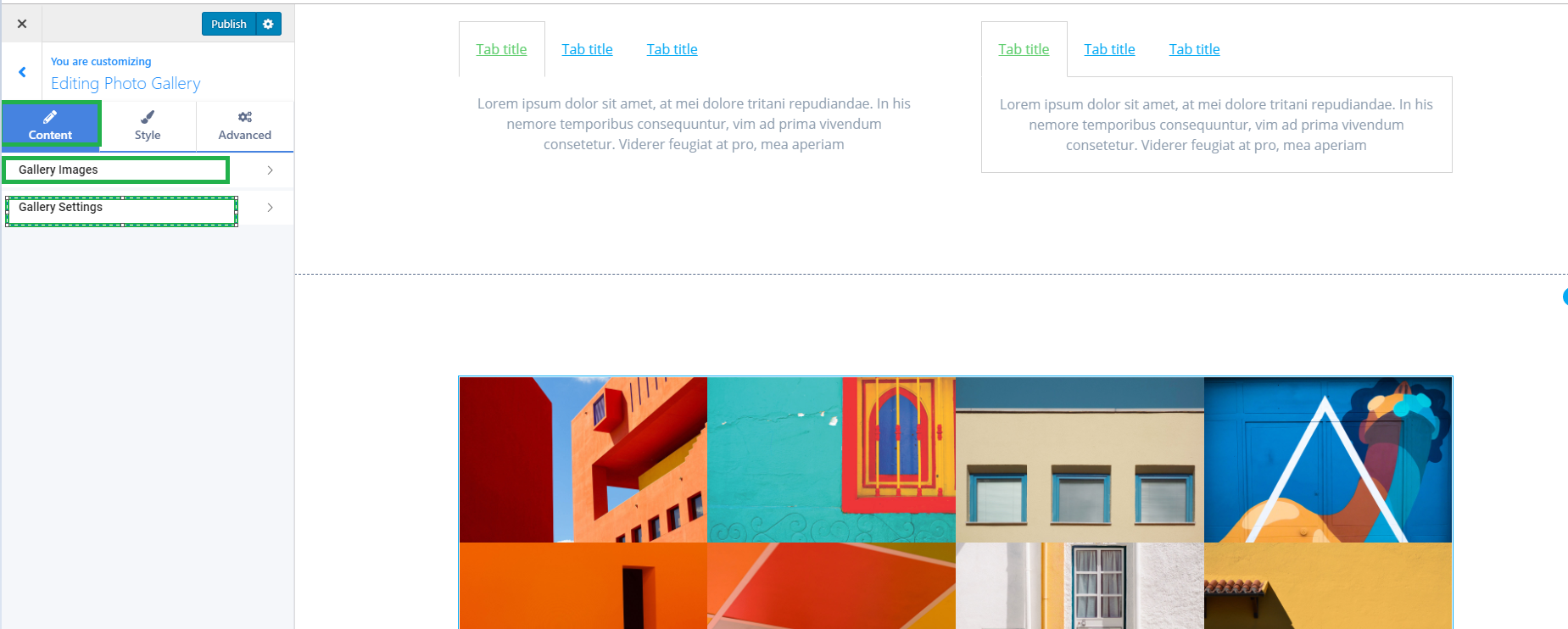
From there, you have the possibility to edit the three main tabs of your component: Content, Style and Advanced.
Content
The Content tab has the following options:
- Gallery Images
- Gallery Settings
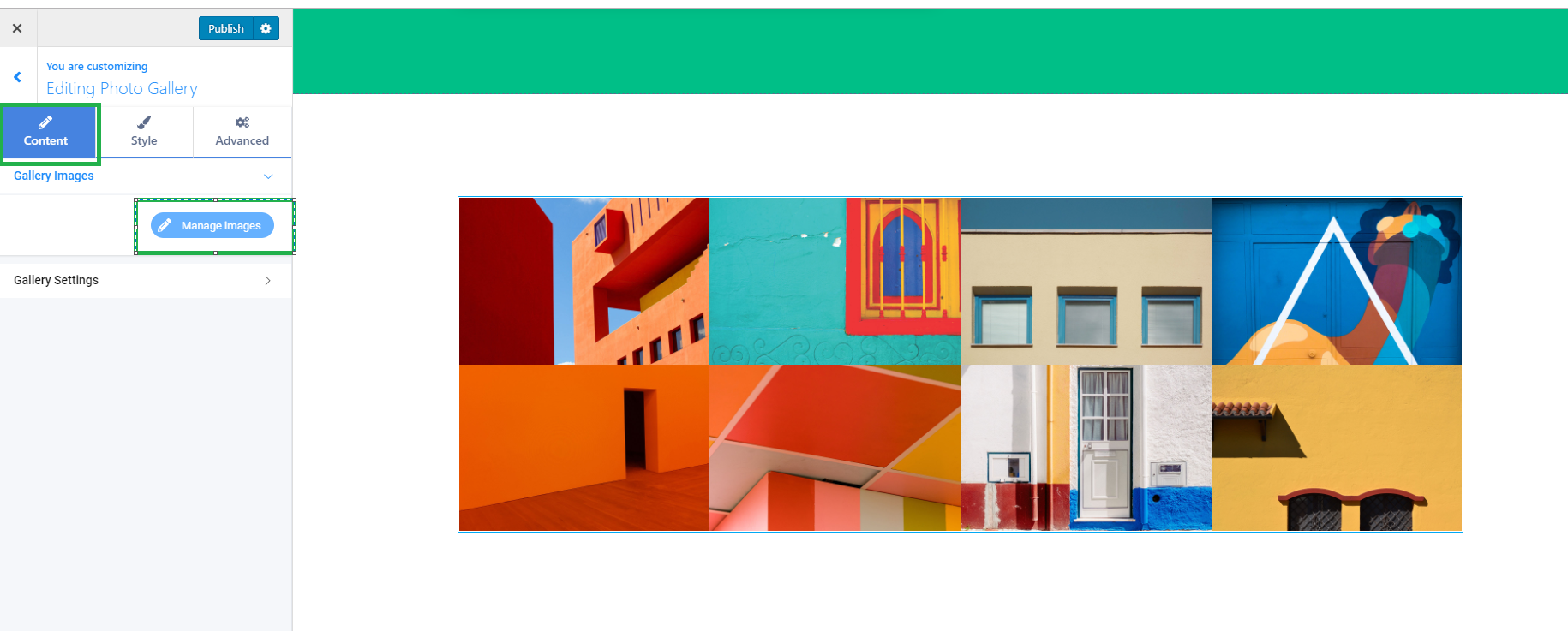
In the Gallery Images option tab, you can manage your gallery images.
Clicking on the Manage Galleries button will open up the Media library so you can add more images to your gallery or edit your existing images.
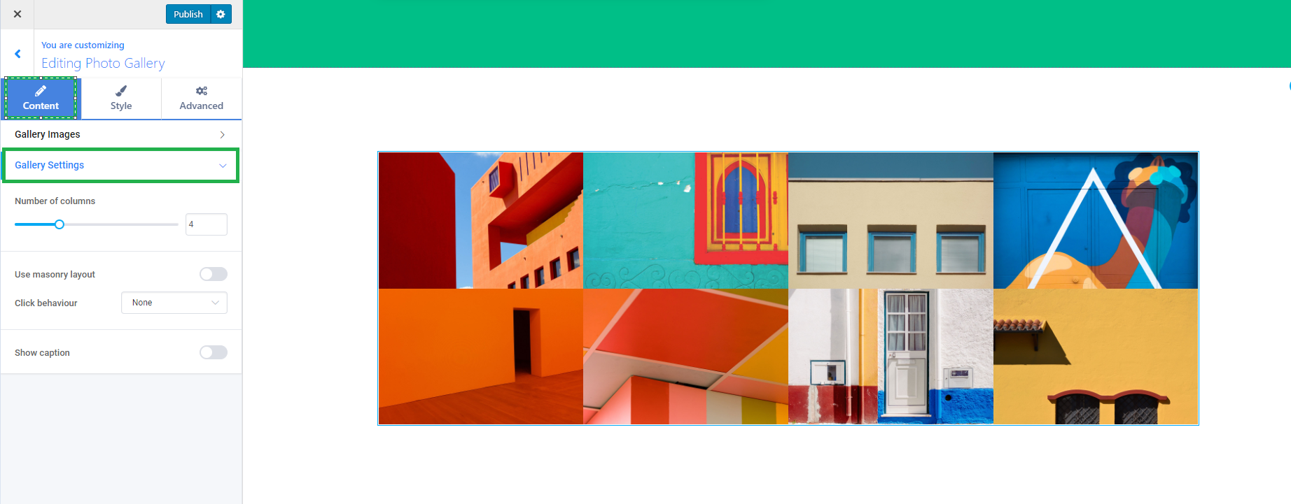
In the Gallery Settings you have the following options:
- Number of columns
- Use masonry layout ( also here you have the click behaviour for your images which you can set as open in lightbox, link to media file, link to media page)
- Show caption
Style
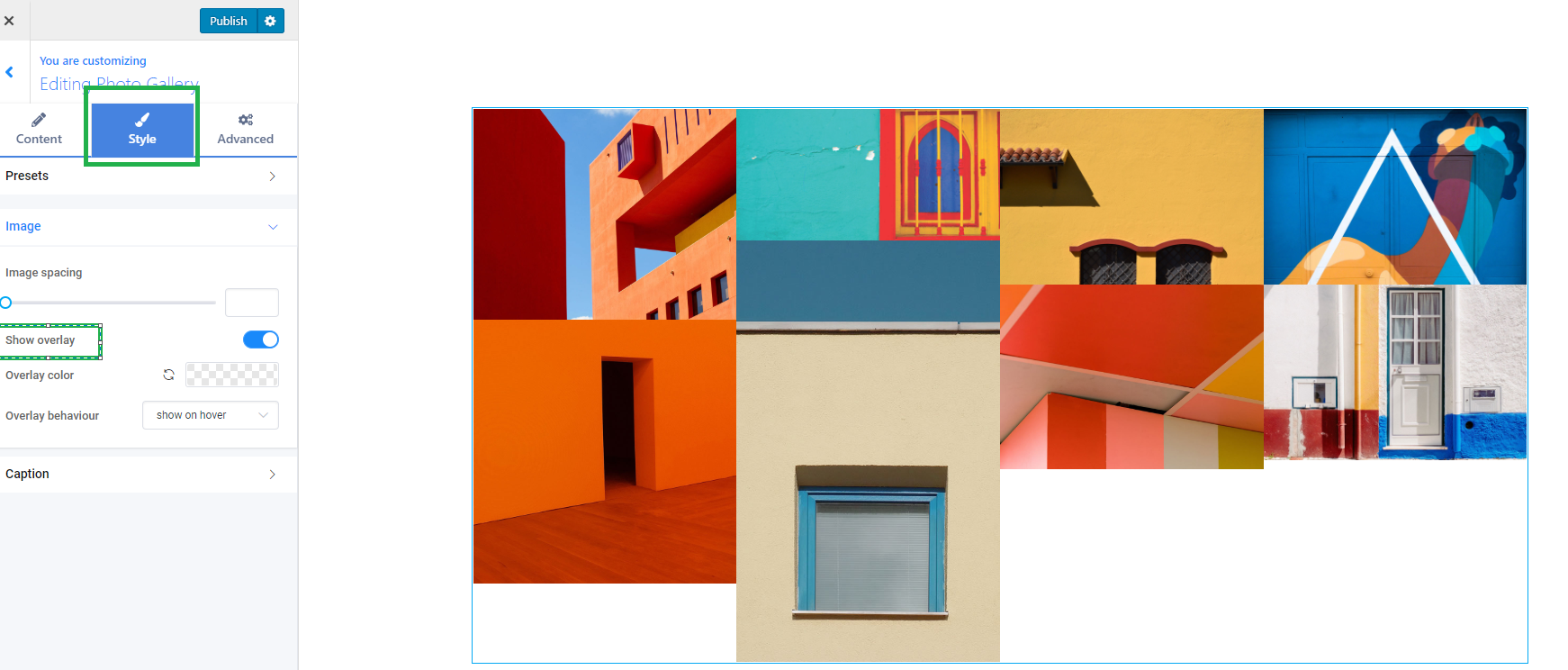
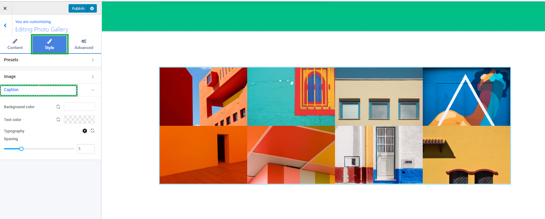
The Style tab contains the following options:
- Presets
- Image
- Caption
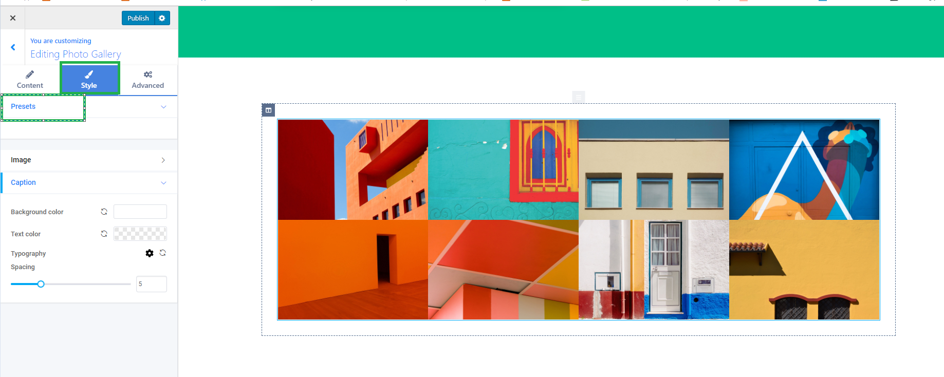
In the Presets tab, you can choose from one of the predefined presets for your PhotoGallery component.
In the Image tab, you can change the image spacing. You can also set the overlay for your images from the Show overlay option. From there you can set the Overlay color and the Overlay behaviour( show or hide on hover )
In the Caption tab, you can change the following options:
- Background color
- Text color
- Typography Spacing
Advanced
In the Advanced tab, you have the more advanced options for your component, which consists of:
- Background
- Spacing
- Border
- Admin
- Typography
- Responsive
- Manage styles