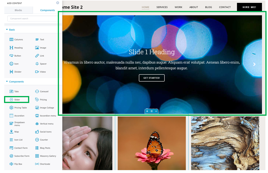
Open the list of Components, and select the Slider component. Use drag-and-drop to place a slider into your page.
Example of slider added to a website page:
Then, place the cursor over the slider, to open the panel with customization options for the Slider.
Slide Content
Slide
Slide image – change the default image by clicking on it and opening the panel where you upload an image of your own.
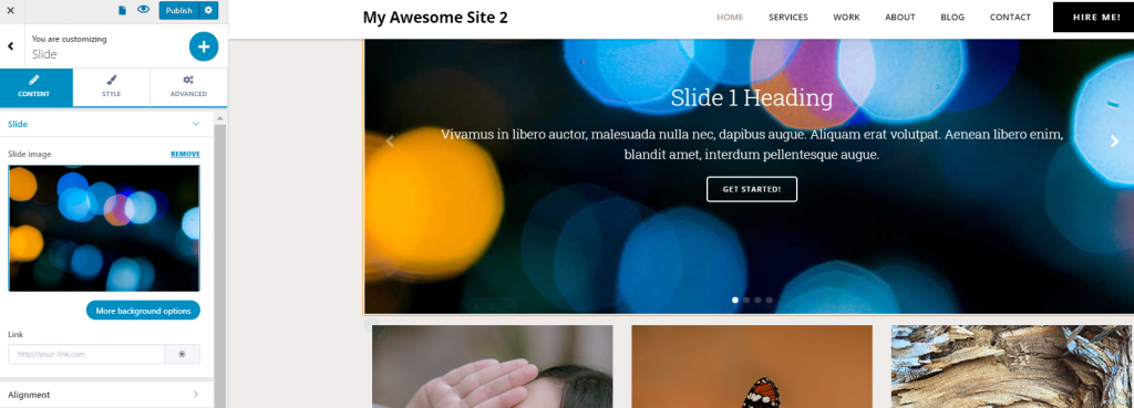
If you click on “More background options”, you’ll go to the settings under the Style tab, where you’ll find advanced customizations for the slides background.
Link – this option allows you to place a link onto the image, so when users click on that slide, they’ll go to the address indicated by the respective link. Fill in the blank space with the link you want to place onto the slide, and save the changes.
Alignment
This option refers to the alignment of the content within the slide.
Horizontal alignment – the content can be aligned to the left, at the center or to the right of the slide.
Vertical alignment – the content can be aligned to the top, in the middle or to the bottom of the slide.
Content elements vertical spacing – this defines the distance between content elements, on a vertical axis. The greater the values, the more distance will be between the content elements. Select the value you want on the slider corresponding to “Content elements vertical spacing”.
Slider
The Slider can be composed of as many slides as you want.
You can:
- Remove a slide from the slider
- Duplicate a certain slide
- Change the order of the slides
- Add new slides (press the + Add slide button to add a new slide)
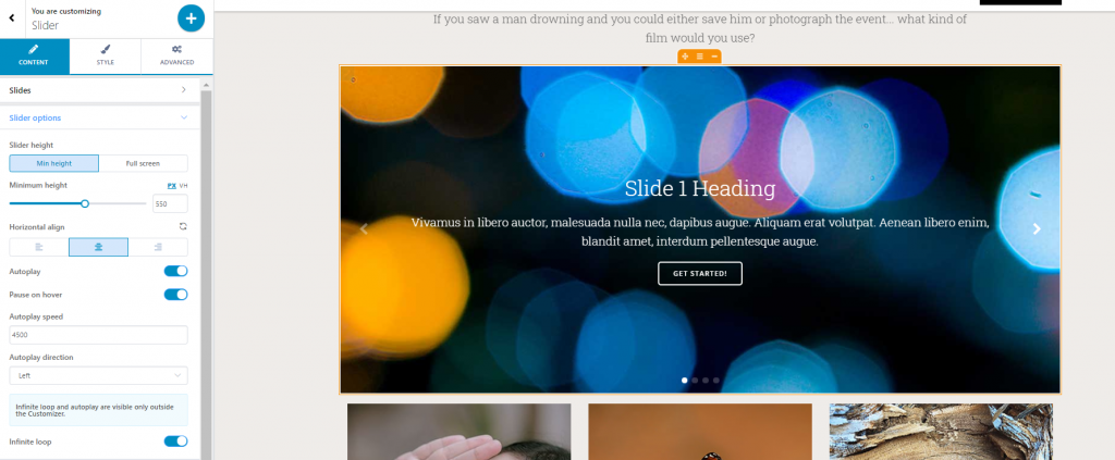
Click on “More slider options” to expand the list of settings for the slider.
Slider Options:
Slider height – this is the vertical distance the slider occupies in the page. It can be set to minimal height or full screen.
Minimal height can be adjusted based on the value you choose on the corresponding slider.
Horizontal alignment – content can be aligned to the left, at the center or to the right
Autoplay – when this option is enabled, the slides succeed to one another automatically, without any visitor intervention.
Pause on hover – if this option is enabled, when users hover with their mouse over the component, the slider is paused.
Autoplay Speed – from here, you adjust the speed at which the slider automatically plays in the website page. Select a greater or smaller speed and see which value is most appropriate for your website presentation.
Autoplay Direction – this option refers to the direction towards which the slides are succeeding to one another. The Autoplay Direction can be set to the left or to the right.
Infinite Loop refers to the slider automatically playing in an infinite succession of slides. Enable the option “Infinite loop” if you want to activate it for the slider in your website page.
Autoplay and infinite loop, when activated, are visible only outside the Customizer.
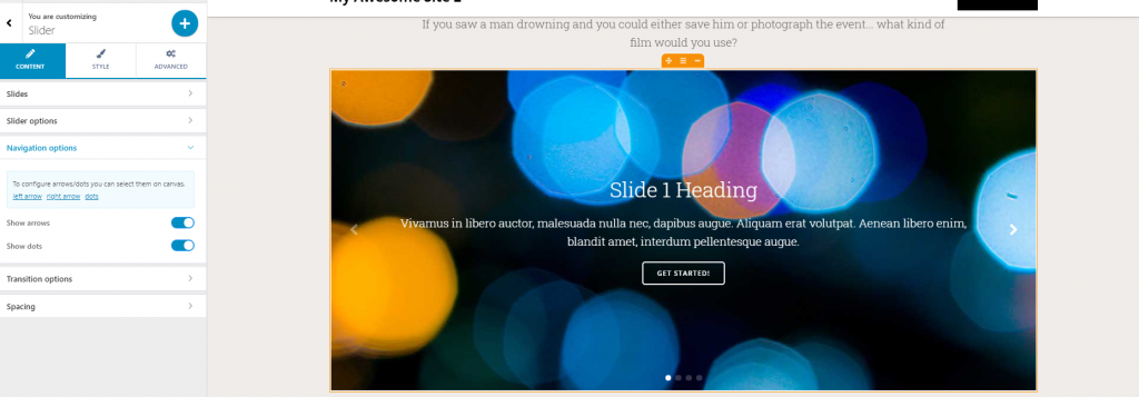
Navigation Options
Show arrows – arrows indicate the passage to the next/previous slide in the slider. If you enable this options, there will be right/left arrows that indicate the next/previous slide.
To further customize the arrows, click on them and open the panel with customization options for those arrows.
Arrow
Content
Choose the arrow horizontal position (to the left, at the center or to the right).
Choose the arrow horizontal offset (this refers to the distance of the arrow from the slider margin).
Choose the vertical position of the arrow (to the top, at the middle or to the bottom).
Icon properties – keep the default icon or choose the appropriate icon from the Icons Library.
Icon Style
Icon color – this is the color of the icon as it appears in the slider. It’s recommended that you choose a color which stays in contrast with the slides colors, for visibility reasons.
Icon hover color – this is the color of the icon as it appears when users hover their mouse over the respective icon. It should differ from the color of the icon in normal state, and be visible enough onto the slider.
Icon size – this is the dimension of the icon (left, right icon). Choose values on the slider, and test with different dimensions of the icon.
Icon Rotate – this option allows for the icon to rotate. Choose a value on the slider, to set the appropriate rotation of the icons.
Icon background and border
Icon background – this is the color of the background for the icon indicating the next/previous slide.
Hover background – this is the color of the background for the icon indicating the next/previous slide, as it appears when users hover their mouse over the respective icon.
Spacing – this option defines the space onto which the icon is deployed.
Border type – you can specify which type of border you want to add to the icons (no border, solid line, dashed line, dotted line, double line, groove line, etc.)
Border radius – this option defines how round the corners of the icon border will be. Greater values mean rounder corners of the icon border.
Advanced Settings for the Icon
From here, you can make customizations both for the Container and for the Icon.
Settings can be adjusted for the icon both in normal state and on hover.
Dots
Show dots – dots indicate which slide in the slider you’re currently viewing.
To further customize the dots, click on them and open the panel with customization options for the respective dots.
Dots Content
Horizontal position – this refers to the placement of the dots to the left, at the center or to the right of the screen.
Horizontal offset – this refers to the placement of the dots towards the right, or the left of the screen, depending on what values you select on the slider.
Vertical Position – this option refers to the positioning of the dots to the top, at the center or to the bottom of the slide. Generally, the dots indicating the slides are placed at the bottom of the slider.
Vertical Offset – this refers to the placement of the dots towards the top, or the bottom of the screen, depending on what values you select on the slider.
Dots Style
Size – define the dimensions of the dots, by selecting appropriate values on the corresponding slider
Color – select which color you want to give to the dost marking the slides. Open the color picker and select the color you want.
Advanced Settings for the Dots
From here, you can customize either the Navigation Dots container or the Navigation Dots themselves.
Also, you can customize the dots in normal state and on hover.
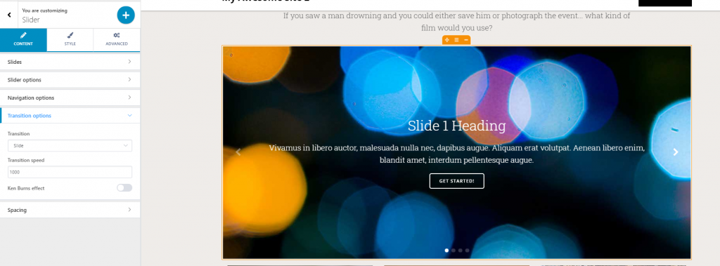
Transition Options
These settings refer to the way the transition from one slide to another is made.
Transition types:
- Slide
- Fade
- Cube
- Coverflow
- Flip
Test how the transition is made from one slide to another, for each of these variants, and see which is best for your website.
Transition Speed:
This option refers to how fast or slow the transition from one slide to another is made. Greater values mean a faster transition from one slide to another, while lower values have the opposite effect.
Ken Burns effect:
The Ken Burns effect refers to adding motion to still pictures you use for your slides. When enabling this option, you’ll get an animated zoom effect.
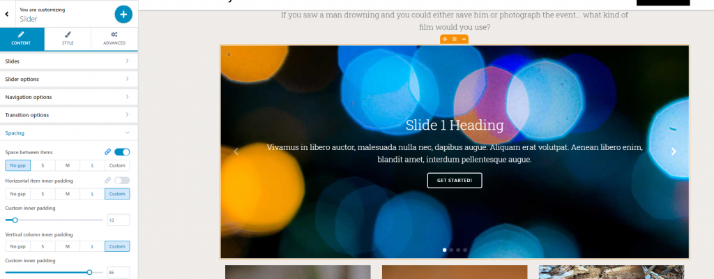
Spacing options
From here, you can define:
Space between items – if you enable this option, you create space between the slider and the other items in the page.
The space can be defined by one of these values:
- No gap
- Small
- Medium
- Large
- Custom space
Item inner padding – if you enable this option, you can set specific values for the space each item occupies in the slide.
The values are:
- No gap
- Small
- Medium
- Large
- Custom space
Custom inner padding:
To set up custom spacing for the items in the slides, select a value on the corresponding slider.
Vertical column inner padding – this refers to the space the items occupy in the slider, on a vertical axis.
The options are:
- No gap
- Small
- Medium
- Large
- Custom space
Custom inner padding:
To set up custom spacing for the items in the slides, on a vertical axis, select a value on the corresponding slider.
Slider Style
Background Color – this will be visible if you set background spacing to values that are greater than 0. Otherwise, the background won’t be visible for the slider. (The background spacing can be set from the Advanced Settings tab).
Choose a color from the color picker and apply it to the slider background.
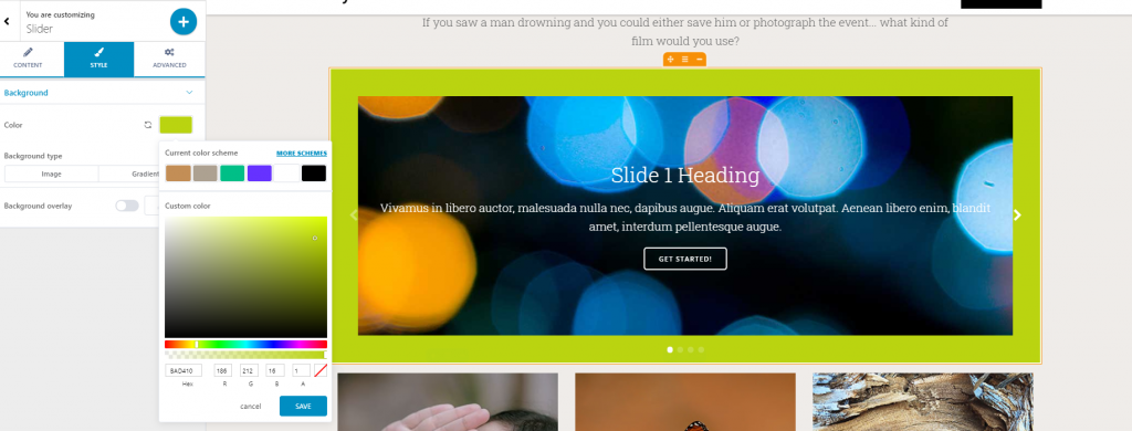
Background Type – the background can be a color, or an image/gradient. For the image, click inside the default image to change it with one of your choice. For the gradient, click on the cog icon to expand the list of gradients where you can choose one from.
Background Overlay – the overlay is a semi-transparent color that is applied on top of the background, to obtain a nice visual effect. Enable this option and click on the pencil icon to expand the list of customization options for the background overlay. You have the options to choose:
- A color
- A gradient
- Shape only
Advanced customizations for the Slider
From here, you can make customizations for the slider either in normal state or on hover.
You can adjust settings for:
- The Slider background
- The Slider spacing (padding and margin)
- Border and Shadow
- Typography (you can change text color, heading color, link color, color of the link when users hover their mouse over it, horizontal alignment)