For any block of content you add to the page, there are some basic customizations you can make simply in the Customizer, for the respective sections to look the way you want and perfectly integrate them into the page of your website:
Change Background of the Predefined Sections
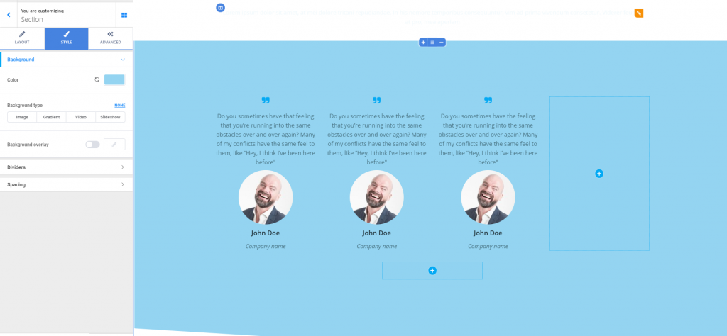
Go to the section you want to change the background to. Click inside the section and the list of corresponding settings will open in the Customizer. Click on the second tab, for Style options.
The first subsection in the list of options for the sections style refers to the background.
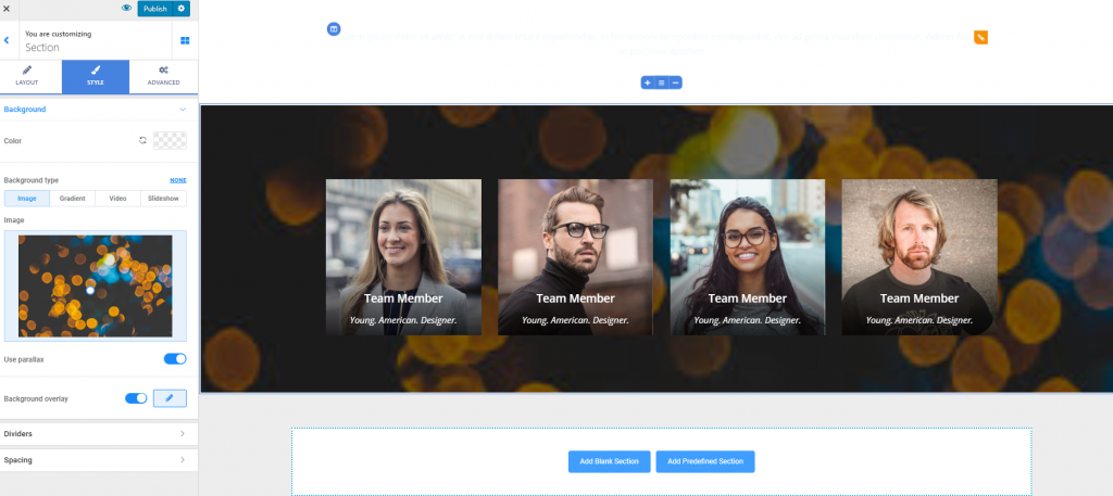
You can either set a simple color for the background of the respective section, or change the background type so as it displays:
- An image
- A gradient
- A video
- A slideshow.
Set a simple color for the background of a section
Click on the color picker next to Color to select a color of your choice for the section background. The colors panel gives you the possibility to take into account the color scheme and choose a color that fits into the overall design and ensures coherence is maintained:
You can revert to the default option any time.
Image for the Background
Upload the image you want to set as section background, and customize the following:
- Positioning of the image for the best fit (top left, top center, top right, center left, center center, center right, bottom left, bottom center, bottom right)
- Attachment (you can set the image to move at the same time as the rest of the section content, when users scroll down the page, or you can set it to stay fixed as users scroll down the page)
- Repeat (from here, you decide whether the image is repeated onto the background or not)
- Dimensions of the image (choose one of 3 values: auto, cover, contain)
- Use parallax – parallax creates an effect that means the background moves at a slower rate than the foreground, when users scroll down the page.
Background set as Gradient
Click on the default gradient to open the panel with available gradients and select one of your choice:
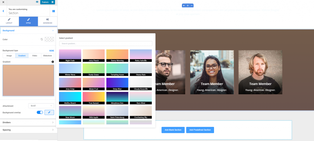
For further customizations, click on the cog icon next to Gradient to expand the list of settings for the gradient of the section:
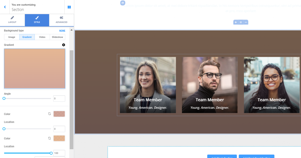
- Select a specific value on the slider for the angle of inclination you want to give to the gradient
- Select the colors that will be combined to form the gradient you’ve chosen
- Select values on the corresponding sliders for the location where one color fades into the other
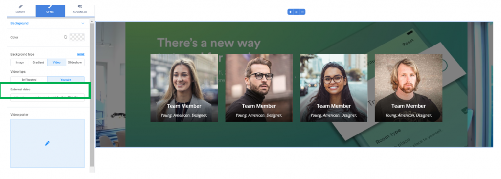
Video for the Background
You have 2 variants:
- Either you upload a video file from your device
- Or you provide the link to an external video file (e.g. YouTube)
Video Poster – the video poster is an image that’ll be displayed in case the video file is not loaded or won’t play. It has the same value as an alternate text in case of an image.
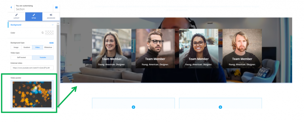
The video poster will be displayed into the background, in case the video file is not loaded.
Slideshow for the Background
In case you find it appropriate, you can set a slideshow as background for your section and customize it to your liking.
- Click on each of the default images to replace them by uploading your own images from your device.
- Use the button Add new slideshow image to add more images in the slideshow you are customizing.
- If you want to delete a slide, click on Remove slide under the image corresponding to that slide.
- Slide duration – this refers to the time one slide is displayed onto the screen, before the next slide comes in. Smaller values mean an image is displayed for a shorter time on the screen, before the next image comes in.
- Effect speed – this refers to how smooth or sharp the transition from one image to another is made. Smaller values result in sharper transitions from one image to another in the slideshow.
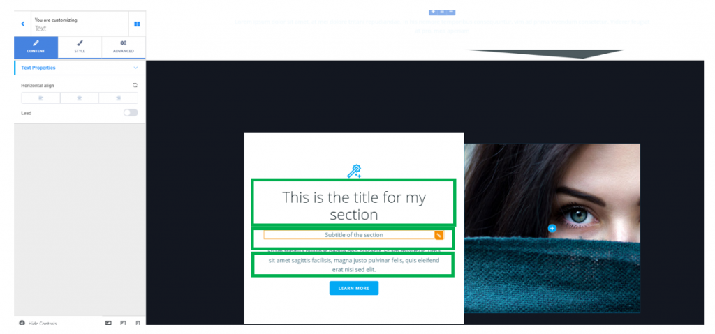
Change Text in the Predefined Blocks
To change portions of text in one of the predefined blocks you have added to your page, click on the respective section, and into the box corresponding to the text you want to modify.
Then, do the editing for that section (heading, subtitle or simple text):
Change Images in the Predefined Blocks
To change an image in a predefined block you’ve added to the page, click on the section you want to modify and into the default image.
You’ll open the list of components; from there, you need to select the Image component and add it to your section with drag-and-drop, within the container for the image you want to replace.
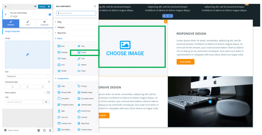
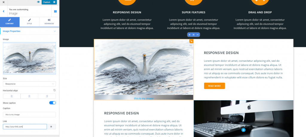
Then, clicking inside the image will open, in Customizer, the subsection with settings corresponding to that image:
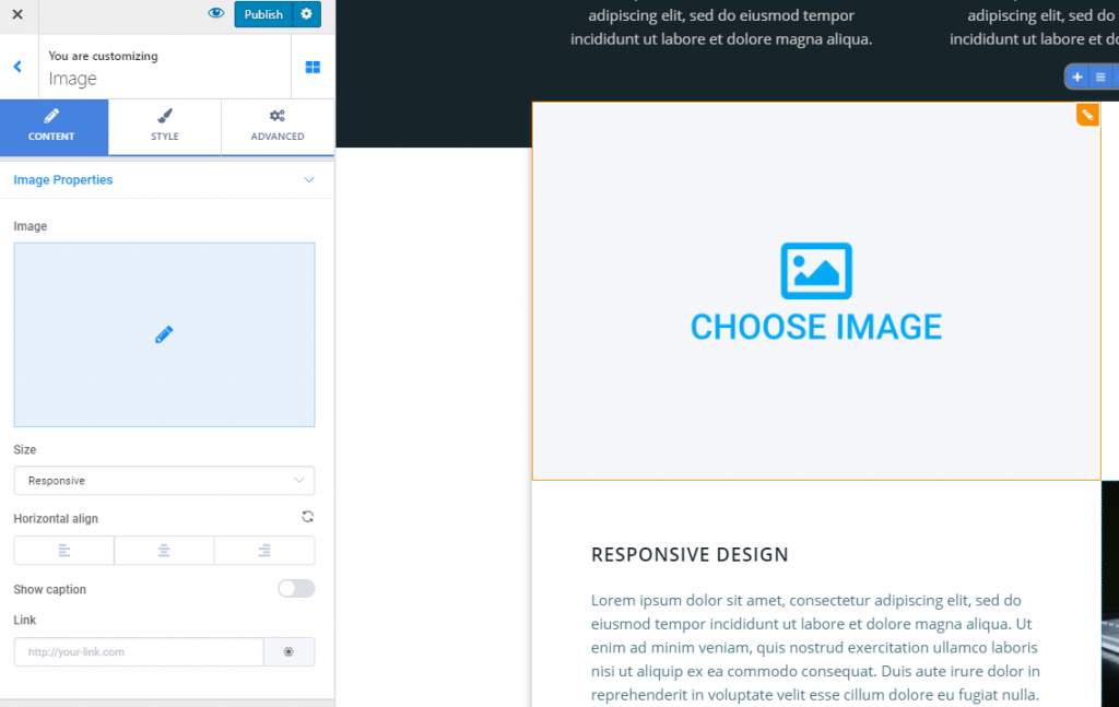
- Upload an image you want to place in the section, from your device
- Set the dimensions for that image (you have the following options: responsive, thumbnail, medium, medium large, large or full size)
- Define the alignment of the image (to the left, at the center or to the right)
- Decide whether to show caption or not (the caption is a short description of the image, that you attach to it to better explain what it stands for). Enable the option to Show caption and display the explanatory text
- You can place a link over the image (fill in the blank corresponding to the Link option with the URL you want to lead your users, when they click on the image)
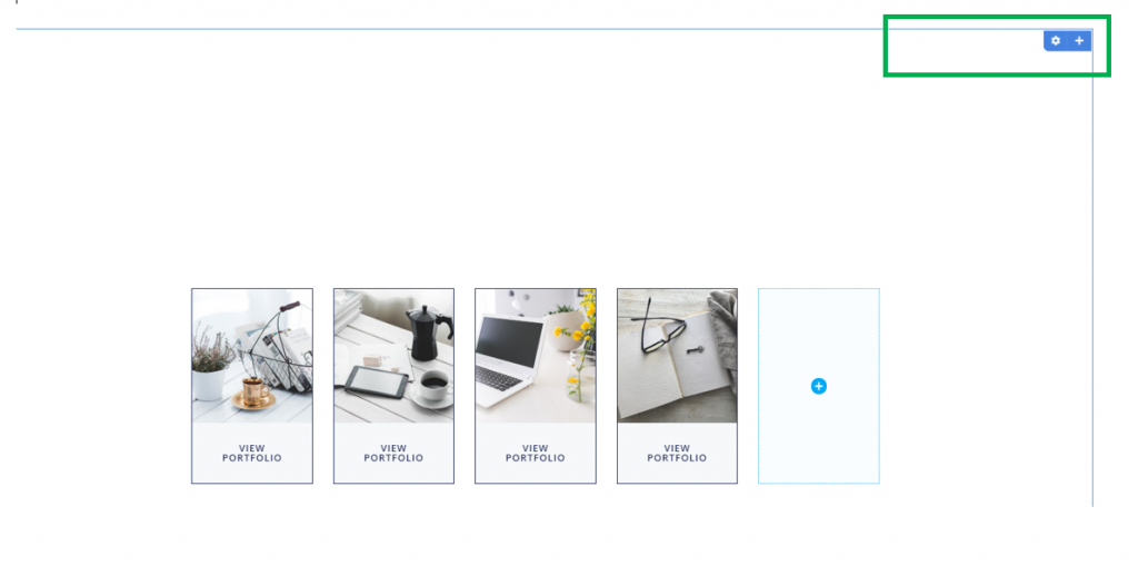
Add Items in a Section
For sections that contain columns, you can add extra columns to the table: hover your mouse over section and a list of options will appear in the upper part of the section. Clicking on the + sign will add a new column to the section you are modifying.
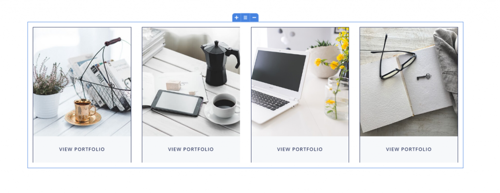
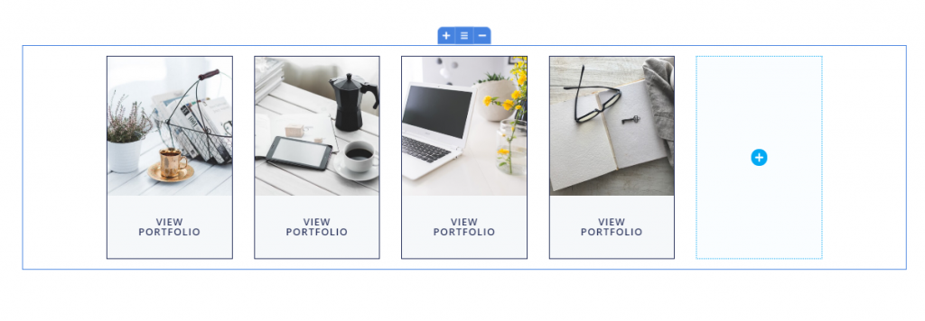
Define the number of columns
To place the new items on the same row as the previously added items, you have to adjust the number of items per row, from the cog icon in the right upper corner of the section: