Click on the blue button in the left-hand menu of the Customizer, to open the list of components. Find the Accordion Menu component and use drag-and-drop to add it to a section in the page you are editing.
Accordion menu added to a section in your page:
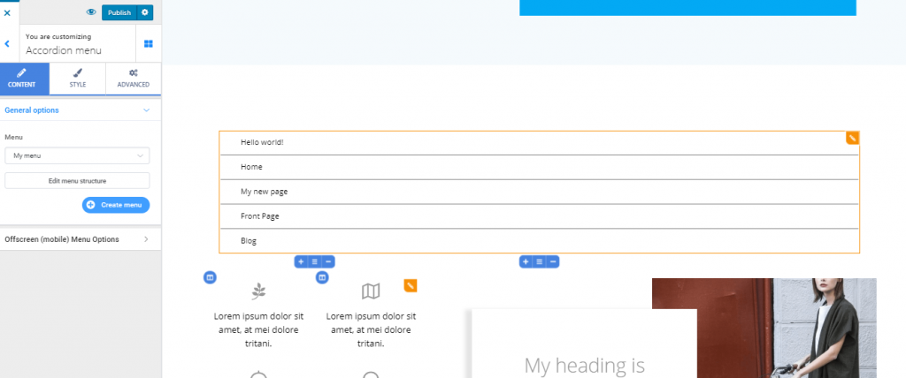
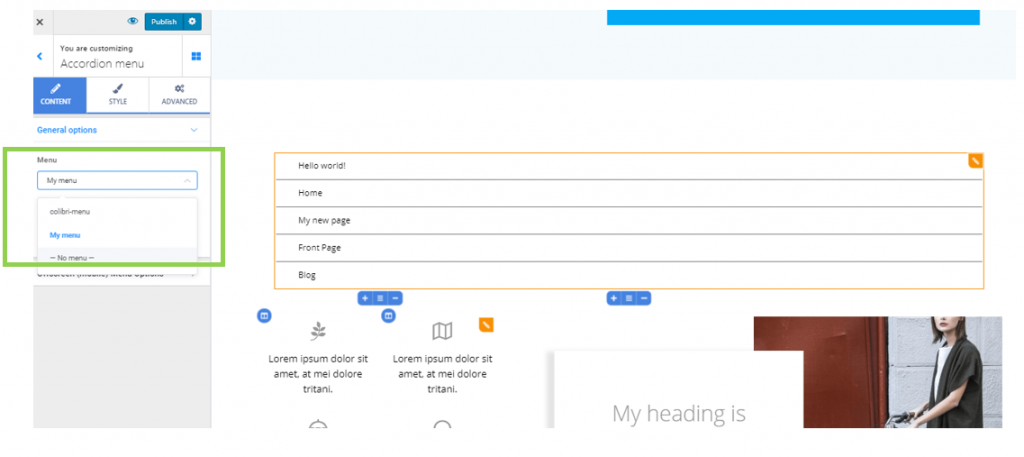
Content
General Options
Under Menu, select from the drop-down list the menu you want to include in the Accordion Menu component.
If you click on Edit menu structure, you’ll be taken to the respective menu settings, where you can:
- Add new items to the menu
- Reorder the menu items
- Remove items from the menu
- Change the labels for the menu items
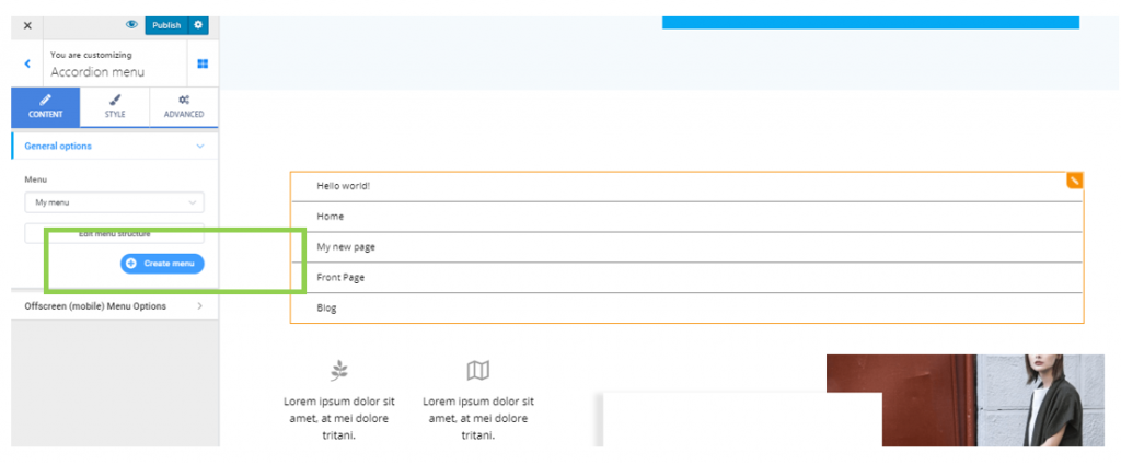
In case you want to include a different menu in the Accordion Menu component, other than the currently available menus, click on the blue button Create new menu:
Offscreen (mobile) Menu Options
Also known as hamburger menu, the offscreen menu makes it easier to view page/page section categories on mobile devices. It hides the traditional menu.
Make the offscreen menu show on different devices, by selecting:
- display as a hamburger menu on mobile
- display as a hamburger menu on mobile and tablet
- display as a hamburger menu on mobile, tablet and desktop
To visualize the changes you are making for the offscreen (hamburger) menu, you need to open the offscreen panel:
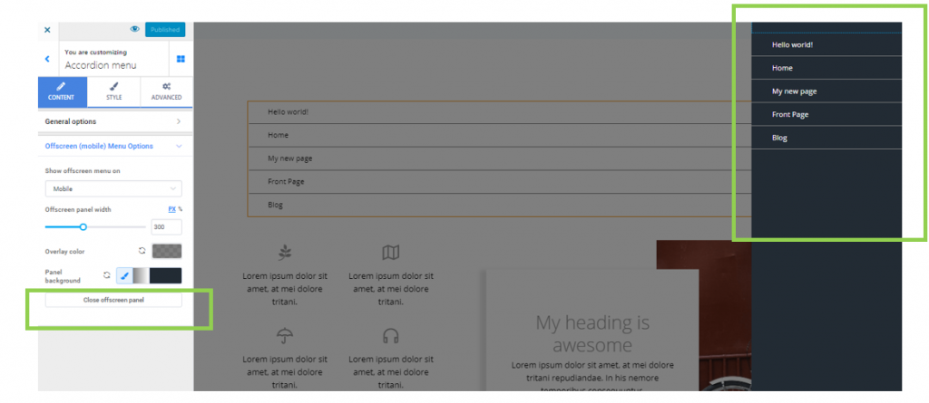
Offscreen panel width – this is the horizontal distance over which the offscreen menu is displayed (its width), when users expand the Accordion menu by clicking on the menu icon. Select your values on the slider and make the offscreen menu wider (by choosing higher values) or narrower (by choosing smaller values).
Overlay color – the overlay color is the color that is applied on top of the page, as it appears behind the expanded Accordion menu, while the menu is brought to the front.
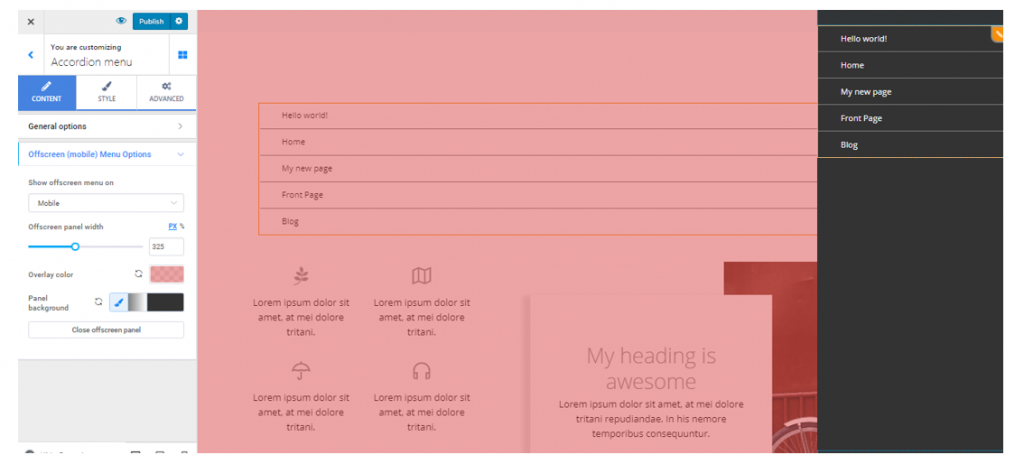
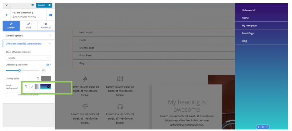
Panel background – this is the background onto which the menu items are displayed, when the offscreen menu is expanded. You can apply a simple color, by selecting it from the color picker, or a gradient, by selecting it from the representative icon at the right of the brush symbol corresponding to options for the Panel background.
When you have finished customizing the Accordion menu as an offscreen menu on mobile devices, click on the button at the end of the settings list, Close offscreen panel.
Style
From here, you can edit the style of the Accordion menu.
You can adjust style settings differently for the menu button in normal state, on hover (as they appear when users hover their mouse over the buttons) and for the active menu button (the item users have clicked on).
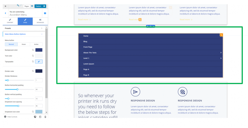
Main menu button options
These are the options for the items at the first level of the Accordion menu.
Background color – this is the color of the background onto which the main menu items are placed.
Text color – this is the color of the text corresponding to the menu items.
Typography – click on the pencil icon next to Typography, to open the panel with typography options for the text of the main menu items:
- choose a certain font
- choose the weight of the font
- define the dimensions for the font
- turn the text to uppercase, lowercase, capitalize it, etc.
- define the height of the lines of text corresponding to the items in the main menu
- define the space between the letters of the text corresponding to the items in the main menu
Divider color – this is the color of the graphic elements separating the items in the main menu; select a color you want, from the color picker.
Divider thickness – this option refers to how thick the graphic elements separating the main menu items are. The higher the values you select on the slider, the thicker the dividers will be.
Button horizontal padding – this option refers to the horizontal distance over which the main menu items are deployed.
Button vertical padding – this option refers to the vertical distance over which the main menu items are deployed.
Dropdown icon spacing – define the distance between the icons that, when clicked on, expand an item in the main menu to show items of second-level category in the Accordion menu.
Dropdown icon color – set the color of your choice for the icon that, when clicked on, expands items in the main menu to show items of second-level category in the Accordion menu.
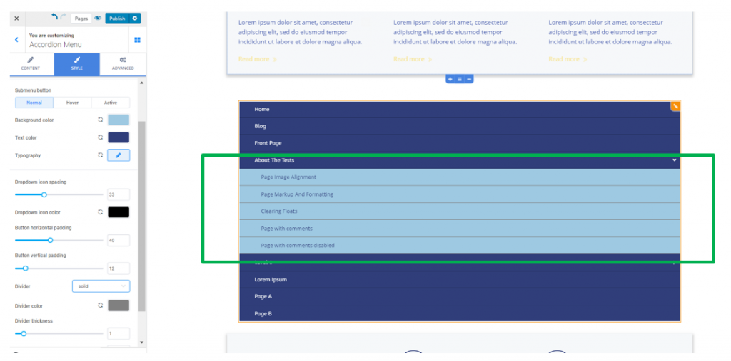
Submenu button options
These are the options for the items at the second level of the Accordion menu:
Background color – this is the color of the background onto which the submenu items are placed.
Text color – this is the color of the text corresponding to the submenu items.
Typography – click on the pencil icon next to Typography, to open the panel with typography options for the text of the submenu items:
- choose a certain font
- choose the weight of the font
- define the dimensions for the font
- turn the text to uppercase, lowercase, capitalize it, etc.
- define the height of the lines of text corresponding to the items in the main menu
- define the space between the letters of the text corresponding to the items in the main menu
Button horizontal padding – this option refers to the horizontal distance over which the submenu items are deployed.
Button vertical padding – this option refers to the vertical distance over which the submenu items are deployed.
Divider color – this is the color of the graphic elements separating the items in the submenu; select a color you want, from the color picker.
Style of the Divider – choose the style of the Dividers (they can take the form of a solid line, double, dashed line, dotted line, etc.)
Divider thickness – this option refers to how thick the graphic elements separating the submenu items are. The higher the values you select on the slider, the thicker the dividers will be.