Open the list of Components and find the Contact Form component. Use drag-and-drop to add a Contact Form component to the page you are customizing.
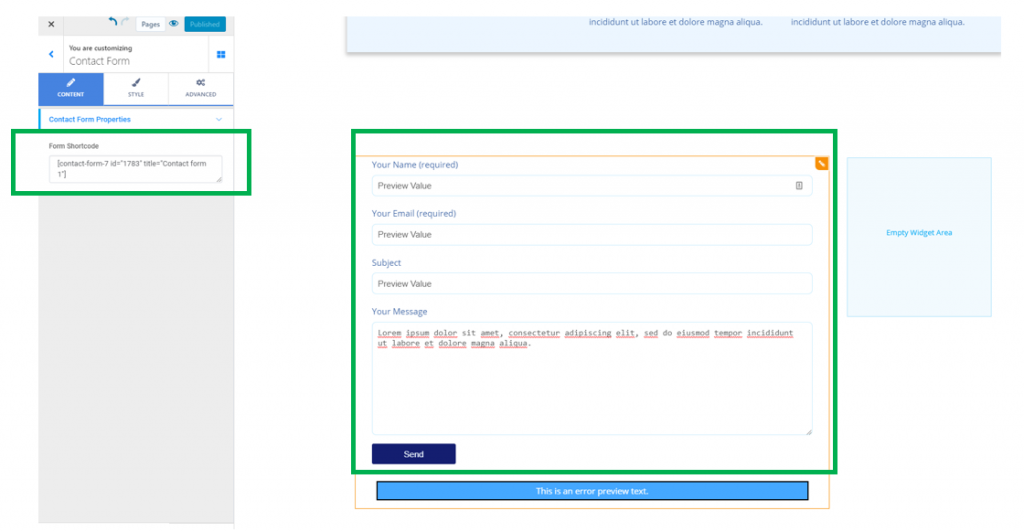
To create a contact form into your page, you need to previously install the Contact Form 7 plugin, in the WordPress Admin dashboard. You’ll find a Form shortcode associated with your contact form. Note down that shortcode, as you will need it to insert the contact form into the page of your website.
In Colibri, make sure you have the settings category for Contact Forms open in Customizer.
Content
Under Form Shortcode, fill in the blank space with the shortcode you copied from the contact form you created in the WordPress Admin dashboard, with the help of Contact Form 7 (as you can see in the screenshot above).
The contact form will thus be inserted into your website page.
Style
From here, you can configure the styling options for the contact form you added to your web page.
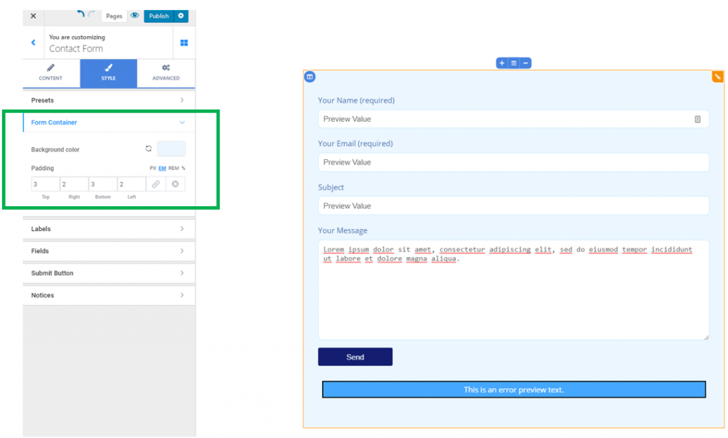
Form Container
Background color – this is the color you give to the background onto which the contact form will be displayed.
Padding – this option refers to the surface the contact form occupies in its section. Set individual values for each side of the contact form and define the distance of the top/bottom/right/left sides of the contact form from the margins of the section.
Labels
The labels are the explanatory texts “saying” what the contact form fields represent.
Text color – this is the color of the text for the labels of the contact form. Choose a color you prefer, from the color picker.
Typography – click on the pencil icon next to Typography, to open the panel with Typography options for the contact form labels:
- Choose a font family
- Select the weight for the font
- Define the size of the text
- Turn the text to uppercase, lowercase, capitalize it, etc.
- Choose the height of the line of text
- Choose the spacing between the letters of the text corresponding to the contact form labels
Horizontal align – from here, you set the alignment of the text for the contact form labels, to the left, at the center or to the right.
Fields
From here, you can customize the style for the contact form fields:
Text color – this is the color of the text users will put into the contact form fields.
Background color – this is the color of the background for the contact form fields. Select a color of your choice, from the color picker.
Border color – this is the color that you select for the margins of the contact form fields.
Space Top – adjust values for the distance of the contact form fields from the top of the section.
Space Bottom – adjust values for the distance of the contact form fields to the bottom of the section.
Typography – click on the pencil icon next to Typography to open the panel with Typography options for the text users will put in the contact form fields:
- Choose a font family for the text
- Choose the weight of the text
- Define the dimensions of the text
- Turn the text to uppercase, lowercase, capitalize it, etc.
- Define the height of the line of text
- Set the spacing between the letters of the text users will place in the contact form fields
Padding – this is the surface the form fields occupy in the section. Choose individual values for each side of the form fields:
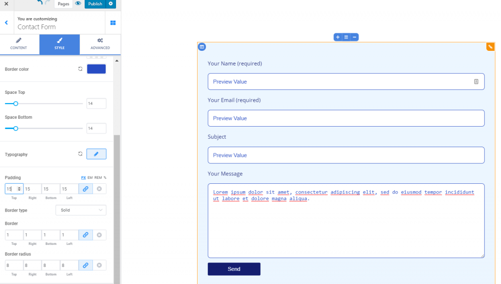
Border Type – if you want to create a visible border for the form fields, choose a value other than None, for the border (solid line, dashed line, dotted line, etc.)
Border Thickness – from here, you can set values for the thickness of the form fields borders. The higher the values, the thicker the border will be.
Border Radius – this option refers to the roundness of the border corners. The higher the values you select on the slider, the rounder the border corners will be.
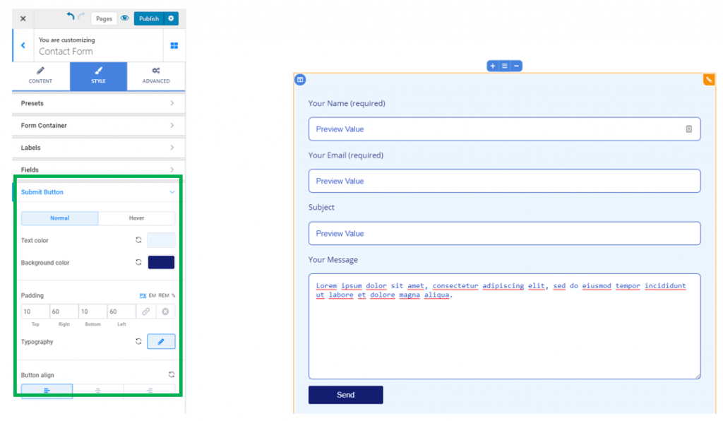
Submit Button
From here, you configure the style of the Submit button associated to the contact form.
You can configure its style differently for the button in normal state and the button on hover (when users hover their mouse over the Submit button).
Text color – this is the color of the text placed on the Submit button (“Send”, in the case below).
Background color – this is the color of the background for the Submit button.
Padding – depending on the values you selected for the form fields, you can configure the padding values for the Submit button. Set individual values for each side of the button and define the surface it occupies in the contact form section.
Typography – click on the pencil icon next to Typography and open the panel with Typography options for the text of the Submit button:
- Choose a font family
- Choose the weight of the font
- Define the dimensions of the text
- Turn the text to uppercase, lowercase, capitalize it, etc.
- Choose values for the height of the line of text
- Set the spacing between the letters of the text for the Submit button.
Button align – this controls the alignment of the Submit button (to the left, at the center or to the right of the contact form section).
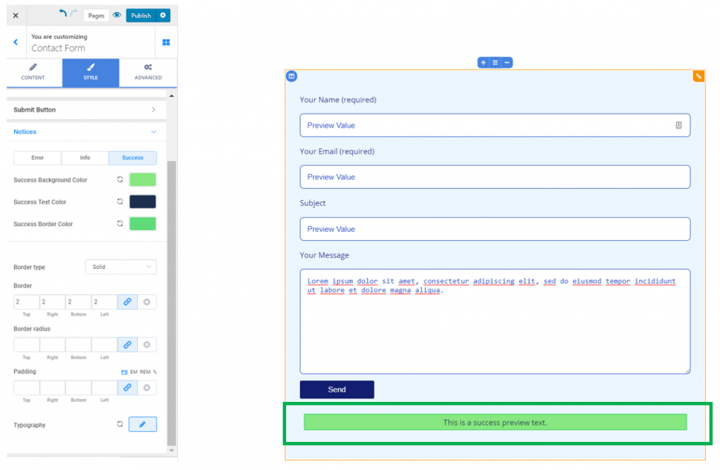
Notices
This subsection refers to customizations for messages users will receive in case of:
- Error sending the message
- Info about sending the message
- Message successfully sent
For each of these cases, the options are:
Background color – this is the color onto which the message is displayed.
Text color – this is the color of the message text.
Border color – in case you chose to display a visible border for the message, select an appropriate color for that border.
Border type – choose values other than None to create a visible border for the message text. Select among solid border, dashed border, dotted border, etc.
Border thickness – from here, you set how thick the border of the message field will be. The higher the values, the thicker the border will be.
Border radius – from here, you define the roundness of the border corners.
Padding – this controls the surface onto which the message field is deployed. Set individual values for each side of the message field.
Typography – click on the pencil icon next to Typography, to open the panel with customization options for the text of the message:
- Choose a font family
- Choose the weight of the font
- Define the size of the text
- Turn the text to uppercase, lowercase, capitalize it, etc.
- Set the height of the line of text
- Set the spacing between the letters of the text for the message.
Example of customized notice: