Open the list of components, in Customizer.
Find the Widget Component, in the Site Data components category, and use drag-and-drop to add the component to a page you are customizing.
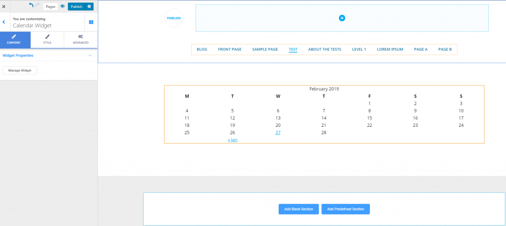
Content
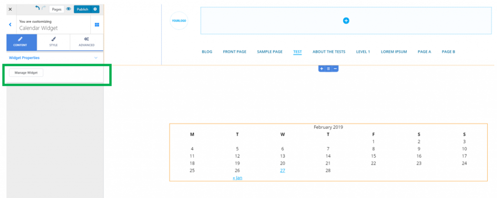
From here, you can add and remove widgets, after you have clicked on “Manage Widgets”:
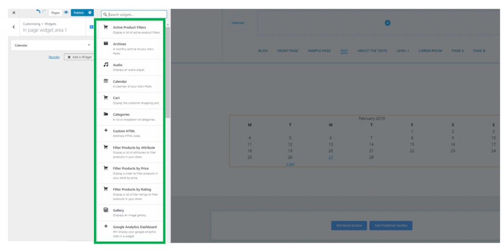
Go to the list of available widgets, and add the widget you want to include in the page section you are customizing:
Style
From here, you can customize both the widget box and the widget title:
Widget Area Background color – choose a color for the background onto which the widget is placed. Select the color from the color picker.
Background type – the background can also be set to image or gradient (and you’ll have to adjust properties either for the image or for the gradient you selected)
Widget Area Border type – if you select values other than None (solid, dashed, double, dotted, etc.), you create a visible border for the widget box.
Border thickness – if you chose to create visible border for the widget box, adjust the thickness of the border. Higher values mean a thicker border.
Border color – select a color for the widget border.
Border Radius – these values define how round the corners of the border will be. Higher values mean rounder corners for the border.
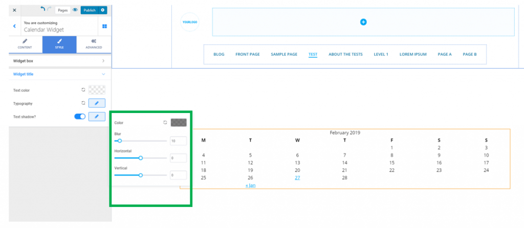
You can also adjust the following:
Text color for the widget title – this is the color of the text for the widget title
Typography – click on the pencil icon next to Typography, to open the panel with further customization options (font family, weight of the font, dimensions for the text, style, decoration, line height and letter spacing).
Text Shadow – you can enable the option to show a shadow effect for the text of the widget title. Click on the pencil icon next to Text Shadow, to open the panel with further customization options: