In the left-hand menu of the Customizer, go to Header Sections.
Either
- You’ll find a default Navigation section that’s already been added to the page (you need to tweak and refine it until it looks as you wish)
- Or you need to click on the + icon next to Header Section to expand the list of available sections and choose Navigation from the list. Select a Navigation section that best suits your page.
General Options
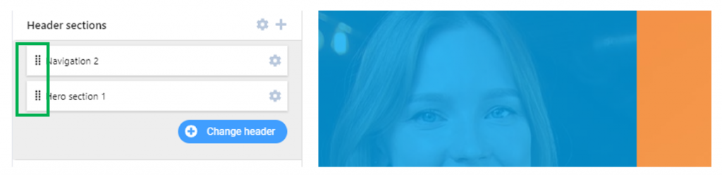
Following best practices, the Navigation section should come first in the list of Header sections. Make sure Navigation is placed on top of the HERO. To change the order of the sections and make Navigation the first section in the Header, use drag-and-drop and rearrange the Header sections:
To delete the current Navigation section, hover over it with the mouse and click on the red Remove button that appears.
To start customizing the Navigation section, click on the grey cog icon next to the respective section.
Customize Content of the Navigation section
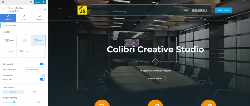
From here, you can set the layout of the Navigation section, and adjust some additional settings.
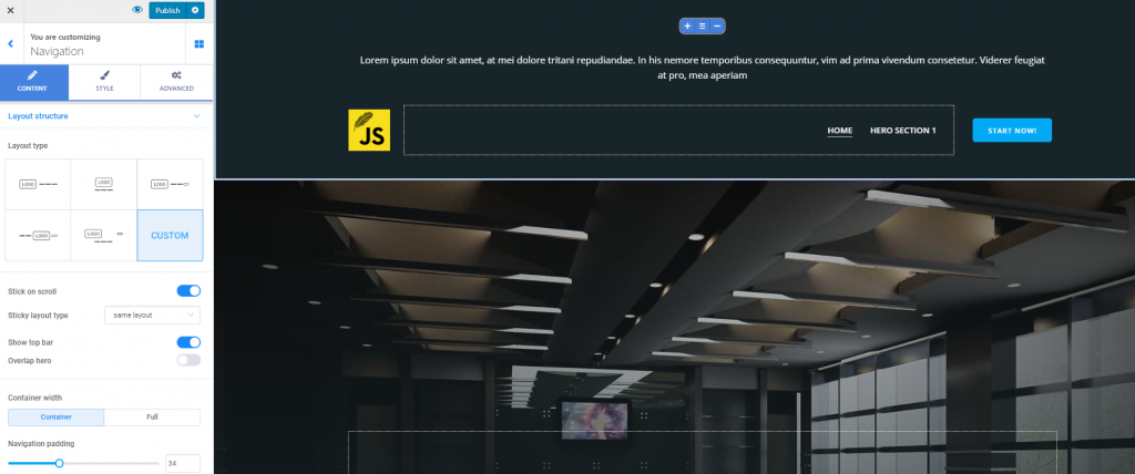
Layout Type
You might choose among 5 different arrangements of the elements in the Navigation section. For ease of use, you can visualize each layout type, before deciding to apply it to your web page:
Thus, you can place:
- Logo on left, navigation buttons on right
- Logo above, navigation buttons below
- Logo on left, navigation buttons on right, call-to-action button on right (after the navigation buttons)
- Navigation buttons on left, logo at the center, call-to-action button on right
- Logo on left, call-to-action button on right, navigation buttons below
Depending on your choice, the call-to-action can be more prominently placed, in case you want to maximize conversions. Also, branding can be put to the front, based on a correct placement of the logo.
Stick on scroll
You can set the navigation to sticky, so when users scroll down the page, they can still see the navigation:
Click on the pencil icon next to the activation button for Stick on scroll, and open the additional set of options:
- You can choose to show sticky navigation immediately/after hero section
- You can choose to keep the same navigation layout type or select a different layout for the navigation set to sticky: logo/nav; logo/nav/CTA; nav/logo/CTA or same layout.
Show top bar
Enable the option to show a top bar, if you want to integrate additional, very useful information into the Navigation section.
Enabling the option to show a top bar will add a container above the other elements in the Navigation section.
To add content to the top bar, you have to drag-and-drop elements from the list of components.
Transparent navigation bar
If you enable this option, the navigation bar will be set to transparent and fully integrate into the Hero color scheme. Otherwise, it will have a distinct color, facilitating users’ orientation within the website.
Container width
From here, you can set the width of the container that includes the elements in the Navigation section:
- Container – you’ll opt for the default width of the Navigation container
- Full – you’ll opt to expand the Navigation container to full width.
Top bar width
From here, you can set the width of the top bar that includes the elements in this part of the page:
- Container – you’ll opt for the default width of the top bar container
- Full – you’ll opt to expand the top bar container to full width.
Navigation Padding
This option refers to the space that the Navigation section occupies in the page. Adjust the values on the slider, make the Navigation section narrower by selecting a smaller value, or make this section larger by selecting a greater value.
Adjust Styling Settings for the Navigation section
From here, the options referring to the background will allow you to further customize the Navigation section.
Background Color
Click on the color picker to select a color you’ll apply to the Navigation section.
You can revert to the default setting any time.
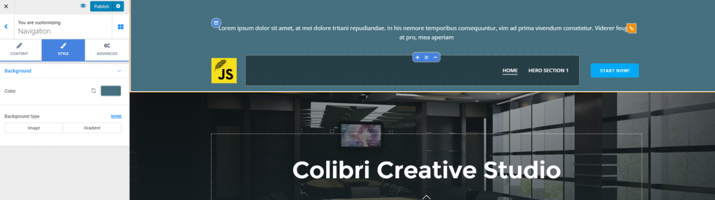
Background Type
For more complex customizations, you can change the Background Type to:
Image
- Upload an image of your choice to set it as background for the navigation section
- Adjust the positioning of the image, for optimal view (top left, top center, top right, center left, center center, center right, bottom left, bottom center, bottom right or custom)
- Set the image to fixed or scroll
- Set the image to repeat, repeat X, repeat Y
- Define the size of the image you’ll set as background
- Enable Use Parallax to add a parallax effect to the background of the Navigation section
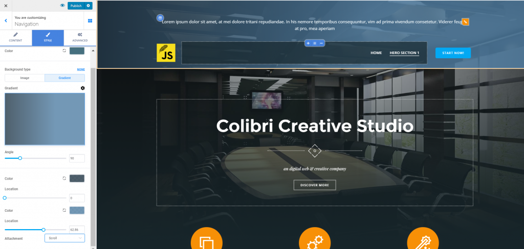
Gradient
- Choose a gradient you like
- Click on the cog icon next to Gradient, to adjust each of the gradient colors, the inclination angle for the gradient and the location for color change
- Set the gradient to fixed or scroll.
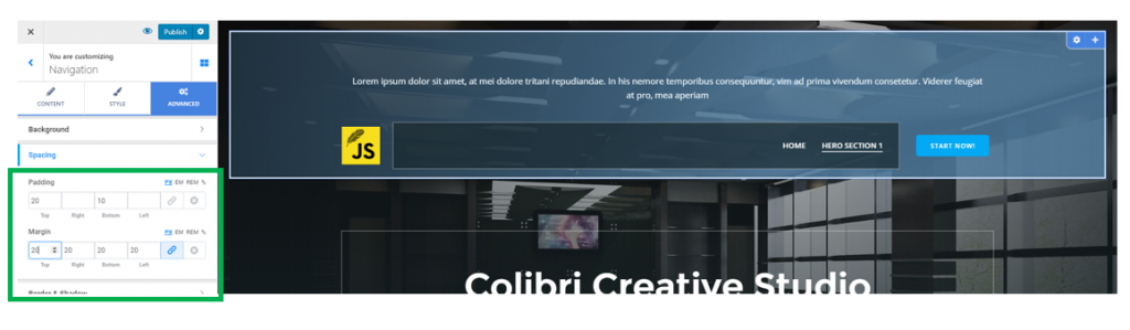
Make Advanced Customizations to the Navigation section
Spacing
The Spacing Options include:
- Padding – you need to set values for the width and height of the space the Navigation section occupies in the page (set distinct values for top, right, bottom and left sides). The values can be expressed in pixels, em, rem or in percentages.
- Margin – you will set values for the distance of the Navigation section from the top and to the bottom, from the left and to the right. The values are expressed in pixels, em, rem or in percentages.
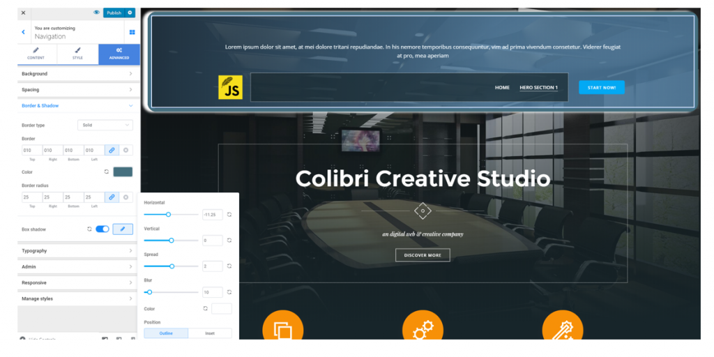
Border and Shadow
The border of the Navigation section will be visible if you set the border thickness to values that are greater than 0 and select a border type other than none.
- Border Type – select among 6+ variations of border types
- Border Thickness – select how thick you want the border to be (top, bottom, right, left)
- To give a more stylish aspect to the Navigation section, choose a certain color for the border
- Border radius – define the roundness of the border corners
Enable the option to apply a Box Shadow and click on the pencil icon next to this option, to expand the list of additional features:
- Define the horizontal distance that the box shadow spans over
- Define the vertical distance that the box shadow spans over
- Spread – decide to what extent the shadow spreads around the box
- Blur – set smaller or higher values for a slighter or more accentuated blur effect
- Color – select a color for the shadow