You can add a divider component in any section you included in the page.
The divider is a graphic element that separates one section from another in a page.
Click on the blue sign next to Section, in the upper part of the Customizer menu. You will open the list of components.
In the category of Basic Components, find the Divider component.
Use drag-and-drop to include a Divider into the section you are modifying.
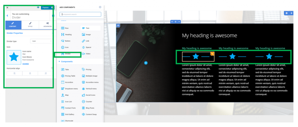
Dividers added to a page section:
To customize the dividers you included in a page section, you need to have the settings category for Dividers open in Customizer.
Content
Type of the Divider
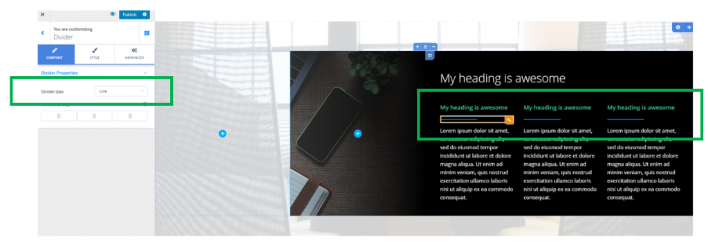
You can choose the divider to be represented by a simple line separating 2 parts of content, or else by an icon.
Divider represented by a simple line:
In case you choose the Divider to be represented by an icon, you need to choose the most adequate icon from the icon libraries that are available in Colibri:
Alignment of the Divider
From here, you’ll define the alignment of the graphic element serving as a Divider (to the left, at the center or to the right).
Style
From Style settings, you can make tweaks and refines to the graphic elements serving as separators into a page section.
Style for Dividers represented by a simple line
Color of the Divider – select, from the color picker, the most appropriate color for the line representing the divider.
Type of Line for the Divider – the line itself can be one of the following: solid, dashed, dotted or double.
Thickness of the Divider – this option determines how thick and visible the line representing the Divider will be.
Width of the Divider – this option refers to the horizontal distance over which a Divider deploys.
Space for the Divider – select, on the slider, values that control how much space the Divider puts from the above content and to the content below it.
Style for Dividers represented by icons
Icon color – select the color you want to give to the icon of the Divider, from the color picker
Line type – select which type of line will accompany the icon
Thickness – select specific values for the thickness of the line accompanying the icon
Width – specify the horizontal distance to which is extended the line accompanying the icon
Icon space – this option controls how much space the Divider puts from the content above it and to the content below.
Advanced
From the Advanced settings category, you can make further adjustments to the line/icon representing the Divider, and the container of the Divider, as well.
The options are available both for the Divider element in normal state and for the Divider as it appears when users hover their mouse over the item.