If you want to add icons to sections of your page, click on the blue sign next to Section, in the upper part of the Customizer menu. You will open the list of components.
In the category of Basic Components, find the Icon component.
Use drag-and-drop to put a new icon into the section you are modifying.
Icons added to a page section:
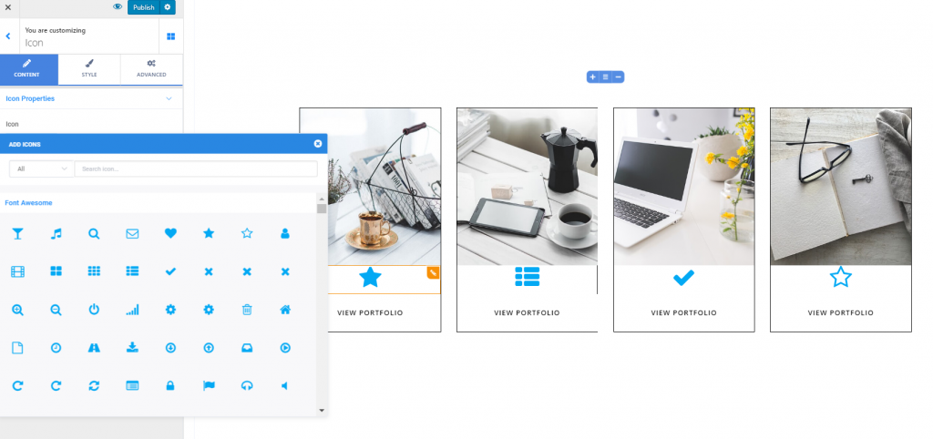
To customize the icons you included in a page section, you need to have the settings category for Icons open in Customizer.
Content
From here, you can adjust the icon properties.
Choose the icon – you can change the default icon with another one, from the Font Awesome library, Ionicons library, Materials library, etc.
Align the icons – you can align the icons to the left, at the center or to the right.
Add links on the icons – to place links on the icons, you need to fill in the blank space dedicated to Link with the full URL of the destination page.
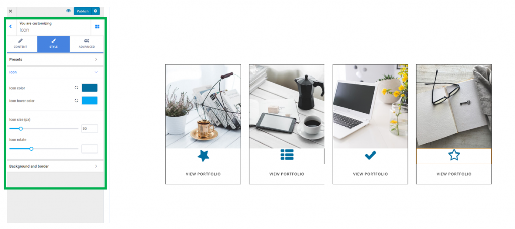
Style
From here, you can modify the way icons appear in the page section.
Color of the icons – change the color of the icons, by choosing the wanted color from the color picker.
Color of the icons on hover – change the color of the icons as they appear when users hover their mouse over them, by choosing the wanted color from the color picker.
Define the dimensions for the icons – try different values on the slider to check the appearance of the icons in the page section. Higher values equal greater dimensions of the icons, while smaller values mean smaller dimensions of the icons in the page section.
Icon rotate – this feature refers to how you rotate the icon and change its inclination, so as it is displayed the way you want, in the respective section.
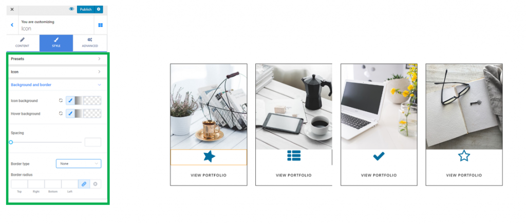
Background and border
Background color in normal state and on hover – from here, you can create a colored background for the icons you’ve added to the section. Also, you can choose a different color for the icons as they appear when users hover their mouse over them, to make them more salient in the page section.
Border Type – you might want to create a border for the icons. Select one of the available types of border and adjust values for it.
Note! When applying a visible border to an icon, you need to also check the values you set for icons rotation, as the border will follow the rotation of the icons.
Border Thickness – give individual values for each side of the icon border. Thus, you decide how thick the icons borders will be.
Border Color – you define, from here, the color of the visible border for an icon.
Border Radius – from here, you decide how round the border corners will be. The higher the values you select, the rounder the border corners will be.
Advanced
From the Advanced settings category, you can modify additional parameters for the icons.
You can make changes both to the icon itself, and to the container of the icon.