You can add a link component in any section of your website pages.
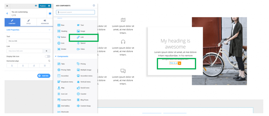
Click on the blue sign next to Section, in the upper part of the Customizer menu. You will open the list of components.
In the category of Basic Components, find the Link component.
Use drag-and-drop to put a new link to the section you are modifying.
New link added to a page section:
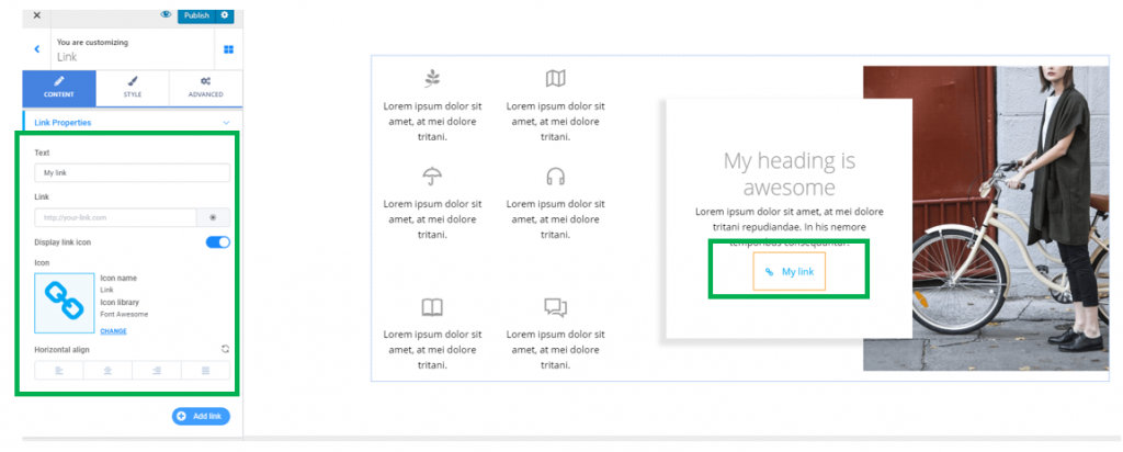
To customize the link you included in a page section, you need to have the settings category for Links open in Customizer.
Content
Anchor text of the link – fill in the blank space under Text with the words you want to place a link over. This will be the anchor text of the link.
URL of the link – fill in the blank space under Link with the full URL of the target page, that you want users to land on after they click on the link.
Link Icon – enable the option to Display link icon, to add a suggestive icon next to the link. You can change the default icon with one of your choice, by selecting an icon from the Font Awesome library, Ionicons library, Materials library, Typicons library, etc.
Alignment of the link – you can place the link to the left, at the center or to the right of the section where you included it.
Style
From here, you can modify settings for the style of the link, as well as the icon associated to it.
Customize the Link Style
Typography – this option refers to the typography of the anchor text that the link will be placed over. Click on the pencil icon next to Typography and open the panel with typography options for the text (choose the font, choose the weight of the font, define the dimensions of the text, turn the text to uppercase/lowercase/capitalize it, adjust the height of the line of text, etc.)
Text color – from here, you can change the color of the anchor text for the link. By default, the color associated to the link text is blue. It’s best practice that you should keep the blue color for the links, as users are accustomed to recognizing links by this color.
Hover text color – this is the color of the anchor text for the link as it appears when users hover with their mouse over that link. Choose an appropriate color from the color picker.
Visited text color – this is the color of the anchor text for the link as it appears after users have accessed that link. The distinctive color will mark to users that they have already visited that link.
Advanced
If you want to make further customizations for the link component, you need to use the options corresponding to the Advanced tab.
Enlarge the box for the link you added to a page section: you have to go to Spacing -> Padding.
Give values greater than 0 for the padding and enlarge the surface the link component occupies in the page section.