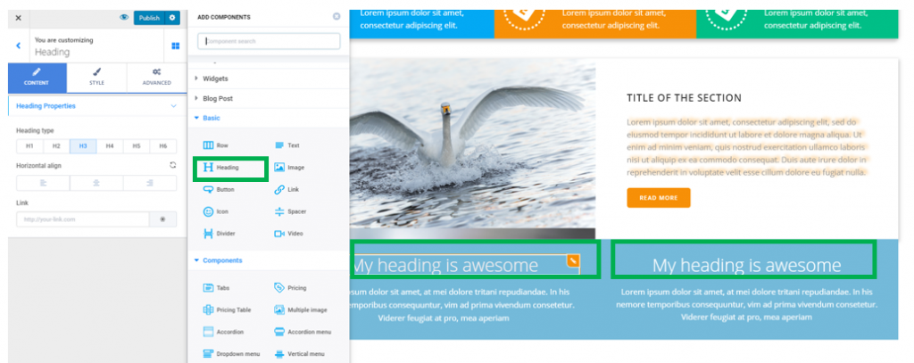
You can add a heading component in a predefined section you included in the page, or in a blank section you are creating from scratch.
Click on the blue sign next to Section, in the upper part of the Customizer menu. You will open the list of components.
In the category of Basic Components, find the Heading component.
Use drag-and-drop to put a new heading to the section you are modifying.
New heading added to a page section:

To further customize the heading, you need to make sure you have the settings category for Headings open in Customizer.
Content
From here, you have to choose the heading properties:
Choose the heading type – the heading might be H1, H2…H6. It’s recommended that you don’t have more than one H1 on a page. Headings are of great help for better structuring the text in the page.
Choose the alignment of the heading text – the text of the heading might be aligned to the left, at the center or to the right.
Also, you can place a link over the heading text. Fill in the blank space dedicated to Link with the complete URL of the destination page.

Style
From here, you can configure the style for your heading.
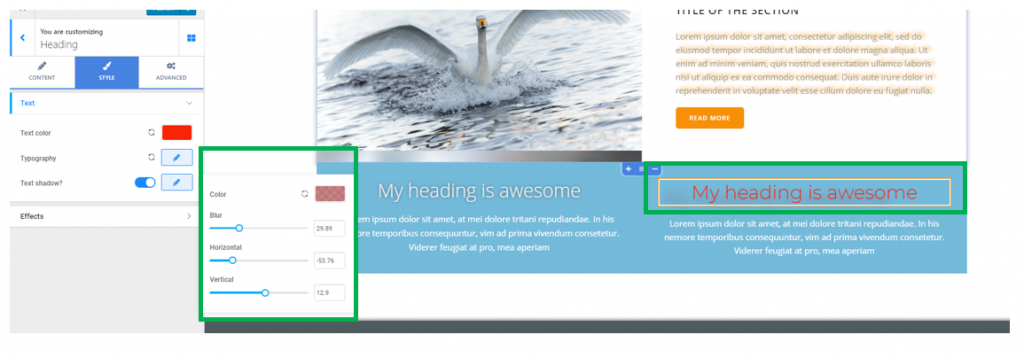
Text color – choose a color for your heading, from the color picker.

Typography – make adjustments for an appropriate typography that brings to front a suggestive heading:
Click on the pencil icon next to Typography to open the panel with settings for the heading text typography:
- Choose the font family for the heading text
- Choose the weight of the font
- Define the dimensions of the heading text, by selecting your values on the slider (the values can be expressed in pixels, em or rem)
- Turn the text to uppercase, lowercase, capitalize it, etc.
- You can choose to underline the text, to better emphasize it, apply a line above the text, etc.
- Specify the height a line of text occupies in the heading container
- Set the optimal distance between letters in a heading text (higher values on the slider mean more space between the letters of the heading text).
Text Shadow – if you enable this option, an elegant shadow effect will be applied to the text of your heading. Click on the pencil icon next to Text Shadow to open the panel with settings for the text shadow:
- Select the color the text shadow will have
- Define its horizontal deviation from the text
- Define its vertical deviation from the text
- Set the blur effect of the shadow to smaller or larger values, for a lighter or more pronounced effect

Effects for the headings
From here, you can add a highlighted or rotating effect for the headings you’ve added to your section.
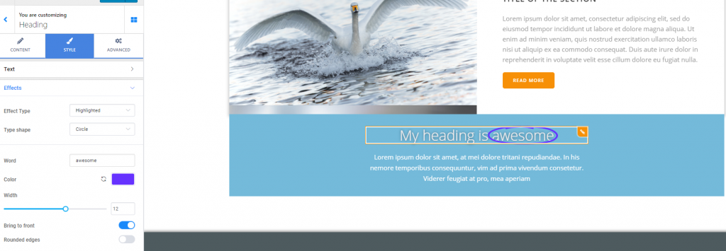
Highlighted:
This effect means you put a stress on a particular word/expression in the heading, by highlighting it.
The highlighting element can be set as follows:
- Choose the shape of the element that serves to highlighting text (5+ shapes are available for creating an effective highlight effect)
- Specify the word/expression that will be highlighted. For that, fill in the blank space next to Word, with the exact word/expression you want to put a stress on
- Select the color for the highlighting element, from the color picker
- Select the width of the highlighting element, by choosing your values on the slider
- Bring to front – this option means you bring the highlighting element on top of the word/expression that’s highlighted

Rotating effect
The rotating effect means that a part of the text is replaced by alternative texts, while the page section is being seen by visitors.
The replacement of words can be set according to 8 animation types: 3D flip, letter flip, slide, clip, etc.
You can configure this animation for the heading as follows:
Next to Word, fill in the blank area with the word/sequence of words you want to replace by its alternative within the animation.
Next to Rotating Words, fill in the blank area with the alternative words/sequences of words that will replace the initial word in the animation. The alternative texts should be put one per line.
The rotating effect:
