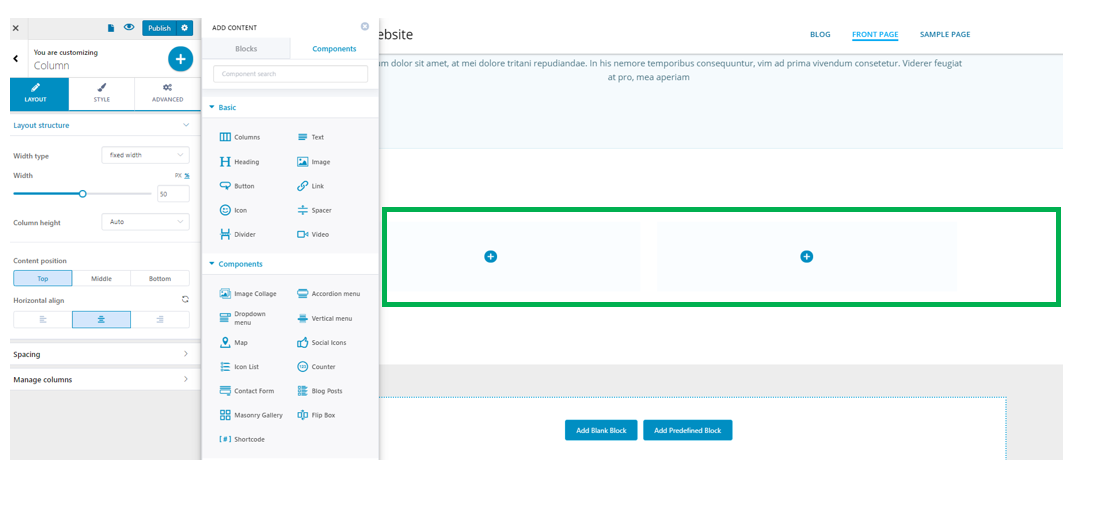
You can add a columns component both to a predefined section in the page, or in a blank section you introduced in the page.
Click on the window-like blue sign next to Section, in the upper part of the Customizer menu. You will open the list of components.
In the category of Basic Components, find the Columns component.
Use drag-and-drop to put new columns to the section you are modifying.
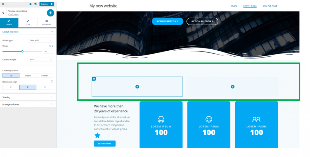
New columns added in a predefined section:
New row added in a custom section:
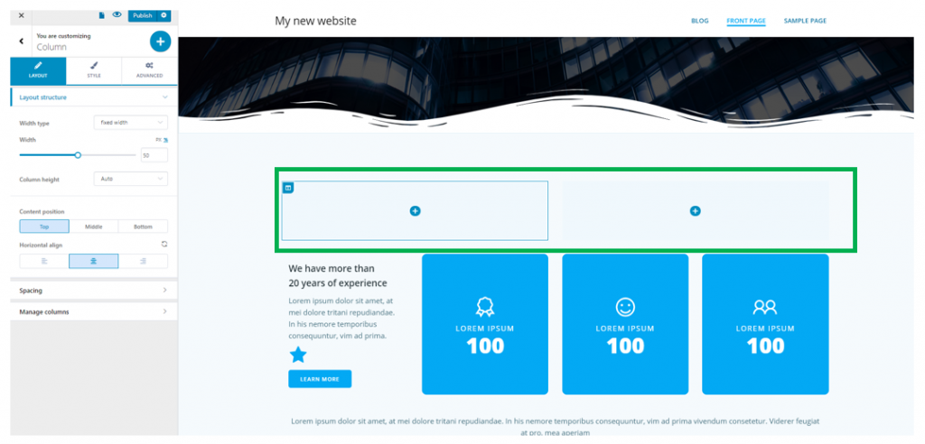
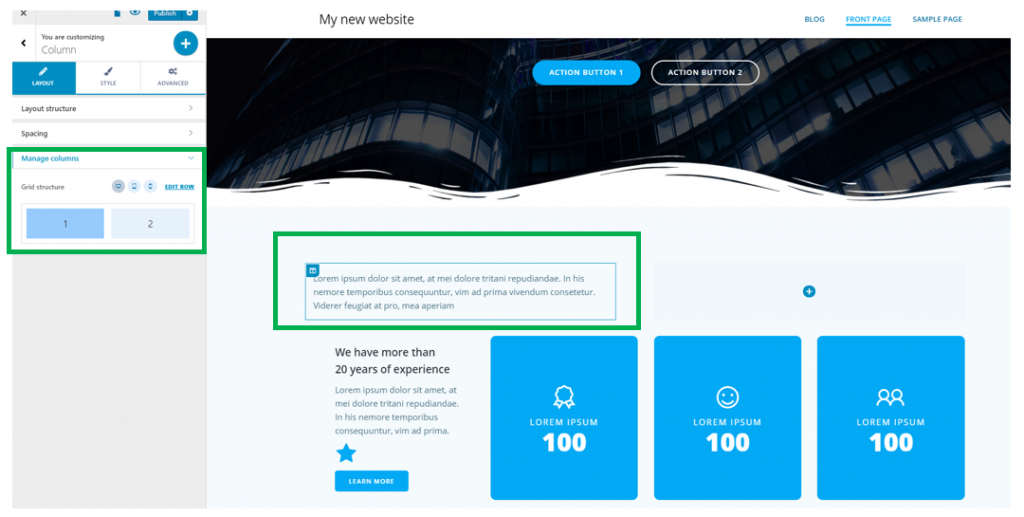
Customizations for a new column
You need to make sure the category of settings specific to the column is open in Customizer, like in the example below:
If you decide to keep 2 or more columns in a row, you have options for:
Layout Structure
Enable the option Equal Width Columns to make the columns the same width. If the option isn’t enabled, you can extend the width of one column and make another one smaller, by dragging its right margin:
- You can set the number of columns that will be placed in a row
- The column height will be set automatically, or to minimal height that you define on a slider
Enable the option to make columns fixed width, so the columns will expand to the same horizontal distance. It’s recommended that you use this option, for coherence in design:
- You can set the width of the column, by selecting your values on a slider. Values can be expressed either in pixels or in percentages.
- The column height will be set automatically, or to minimal height that you define on a slider
You can enable the option to make columns size fit to content. This way, columns will adjust their dimensions depending on the content that’s included in them:
- The column height can be set automatically
- The column height can be set to minimum height that you define on a slider
You can also make the columns expand to available space. This way, the column will fully integrate into the design, in a perfect, coherent manner:
- The column height can be set automatically
- The column height can be set to minimum height that you define on a slider
Content Position
Content is added to the column by inserting text or images into the column.
In our case, we added text. This text can be aligned as follows:
Vertical alignment – content is positioned:
- At the top
- In the middle
- At the bottom
Horizontal alignment – content is positioned:
- To the left
- At the center
- To the right
Spacing
Space is important in creating a good website design. The features in this category refer exactly to spacing:
Spacing between columns
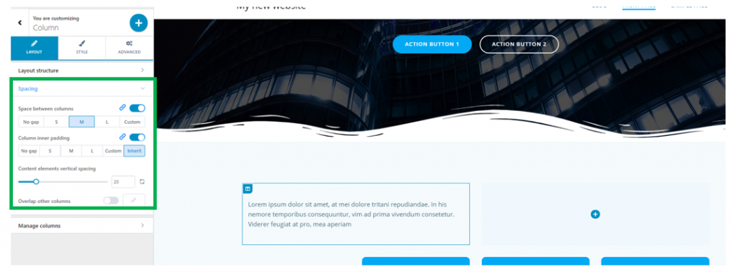
If you select No gap, the columns will stick to one another. Otherwise, you can choose to include small/medium/large distance between the columns. There’s also the option to create your own custom spacing for the distance between columns.
Column Inner Padding
Column Inner Padding refers to how the content in a column is placed into its container. The values are no gap, small, medium or large space, or else, custom space.
From here, you can set the column you are customizing to overlap other columns in the page. Enable this option to Overlap other columns, and set values for the vertical and horizontal distance of the overlap: adjust values on the sliders, for vertical overlap and horizontal overlap.
Manage Columns
From this subsection, you can view how the structure is shown on desktop, mobile and tablet:
Style
From here, you can set the background of the column.
You can change the column background by selecting the desired color from the color picker.
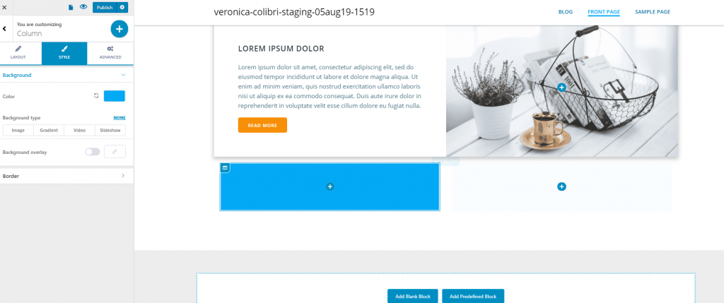
In case you don’t want a simple colored background for your column, you have the possibility to set:
- An image
- A gradient
- A video
- A slideshow
As the background of your newly inserted column.
Set an image as column background
Click on the pre-existent image to upload a different image from your device and change the default.
To adjust settings for the image, click on the cog icon next to the image and open the panel with customization options:
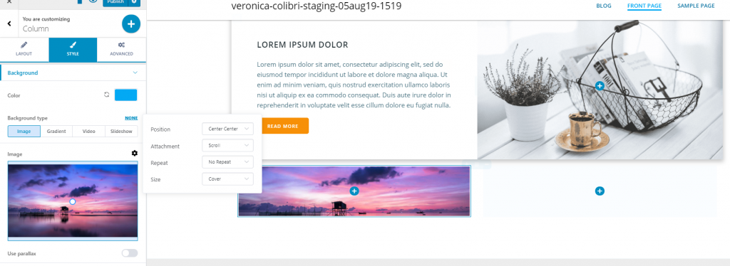
- Position – from here, you adjust the positioning of the image (top left, top center, top right, center left, center center, center right, bottom left, bottom center, bottom right)
- Attachment – you can set the image to scroll at the same time as the content in the page, or you can set it to be fixed and stay in place as users scroll down the page
- Repeat – you can set the image to repeat into the background or be displayed as a single representation of the uploaded image
- Size – from here, you set the dimensions of the image (the options are auto, cover and contain)
Use parallax – you can enable this option to apply a nice parallax effect for the column background.
Set a gradient as column background
To set a gradient as background of the column, select Gradient as background type, and click on the pre-existent gradient to change the default.
Click on the cog icon next to Gradient, to open the panel with customization options:
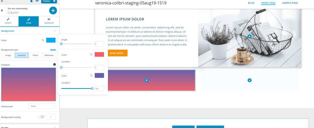
- Change first color of the gradient
- Adjust the location where the first color changes to the second color
- Change second color of the gradient
- Adjust the angle of inclination of the gradient
Attachment – you can choose the gradient to scroll at the same time of the column content, or stay fixed while users scroll down the page.
Set a video as column background
You can choose to set a video as background for the newly inserted column.
The options are to either upload a self-hosted video or use a YouTube link. Click on the pre-existent video to change the default.
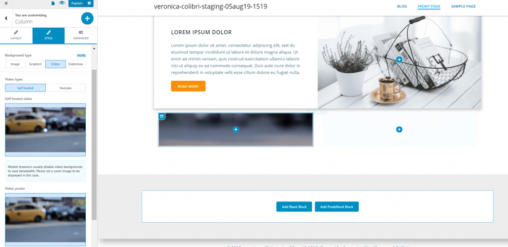
In case you choose to set a video background for the column, you should know that mobile browsers usually disable video backgrounds to save bandwidth. Please set a cover image to be displayed in this case.
The cover image can be set from the option related to Video poster. Click on the image to change the default with an image from your own device.
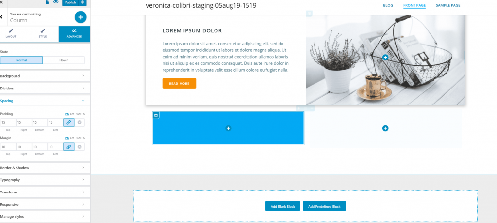
Advanced
You can make additional changes to the background, from the Advanced tab. These changes can be made either for the column in normal state and on hover.
Spacing
From here, you adjust values for each side of the column, regarding:
- Padding – this is the space the content in the column occupies
- Margin – this is the border of the column
Border and Shadow
You can give a visible border to the column, and apply a shadow effect to it.
For the border to be visible, you have to select a border type other than none: solid, dashed, dotted, double, groove, ridge, etc. and you have to choose as border thickness values that are greater than 0 (for each of its sides).
You can set a specific color for the border.
Border Radius – from here, you set how round the corners of the border will be. Greater values mean rounder corners for the border.
Box Shadow – you can apply a shadow effect to the column. Enable this option and set the horizontal and vertical distance to which the shadow is extended, the spread and you can add a blur effect to the shadow. You can also select the color this shadow will have.
Typography
You set, from here, colors for the text, as follows:
- Color of normal text
- Color of the heading text
- Color of the link anchor text
- Color of the link anchor text, when users hover their mouse over the link